Browser: Safari 16.5
OS: macOS
I have an issue where I have a Carousel widget which is set to show 4 posts on desktop and I want it to be that way until I select 2 at mobile portrait. However if I set 2 in mobile-portrait, it then immediately scales back to 2 up until the 4 I set on desktop, meaning both tablet and mobile landscape are set to 2 too even though I only set that value on mobile portrait.
One thing worth mentioning, I had tried earlier a mobile-first approach but quickly reverted back, refreshed the CSS cache and regenerated the breakpoints in Bricks Settings, but the issue remains. I am presuming it’s related to that test for now but the thing is even when all the breakpoints are reset, I still get the issue even after dropping in a fresh carousel element.
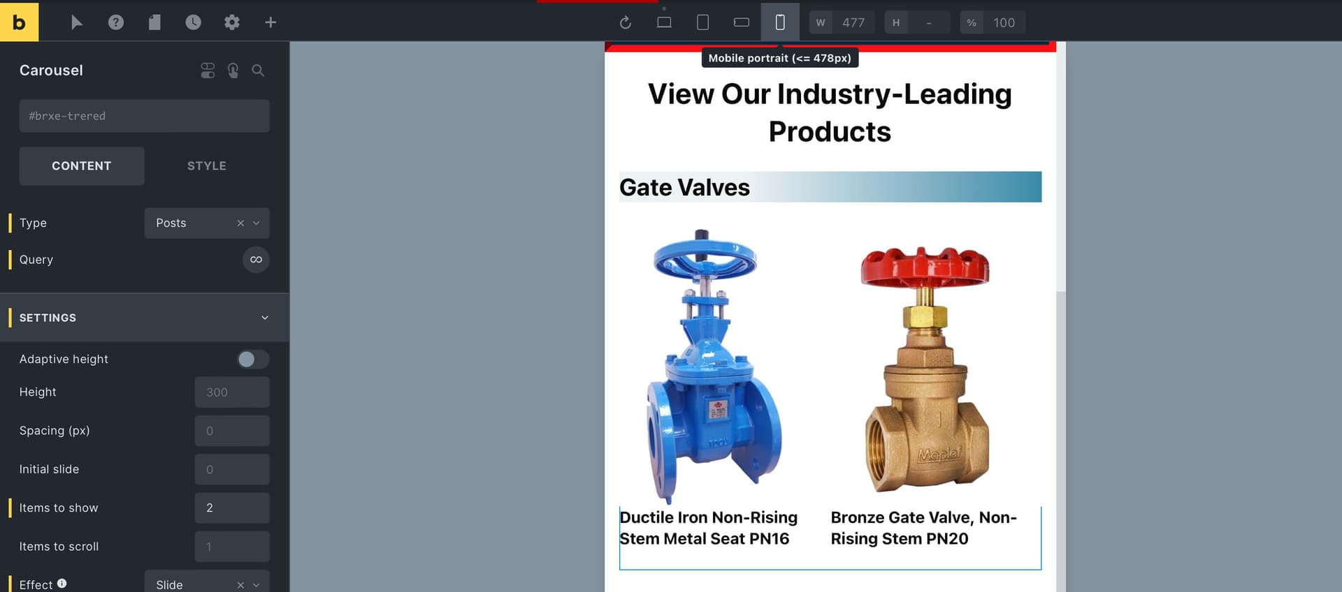
The configuration of the element is here. You can see that it shows “2” as the value only for mobile_portrait, so I’m not sure why it still insists on showing “2” for tablet as well when it should be “4”.
{"content":[{"id":"trered","name":"carousel","parent":"tmktcp","children":[],"settings":{"infinite":true,"fields":[{"dynamicData":"{post_title:link}","tag":"h4","id":"088b0d","dynamicTypography":{"font-size":"1.1rem"}}],"arrows":true,"prevArrow":{"library":"ionicons","icon":"ion-ios-arrow-back"},"prevArrowLeft":"50px","nextArrow":{"library":"ionicons","icon":"ion-ios-arrow-forward"},"nextArrowRight":"50px","type":"posts","query":{"post_type":["product"],"posts_per_page":"10","tax_query_advanced":[{"id":"quckkz","taxonomy":"product_type","field":"name","terms":"Gate Valves"}]},"imageSize":"bricks_medium_square","slidesToShow":"4","effect":"slide","overlayOnHover":true,"overlayAnimation":"fade-in-up","overlayAlign":"top center","overlayBackground":{"hex":"#b80b0f","id":"pfpojy","name":"Brand / Primary"},"slidesToShow:mobile_portrait":"2"}}],"source":"bricksCopiedElements","sourceUrl":"<URL>","version":"1.8-beta","globalClasses":[],"globalElements":[]}