I’ve been using the default breakpoint, which can vary between around 1280 to 1600 (depends on my browser window), to build my sites. I also modify everything to work with smaller breakpoints, 991, 767,478, and 360.
My PC monitor display is 3440x1440, and everything looks good to me.
However, I recently looked at a 3840px iMac emulator and realised my beautiful websites were tiny in the middle, yet it is only 400px different from my own display. It got me wondering how people actually use iMacs, and how developers create their breakpoints to serve their website to iMacs. What’s good practice?
If anyone has comments or links to useful articles/YouTubes on the topic, I’d be interested to know.
Thanks.
1 Like
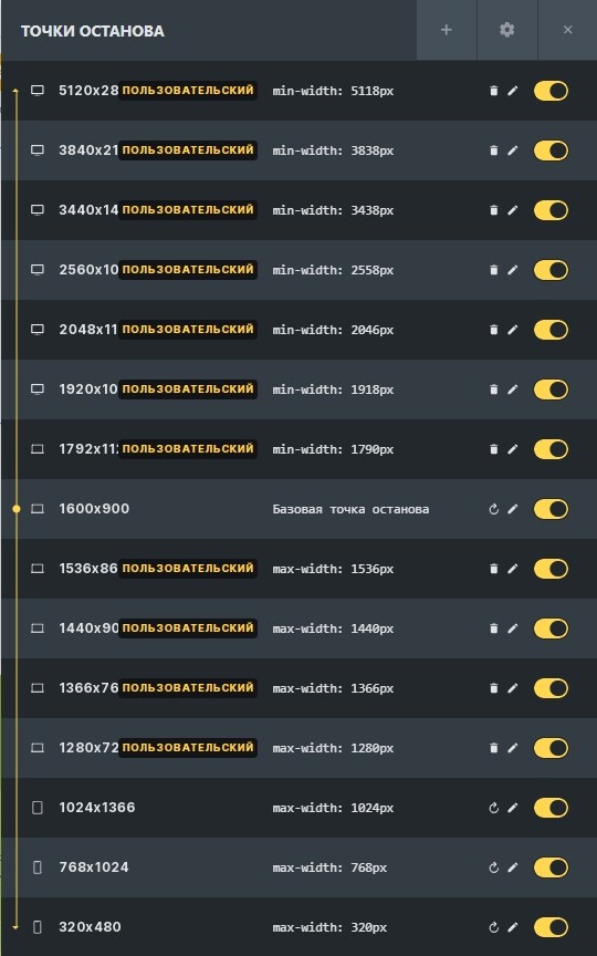
Experimentally and with the help of analytics of visits to several sites, I have compiled such a list of breakpoints:
The base breakpoint is 1600 x 900 pixels. According to the statistics of visits, the most popular resolution is 1920 x 1080 pixels. At first I used it, but practice has shown that users still use laptops more often than other devices, so the resolution of 1600 x 900 pixels was taken as a basis.
Keep in mind that here you are working not with the actual screen size, but with the logical width and height.
The layout should always be checked at each breakpoint and changed if necessary, then the site will look good.
I recommend using this site to check your layouts: Онлайн сервис проверки и тестирования сайта на адаптивность — iloveadaptive
1 Like
Could you check whether the emulator is correct? Usually website content gets adjusted automatically to the retina displays (CSS pixel =/= display pixel) and I’m a bit surprised you’re seeing such a large difference to your large monitor. But yeah, iMacs displays run very wide and while designing I try to keep in mind whether something like a full screen header will look good (for most sites image quality will be the main issue here and if other people fill with content you need to give clear instructions). To me it doesn’t really affect lower breakpoints but basically I often put content in a container that might be larger than your average laptop screen to make sure it doesn’t scatter too far on mac. You don’t want to have your text lines run so wide reading becomes a chore or lose too much visual connection between elements. But in general I’d only put a lot of work in optimizing iMac display if I expect the target group to be designers or similar.
1 Like
Thanks for your comments, everyone.
This seems to be a good list to use.
I’m using Blisk.
Seems good enough for me, but perhaps the list of breakpoints from parktechno will be a useful guide, for some.