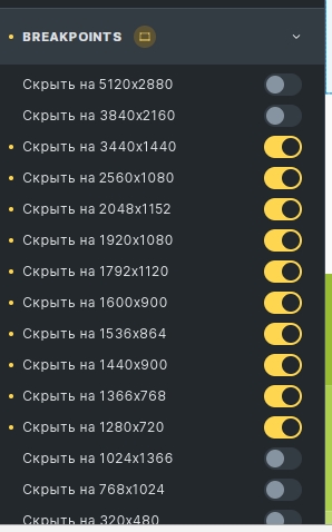
If the site header is complicated, then in practice it is almost impossible to make an adaptive header for all devices. Breakpoints can be divided into: large screens, standard screens, laptops, tablets and smartphones. Ideally, you should create a separate header template for each such group.
The forum has already discussed many times the possibility of completely disabling elements on the frontend. For example, we make a header for the desktop and show it only on desktops. We disable it in other groups. We make our hats in them.
We are waiting for the developers to pay attention to this ![]()
We have made a temporary solution for our projects.
