Experimentally and with the help of analytics of visits to several sites, I have compiled such a list of breakpoints:
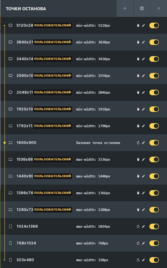
The base breakpoint is 1600 x 900 pixels. According to the statistics of visits, the most popular resolution is 1920 x 1080 pixels. At first I used it, but practice has shown that users still use laptops more often than other devices, so the resolution of 1600 x 900 pixels was taken as a basis.
Keep in mind that here you are working not with the actual screen size, but with the logical width and height.
The layout should always be checked at each breakpoint and changed if necessary, then the site will look good.
I recommend using this site to check your layouts: Онлайн сервис проверки и тестирования сайта на адаптивность — iloveadaptive