NO BUG / IMPROVEMENT: Horizontal Scroll on Mobile with Sticky Header

Hey folks,

First off, yes I have seen the other posts talking about this, but the issue is still not fixed.

When the header scroll function is active it applies the “sticky” value, which then creates a horizontal scroll. If you changed it to fixed, then it gets rid of the horizontal scroll, but causes margin-top issue (but that is easier to deal with).

/* Change This */
#brx-header.sticky.on-scroll {
position: sticky;
}

/* To This */
#brx-header.sticky.on-scroll {
position: fixed;
}

So, can we please get these “basic” bugs fixed. These have been going on since 2021.

Cheers

2 Likes

Hi Shingen,
Thanks for your report, but I’m missing some crucial things here:

  1. browser
  2. operating system
  3. a screenshot of the header settings
  4. a video or a link where I can see the problem

If I get all this from you I might be able to reproduce this “basic” bug :wink:

Best regards,
timmse

Ooops, sorry about that timmse.

Browser: Chrome
OS: Windows 11
Video: 2023-02-23 04-14-09

I did some testing last night and was able to reproduce it over and over with new installs. So my guess it is the fixed scroll header option.

Cheers

No kidding, I can’t reproduce it. Please send me the header as template.json and show me the header template settings :v:

Hey timmse,

Ok, sounds good. I will have two different installs for when I did my testing, so I will give you both configurations, as they both product the same issue. Stay tuned.

Hey timmse,

Ok, here is a video showing you the issue that I am seeing: Bricks Sticky on Scroll Bug - YouTube

As well the json:

{"id":2045,"name":"header","title":"Header","date":"2023-02-17 12:27:29","date_formatted":"February 17, 2023","author":{"name":"admin","avatar":"http:\/\/1.gravatar.com\/avatar\/d343dc8b0607e6306a3fecbbb27dba84?s=60&d=mm&r=g","url":"http:\/\/localhost:10006"},"permalink":"http:\/\/localhost:10006\/template\/header\/","thumbnail":false,"bundles":[],"tags":[],"type":"header","header":[{"id":"hmtkza","name":"section","parent":0,"children":["wjigln"],"settings":{"_padding":{"top":"2rem","bottom":"2rem","right":"2rem","left":"2rem"},"_background":{"color":{"hex":"#ffffff","id":"ensndk","name":"Color #21"}}}},{"id":"wjigln","name":"container","parent":"hmtkza","children":["tsclnq","bvmovm","jdwrxp","lxmmto"],"settings":{"_display":"flex","_direction":"row","_justifyContent":"space-between","_alignItems":"center"}},{"id":"tsclnq","name":"logo","parent":"wjigln","children":[],"settings":{"logoText":"Bricks"}},{"id":"bvmovm","name":"nav-menu","parent":"wjigln","children":[],"settings":{"menu":"2","mobileMenu":"never","_display:mobile_landscape":"none"}},{"id":"jdwrxp","name":"icon","parent":"wjigln","children":[],"settings":{"icon":{"library":"svg","svg":{"id":2107,"filename":"mobile-menu-icon.svg","url":"http:\/\/localhost:10006\/wp-content\/uploads\/mobile-menu-icon.svg"}},"_display":"none","_display:mobile_landscape":"block","_cssGlobalClasses":["mftdvy"],"_cursor":"pointer"}},{"id":"lxmmto","name":"xslidemenu","parent":"wjigln","children":[],"settings":{"menuSource":"dropdown","menu":"2","defaultState":"hidden","clickSelector":".mobile-trigger"}}],"templateType":"header","global_classes":[{"id":"mftdvy","name":"mobile-trigger","settings":{"_display:mobile_landscape":"flex"}}]}

Cheers
Thanks so much for the video and the template!

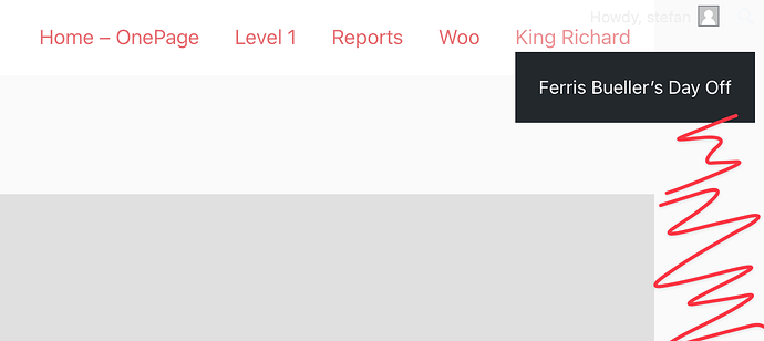
The cause of the problem is completely different and has nothing to do with the sticky header, as far as I can see. It is solely due to the submenu of the last menu item. This creates the overflow (the red stroke is the overflow caused by the submenu item, the gray area is my footer):

Normally, the class “overflows-viewport” should be added to the submenu if there is not enough space available, which changes the orientation of the submenu. However, this only happens when the page is loaded, not when it is resized. There is also a problem if, for example, you have several menus in the header, see here: WIP: Sub-menu alignment stops working when there are two menus in the same page

Assume there is only one menu:

  1. full window width ( = enough space for the submenu). Look at the code of the submenu of the last menu item, the class “overflows-viewport” doesn’t exist on the ul.
  2. Change the window width until the overflow appears.
  3. Reload the page. “overflows-viewport” should now be there and the overflow should be gone, right?
1 Like

Hey timmse,

Aww, I see it now – thank you for this and helping troubleshoot. I will also keep this in mind going forward when dealing with navigation. I appreciate the help. =)

Cheers

You’re welcome :slight_smile:
I’ll add the thread to the existing task, there’s probably a solution for this as well.

Awesome, thanks again! =)

Cheers