WIP: Theme Style > Typography: wrong or empty placeholder value in body / heading font sizes

Browser: Safari
OS: macOS

Similar to SOLVED: Theme Style > Typography in 1.8 beta shows wrong greyed-out default value, inheriting from mobile, there is a new defect it seems with the placeholder text size in theme styles…

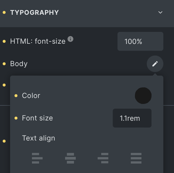
When I view the Theme Styles > Typography > Body Text, I see that it’s 1.1rem for base for example (with 100% base root font size) meaning the font-size for body is 17.6px, but the UI shows 15px instead when I swap to another breakpoint. Screenshots attached.

This is using the default breakpoints, this is not mobile-first.

On desktop breakpoint size:

On tablet breakpoint size:

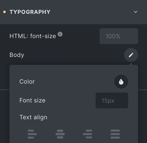
Why does it show placeholder text of 15px when it should be 17.6px? Note that the font-size isn’t set anywhere on a lower breakpoint, the only change is the root font size is 90% instead of 100% on the mobile landscape breakpoint. But that can’t be related because that would then be equivalent to 14.4px not 15px.

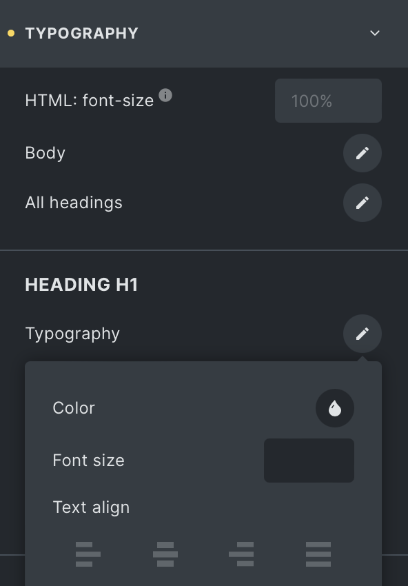
On a similar note, when I tried to confirm this behaviour for h1 font size, it actually shows entirely empty/blank on tablet size and below instead of showing what 3.6rem is in pixels with the root font size taken into consideration. Is this expected behaviour? I would expect it to work the same as the main body typography settings (except using the right values instead of some other random value).

H1 heading on desktop:

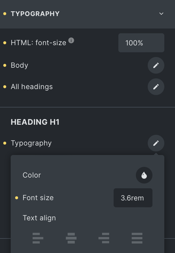
H1 heading on tablet (shows blank):

Hi Dustin,
Thanks so much for your report!

I reproduced the issue and added it to our bug tracker.

Best regards,
timmse

I experience something equal on many other settings.
Currently looking at an empty section padding on mobile.

I did however find out something here, which might be beneficial to solving it.

Image one:
Setting padding on desktop - do not do anything on other breakpoints. All is good.

image

Values shown on mobile:
image

Now, I keep the desktop at 130 and add a setting to the tablet view.
image

Now, the higher breakpoint value disappears on mobile and only shows what was set at tablet.
image

This should have said 130 / 0 on mobile too.

To test it further, I also added a different value for the mobile landscape:
image

Which then gives me on mobile:
image

Which means there is something in the code that seems to use the last set breakpoint and doesn’t push the ‘real settings’ through.

Hope this helps finding a fix for this annoying bug!

1 Like

@MarketingSpectrum, I see the same problem with padding and margins. I thought I filed a bug report for this specific problem, but can’t find it. It also happens if you set all 4 sides to 120 and the add a 0 on any one setting on tablet. Mobile will then show the 0 and a dash for the 3 other sides.

It should be a seperate bug report.

2 Likes