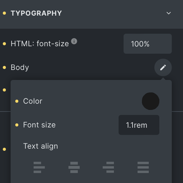
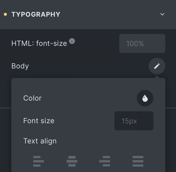
When I view the Theme Styles > Typography > Body Text, I see that it’s 1.1rem for base for example (with 100% base root font size) meaning the font-size for body is 17.6px, but the UI shows 15px instead when I swap to another breakpoint. Screenshots attached.
This is using the default breakpoints, this is not mobile-first.
Why does it show placeholder text of 15px when it should be 17.6px? Note that the font-size isn’t set anywhere on a lower breakpoint, the only change is the root font size is 90% instead of 100% on the mobile landscape breakpoint. But that can’t be related because that would then be equivalent to 14.4px not 15px.
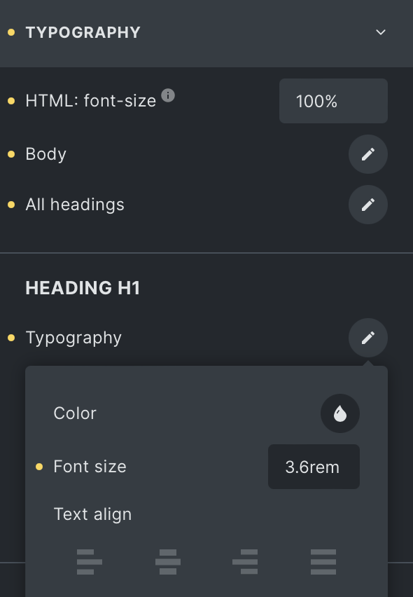
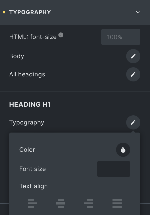
On a similar note, when I tried to confirm this behaviour for h1 font size, it actually shows entirely empty/blank on tablet size and below instead of showing what 3.6rem is in pixels with the root font size taken into consideration. Is this expected behaviour? I would expect it to work the same as the main body typography settings (except using the right values instead of some other random value).
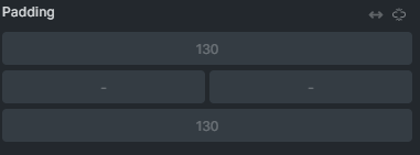
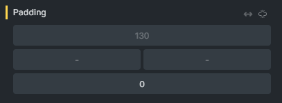
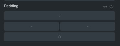
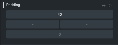
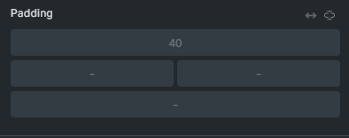
@MarketingSpectrum, I see the same problem with padding and margins. I thought I filed a bug report for this specific problem, but can’t find it. It also happens if you set all 4 sides to 120 and the add a 0 on any one setting on tablet. Mobile will then show the 0 and a dash for the 3 other sides.