Here is my second “big” project of building my company’s website.
I mean it’s my own company and I’m hardly running it since Covid but I’m trying to get it back on track in 2023 and decided to update its website using Bricks. It’s a light fixture distribution company in France.
I’m not a webdesigner or coder but an amateur who just likes discovering new things including a bit of CSS and HTML. I did put quite a bit off effort to use dynamic contents (ACF) as much as possible to simplify the task.
Aside of aesthetic, just one functionality issue. When you activate the mobile menú, the heading of the main card on hero section overlaps the menu. Making it hard to read. But nice style and nice web. Best of Luck and a lot of clients for you!
The way I did it was that I added one additional break point in Bricks with the Dimensions 1024 x 1366 (iPadPro12 Portrait).
Then you can check the way your page looks on an iPadPro12 directly in Bricks and you can make the necessary adjustments without “destroying” the look of the highest break point (usually desktop).
Also, this new break point assumes all styles and formatting from the higher break point, so you do not have to start from scratch.
Congratulation, the site looks very good. The many good quality images give a good insight into the range of possibilities of your products.
I’m also glad to hear that you as a layman are willing to learn HTML and CSS. There are a lot of people who even sell websites and do not know how to write a single line of HTML…
May I ask you how you did the carousel on home, that slides on scroll? That’s a cool feature but I can’t see the option for that.
I wish you much success with the website, may your company flourish again!
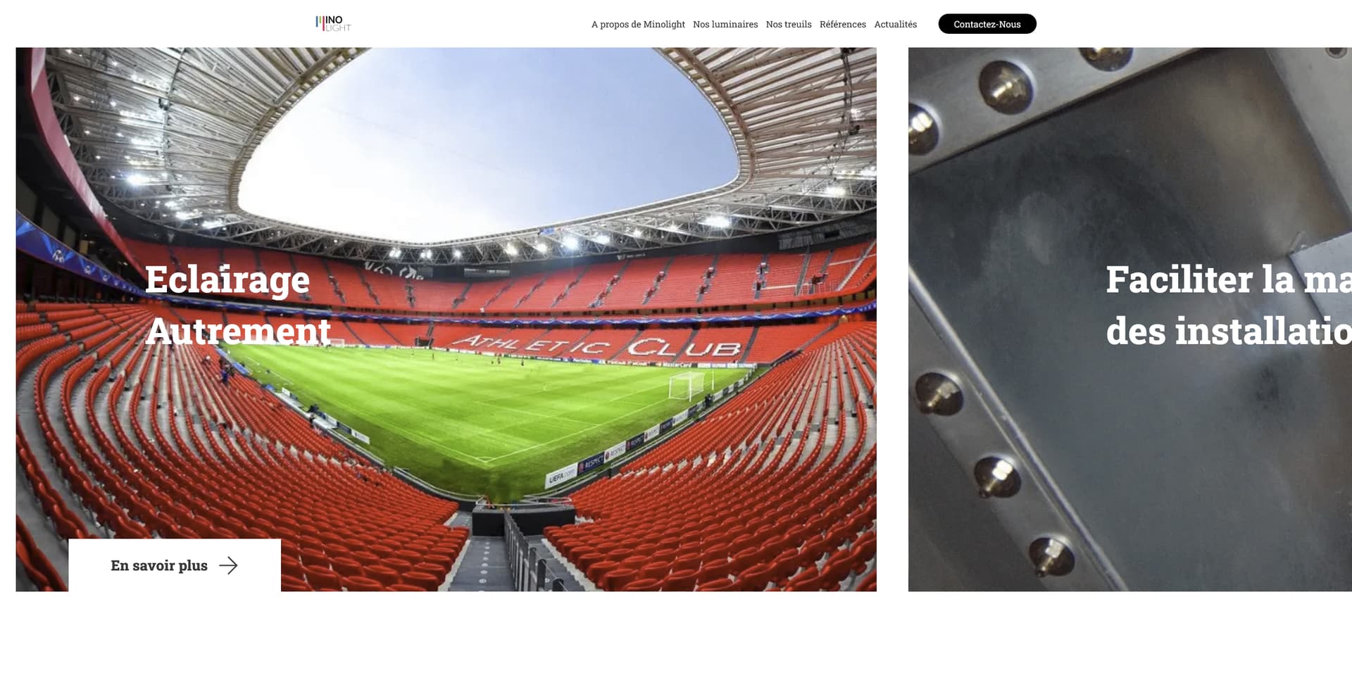
1 - I would definitely make the header wider, make the last element “contact us” as a button, and I would make the font bigger on the menu.
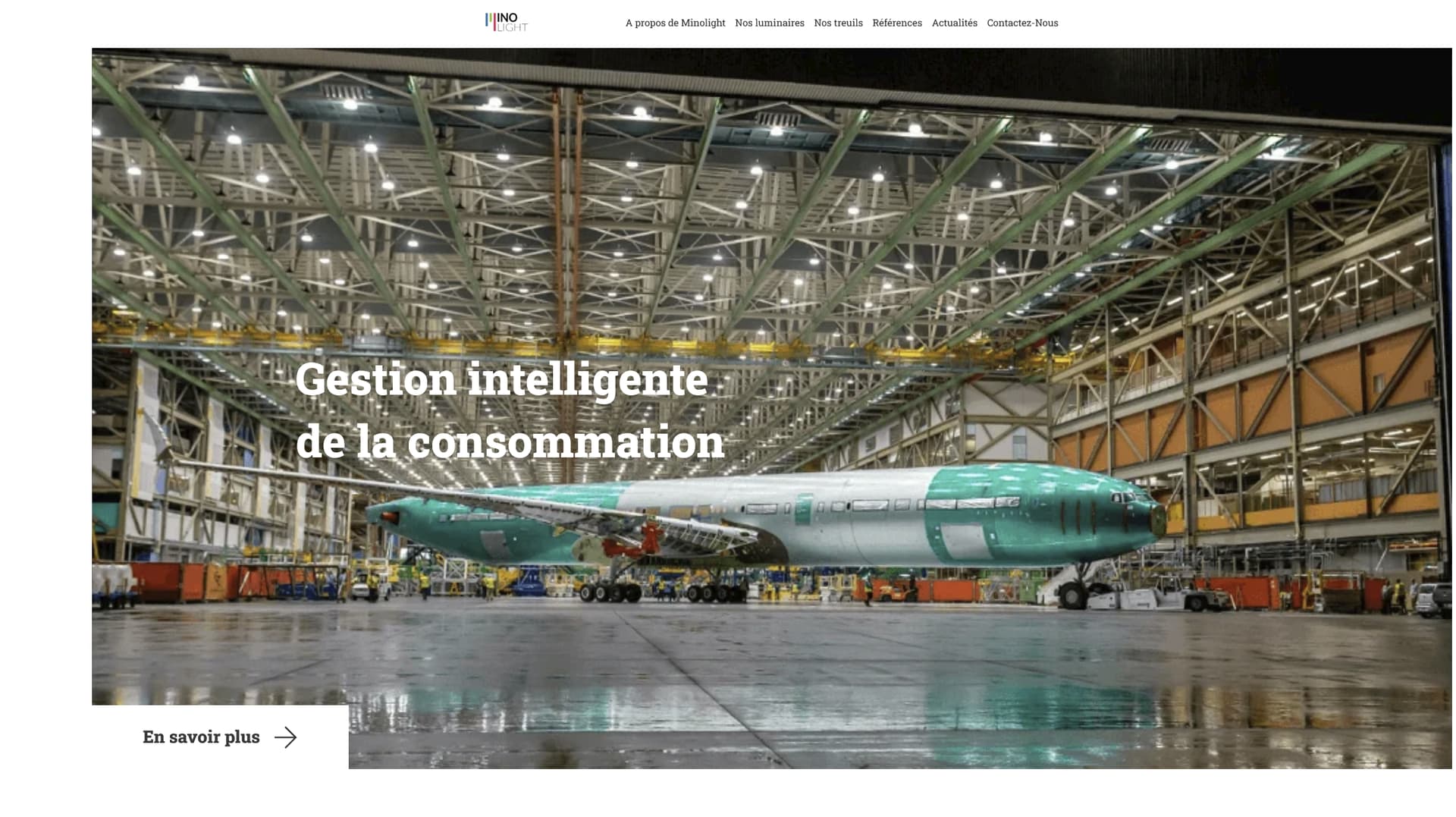
2- And on the carousel, one you decided to go with such a prominent size, and no overlay, you will need to make them bigger resolution, I see them very pixelated. The site is so simple, that a few more hundred kb won’t really heart loading speed almost at all, and the impression with bigger screens will be much better. I don’t have a huge screen 1/2 4k, and this is how I see it
You could also make the slides slightly smaller, so the user can see 1/3 of the next slide, and the slider would make even more sense. I was not expecting it to slide with the mouse, as I did not had any visual reference of it being a slider.
Thank you for the feedback. I will try to recompress the images may be with webp with better resolution.
For the sliders, I’ll try to squeeze them to 90vw but it was a bit voluntary to have the sliders “surprise” the visitor when scrolling down so I will see how I feel about that one.
Thank you for the feedback. I will try to recompress the images may be with webp with better resolution.
It is not so much about compression, it is more about sizing. The image that you have is 1100 px wide, and even a Full HD screen is already 1920. Normally, when you use a hero section background with a transparent dark overlay, you can get away with 1600px and good compression, and the image will still look good. In your case, I would try to get them between 1600 to 2000px. As I said, the homepage is fairly simple and few extra hundred kb more won’t affect performance almost at all.
Another thing I would do is get rid of background images and put them as regular images, in that way you get the benefits of srcset, meaning that for smaller screen sizes, the image loaded will be smaller.
For the sliders, I’ll try to squeeze them to 90vw but it was a bit voluntary to have the sliders “surprise” the visitor when scrolling down so I will see how I feel about that one.
I understand that, but I would rather focus on user experience, rather than trying to surprise them. Personally, I only look forward to the surprise factor when I am looking at the portfolio of a designer, for example. Other than that, I much rather would go for simplicity than surprise factor. Because if the user doesn’t expect a certain behavior and you “surprise” him/her, they might get a feeling of frustration instead
Please notice that in the second screenshot, I made the header wider, turned the “contact us” into a button and made the font bigger, so you can see the difference.
I managed to get better resolution images and replaced them. I was so going for >95 on google speed test, I was mentally not prepared for it but aesthetically, it sure looks prettier.
As for the sliders, I actually have another reason why I did the full width sliders as they scroll horizontally when scrolling down. If I do something like 80 or 90vw, and see a part of the next slider, the visitors will be tempted to slide sideways not knowing that it actually scrolls downwards to get it to move?
I managed to get better resolution images and replaced them. I was so going for >95 on google speed test, I was mentally not prepared for it but aesthetically, it sure looks prettier.
That looks much, much better don’t pay so much attention to the scores, use the information that it gives to see if there is any action that you can realistically take in order to make the site better, but don’t get stuck into them. Loading speed is the most important metric, and your site loads fast!
As for the sliders, I actually have another reason why I did the full width sliders as they scroll horizontally when scrolling down. If I do something like 80 or 90vw, and see a part of the next slider, the visitors will be tempted to slide sideways not knowing that it actually scrolls downwards to get it to move?
Sounds logical if that’s your vision, just go for it, hopefully it will work for you
But still, have a look at the changes proposed for the header
When I looked at your pages the slides had no overlay. Your page is about light! The darkened pictures are not suitable. Inspired from your x-scrolling I did it with javascript for my page. For having the contrast for the text on the pictures i gave them a background. If you like to see it www.pebweb.ch