EDIT: Added new propositions
Hi,
A few ideas for builder top bar to improve general workflow:
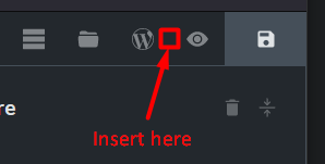
- Preview button is great, but we need a more direct access to frontend button.
Why not moving it top to bar?
To each button its function, more simple, more direct, less clicks, no need to close preview…

-
Template button should be close to Pages button (more logical when we spend time editing pages and templates).
-
History button should be close to UNDO/REDO buttons.
-
Pseudo-class button could be moved to element panel.
-
Order of buttons on the left would make more sense to me like this:
Help / Settings / Templates / Pages / + (from the more global to the more specific)