A few ideas for builder top bar to improve general workflow:
Preview button is great, but we need a more direct access to frontend button.
Why not moving it top to bar?
To each button its function, more simple, more direct, less clicks, no need to close preview…
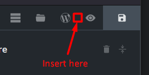
Template button should be close to Pages button (more logical when we spend time editing pages and templates).
History button should be close to UNDO/REDO buttons.
Pseudo-class button could be moved to element panel.
Order of buttons on the left would make more sense to me like this:
Help / Settings / Templates / Pages / + (from the more global to the more specific)
I sent in an idea to the idea board that we should in Bricks settings be able to customise the toolbars to put buttons wherever we want them to improve ergonomics. For example, move the preview and front end buttons to the editor toolbar, move history next to undo/redo and put in the middle toolbar etc. It hasn’t been chosen by Bricks though.
What I can’t get my head around is the moving of the template’s icon to the left, which invalidates all your own academy doc’s, also all the contributors with hours of content to help new users understand Bricks.
I will say I did not notice this in the beta testing as I use keyboard shortcuts, but have had 3 clients tell me their templates have all disappeared.
After 3 years moving an icon does not seam like a big deal until you look @ the ramifications of new on boarders and the effect it will have on future uptake.