Clamp looks a fantastic tool for responsiveness. Can any forum user make a tutorial video on how to get the most out of it? Thanks.
1 Like
Hi Tony,
there are already some videos about clamp functions available - not especially for Bricks, but that doesn’t matter because the technique is independent from which tool you are using, as long it’s css based.
Check the first two videos to get a general understanding how this works and then check the third video which is actually an oxygen related video, but you can use the given tipps also perfectly in bricks:
, max(), and clamp() are CSS magic!")

")
The most “complicated” part about is is generating the function itself, where this little tools comes in pretty handy: Fluid-responsive font-size calculator
2 Likes
Many, many thanks. It looks a great technique. Wonder why it’s not more widely used? I’ll have play and see how it goes. Thanks again. T
Really powerful advice!
I’d like to set the base 62.5% font size shown at 10:45 in the Oxygen video. so that I can then specify Clamp for Body, H1, etc. What code does he use to set the 62.5% and where would I put it in Bricks? Many thanks.
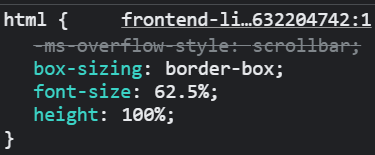
CSS:
html {
font-size: 62.5%;
}
Place to put it:
Bricks > Settings > Custom Code > Custom CSS
No need to insert it, it´s already there 
1rem = 10px.
1 Like
So does that mean body text default for Bricks is already set at 10px approx? Thanks
No,
it ensures that you can use em or rem units with much easier calculation, which are proportional to the root size.
If you have no body font-size settings in your theme styles, the default bricks body font-size is 15px.
If you set the body font-size within your theme styles to 1.6rem for example, it equals 16px. 1.8rem = 18px, 3.6rem = 36 Pixel and so on.
Don’t think too much about the 62.5%, it’s just for easier calculation (multiply by ten).
1 Like
Thanks once again to all.