No problem @ARAKZ
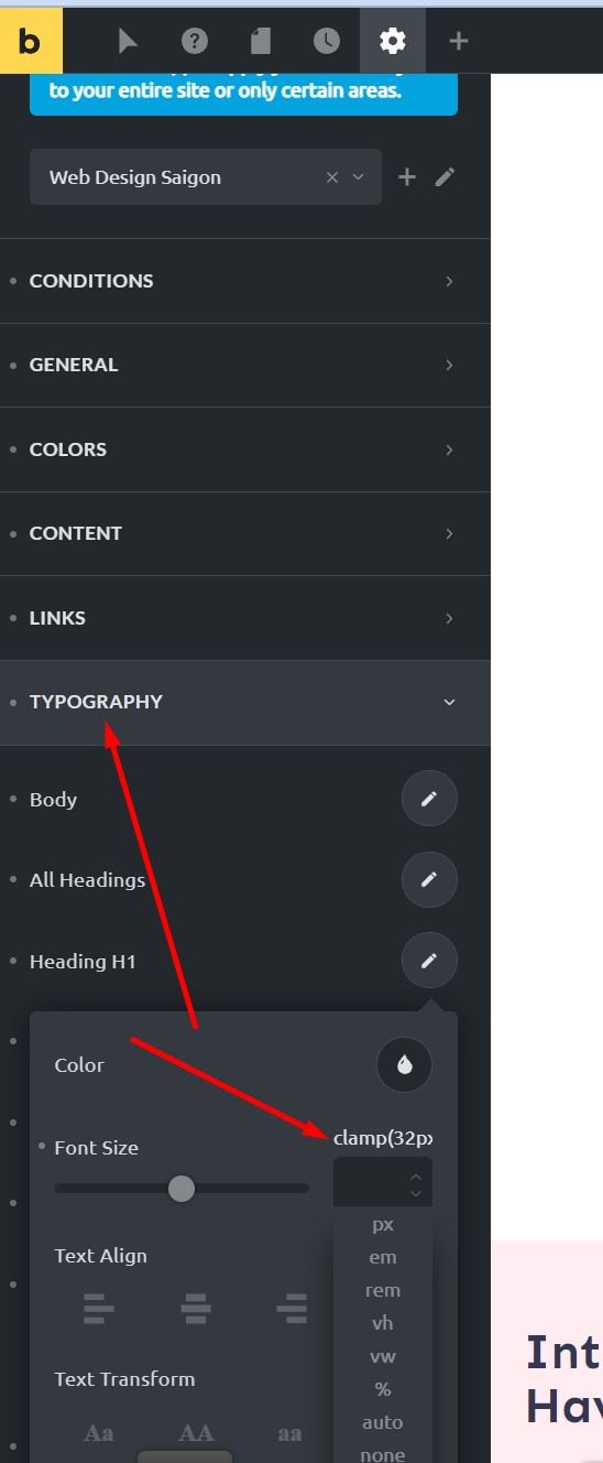
No, it’s even simpler than that, When bricks implemented it, they allow you to put the calculation directly into the global style or any units box. So once you have your clamp CSS calculation.
As an example
clamp(32px,5.2vw,68px)
Then add it to the units box like in the image below 
P.S Here is the tool i use for doing the calculations too. Fluid-responsive font-size calculator
You can do it via px, rem or em. You dont need to bother with the selector, property or options setting, just make sure it is set to clamp and copy the part of the CSS code that i showed further up 
There is also this thread here that @timmse has added some good videos too Clamp - any video traing for Bricks? - #4 by TonyPas