Hey Guys!
How do you do the responsive part? VW VH PX %?
My method is to set the fonts and width to VW. So the size goes up and down with the resolution.
And at tablet breakpoint in bricks i change this to px.
How is your approach?
Greetings
Andre
Hey Guys!
How do you do the responsive part? VW VH PX %?
My method is to set the fonts and width to VW. So the size goes up and down with the resolution.
And at tablet breakpoint in bricks i change this to px.
How is your approach?
Greetings
Andre
Hi @arkaz
Look into clamp for fluid responsiveness on youtube. It allows you to set a max size and min size and then use a calculation in between (the responsive part). It can be used for Typography, padding, margins etc.
Sounds complicated but its nots and Bricks supports clamp too.
Hi Michael,
thank u for the input. That’s something new for me. Awesome.
So if i used for example for fluid fonts, i just put the clamp in the extra css? And the Font settings in Bricks empty?
Greetings
Andre
No problem @ARAKZ
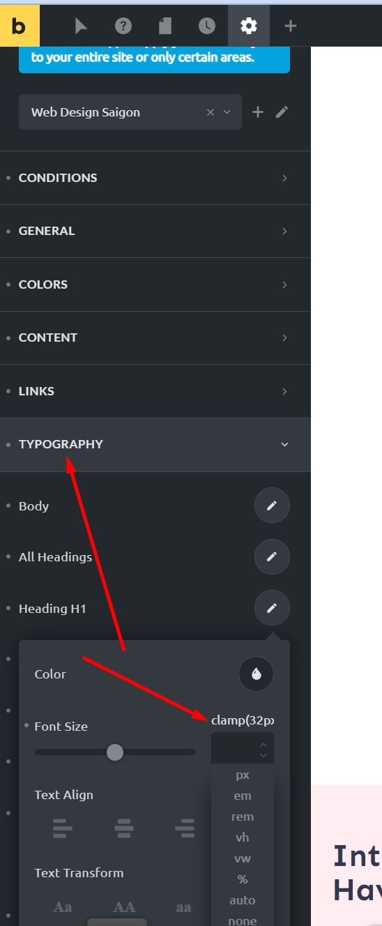
No, it’s even simpler than that, When bricks implemented it, they allow you to put the calculation directly into the global style or any units box. So once you have your clamp CSS calculation.
As an example
clamp(32px,5.2vw,68px)
Then add it to the units box like in the image below 
P.S Here is the tool i use for doing the calculations too. Fluid-responsive font-size calculator
You can do it via px, rem or em. You dont need to bother with the selector, property or options setting, just make sure it is set to clamp and copy the part of the CSS code that i showed further up 
There is also this thread here that @timmse has added some good videos too Clamp - any video traing for Bricks? - #4 by TonyPas
I find it near impossible to go back to edit / view the clamp formula due to the size of the entry field. Is that something I’m doing wrong or is that a product thing, do you think? I assume it’s product, as I see Oxygen seems to be similar in that regard too, as it’s a whole formula in a box mean to display 2 or 3 digits. Just makes it difficult to manage, I find. Only recently started looking into clamp as I keep hearing it’s the way to go.