Hi everyone, what is the best practice for breakpoints to insert so that the layout can work well on as many devices as possible? For now I am not having problems inserting these breakpoints:
1440px base, 1366px, 1280px, 1200px, 1024px, 991px, 768px, 478px, 390px, 320px.
Are they too many? Can you get equally good results without inserting all these breakpoints? I am especially interested in tablets and mobile. What are the best practices for setting breakpoints with Core Framework and Advanced Themer? ![]()
Read this topic. It may be useful to you ![]()
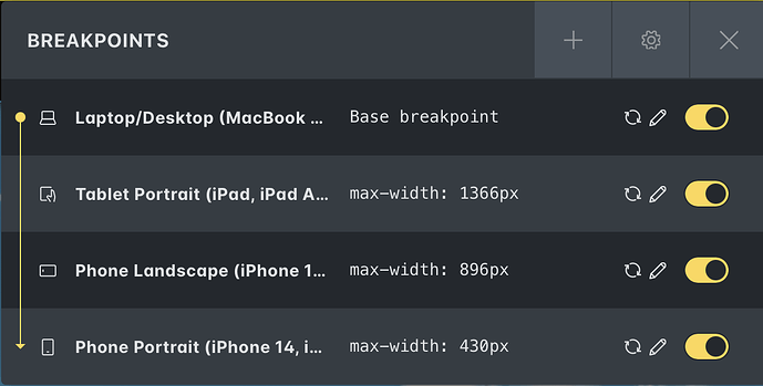
These are the breakpoints I’m currently using, for what it’s worth. I based them off Apple devices as the most common ones among visitors to most of my client sites. I do adapt as needed though for each site depending on their audience. Essentially I kept the four standard ones but changed the min pixels for each one.
1366px for tablet portrait
896px for phone landscape
430px for phone portrait
1 Like
Thank you so much for your kind help ![]()
Thank you so much for kindly replying to me ![]()
