The new Structure Panel is nice, but deleting/duplication a bunch of elements is a pain in the “a…”. Say you need to delete 20 elements. You need to make 40 clicks which is really annoying. Following my recommendation would only need 20 clicks and would be way faster.
Handling in 1.5 beta => 2 clicks for every interaction
Click 1 => Open context Menu + find entry “Delete” or “Duplicate”
Click 2 => Delete Element or Duplicate Element
Recommended Handling => 1 click for the 2-3-4 most important interactions
Personally I think that the context menu on right mouse click is really cool, but there needs to be a MUCH quicker way to do the most 2/3/4 needed interactions. From my point of view these are:
Delete
Duplicate
Wrap With … default … “Div”
Add Child … default … “Div”
How to solve it?
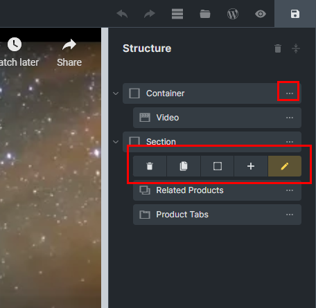
I think Oxygen does this extremely well. Why not combine the right-click context menu from Bricks with the most important interaction icons that are ALWAYS situated on the right side of each element and show up on hover from Oxygen, like in the below screenshot. The big advantage is that you save 1 click on the most important interactions.
Btw, I would suggest bringing this back for the simple(also fast action) tasks. Delete, duplicate, add container or div and wrap with DIV(only). I rarely like to right-click too much.
This is so convenient. Some users are keyboard shortcuts users. But, some users are mouse-clicking users. Please!
Personally I do think that Oxygen’s way is the better way, because the distance you have to move your mouse around to do the final click has been quite long too in Bricks 1.4.0.2 … but we did have a Hover-interaction at least.
yeah, would really love to see constant avaiable options in structure panel. i love the rightclick approach, but for multiple and fast actions a one click solution is a must have for me.
I think a mix of both… hover over for a couple of the common actions (clone, delete, etc) while still keeping the right-click option for all the rest of the options from the structure panel. I like the new right-click menu, personally and think it’s a great addition.
hopefully fixed and no hover elements. hover requires another extra action again. nothing more annoying than traveling with mouse on every single hover.
I would show most used buttons (delete, duplicate, wrap) permanently with 0.1 opacity to not crowd structure panel too much and keep labels more visible than buttons, with opacity 1 on hovering the WHOLE element (no three dots buttons, which was a pain to catch the left buttons).
Maybe add a three dots buttons that triggers the right-click dropdown for “left-clickers”?
Or trigger dropdown on three dots button hover?
Or expand buttons area on hover and show more buttons? (maybe overlaping label with fade gradient if label is too long?)
It doesn’t matter which idea to take. Just let it be whichever is better. As long as it can achieve what we can do we used to do within the structure panel previously.
I was going to agree and others already have basically said what I was going to say.
The original was not bad and what I think people were suggesting was additional right click context options, but not to omit the old way with that.
Also, I think if I am in dark mode I want the right click context menu to be white text on black background. It feels like this was a “rush to get out there” addition. Understandable but inconsistent with dark mode UI I think.
Additionally, a right click context menu for the elements in the edit section would be consistent with other requests or what was imagined when making them.
While I’m on this UI issue, inside the editor area, the icons for an element are too small for my tastes. Should I make a seperate feature request for that?
No harm in making a feature requests but I suspect since the Editor is pretty customizable it’s something you can likely already do with a little bit of CSS via Bricks Settings. I don’t have an exact solution at this moment but if I get some time soon I’ll see if I can find a way to increase the size of the element icons.
What I am trying to avoid is having to do too much individual customization. I know they are possible and Sridhar has demonstrated a few of them, but what I want the developers to realize is this and other UI styling might be universally desired and implemented as part of the development process.
Development right now seems to be focused on “features/functionality” and I totally understand that focus at this stage, but the UI still needs some love as well in my opinion.
Fully second your statement concerning individual customization. Bricks has to focus on usability, pro-workflows, saving tons of clicks, … as soon as possible.
As it is now, Bricks is (well) usable, but it has still a long way to go in terms of Pro-Interface and efficient usability.
Everyone has their own preferences. That’s specifically why Bricks has the ability to customize the UI to how you prefer it. Their defaults should really just be what most people want, and the outliers can customize to their liking from there, IMO.
Bricks is very user friendly already and has a good workflow in most places, certainly nothing too irritating anyways, at least not to me. Personally I’m a fan of the interface as it stands currently, and the changes in 1.5 are a nice functional improvement. I’m sure it’s one of many improvements to come to the UI in the next several updates.
With that said, I suppose some of us (including myself) are getting a little off-topic. To the original suggestion… I am happy to see the proposed changes here as long as we keep the right-click functionality too.