I can see Core Framework’s default is 1400px for the max width.
But various people I respect (like Paul from WPTuts) use 1366px.
Does anyone have opinions which is best and why?
I can see Core Framework’s default is 1400px for the max width.
But various people I respect (like Paul from WPTuts) use 1366px.
Does anyone have opinions which is best and why?
I use 1366px and dont think there is a best way to be honest, however 1366px is a common width for many standard laptop displays, as 1366x768 has been one of the most popular screen resolutions for a long time.
Great, thanks, that makes sense.
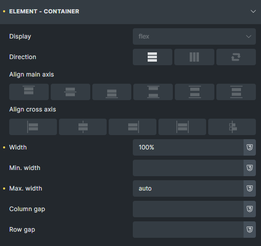
Another thing I’m unsure about is, regarding making Bricks content width the same as Core Frameworks; some tutorials say I need to set the Width (in Bricks main global theme>Element Containers) to match CF Max Screen Width. But some say I should set the Max Width instead.
I tried both and Width seems to actually work but maybe I’m missing something?
I have been using layouts with 100% width in my work for a long time. Once upon a time, accurate pixel values were important, but technology has long gone ahead. Today, it is possible to adjust the layout to any screen without much difficulty, and I do not understand why fixed values are still used, leaving a lot of empty space on the screen that can be used usefully.
My approach on all sites is 100% minus small margins/paddings on the left and right of the screen. And everything. No need to puzzle over it once again.
As for the most popular screen, it is 1600x900 pixels. It is important to understand that this is a logical value, not the actual screen size.

and on tablet and below
