Hello Everyone
What a pleasure to be here. I started off with Wordpress when it first released, worked with templates for a couple of years, and then left due to the barrier of needing to code. Enter Bricks! So grateful for this project.
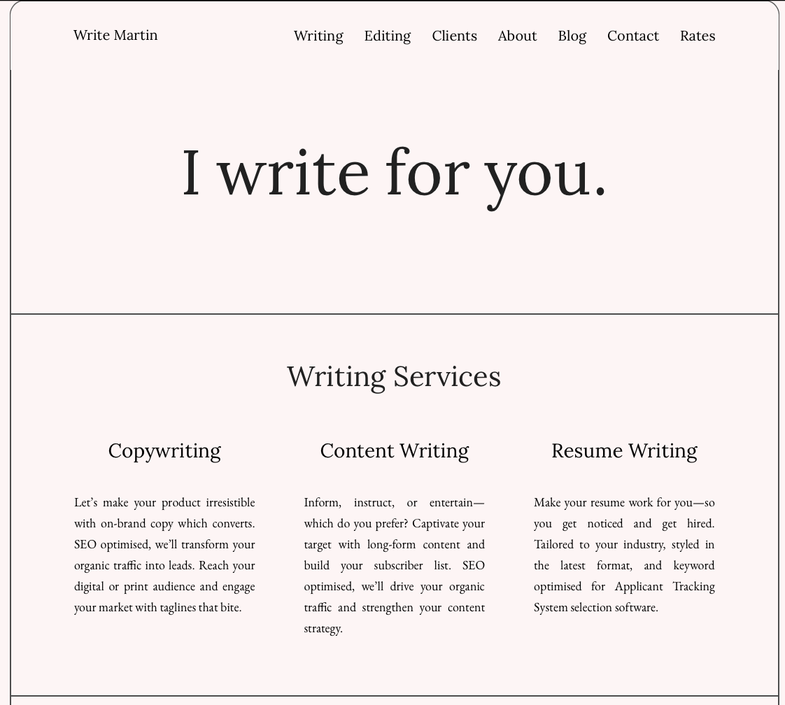
This is my first bricks website writemartin.com —a lightweight, minimalist brochure site, intended to deliver the essentials in an easy to digest format. The design is my own, I would much appreciate your feedback and thoughts for improvement!
There is a list of issues which need to be fixed. I’ve tried everything, but haven’t found solutions yet. If these are things you can solve, I would be most grateful for your advice! I’m stuck otherwise 
-
Header menu: clicking a menu item which causes the home page to scroll downwards to an anchor point works fine. But, now, if say, you are at the bottom of the home page, for example, the “Blog” section, when you click on a menu item which causes the home page to scroll upwards, say from the “Blog’ to the “Writing” section, you will notice the menu header obstructs the “Writing” section header title.
-
Blog navigation: Writing Well – Write Martin in mobile portrait view you will notice the “previous post” vs “previous post” buttons don’t align on the horizontal axis. Instead, even though there is enough space to be horizontally aligned, they appear to wrap—one on top of the other. How to get them horizontally aligned? I’ve tried everything within the Bricks builder panel.
-
Blog font size: the font size in the blog posts is smaller than the Hompage paragraph text, yet, I presume they share the same font size setting, so the font size should be the same?
-
When I test the site on a large 27” screen emulator, the website border extends all the way to the lower border of the viewport—which means a large empty space appears between the end of the content and the footer. How to stop this from happening?
-
Header 1 pixel gap: the site is designed to resemble a simplified “paper page”. So, the site has a 1px solid border with a radius. To get the top border to display, the header is down 1px from the absolute top. This means, when you scroll and the header menu is displayed, you can see the background through this 1 px gap—doesn’t look good. I’ve tried adding a 1px border to the header top border and moving the header up to absolute top 0. But then, then for some reason, the header top border and radius doesn’t align well with sites border. How to close this gap and still have the border display well.
-
Logo text breaks: at particular viewport widths, the logo text breaks and wraps. How to prevent this?
-
Dark mode: how to detect if the user’s browser or OS is in dark mode - and then supply inverted images e.g. in this case, if the user’s browser or OS is in dark mode, the black “Clients” images must invert, becoming white instead of black.
-
Heading text breaking and wrapping: using the Brave android mobile browser, the heading text was breaking and wrapping - even though there was enough width for the headings. To resolve this, I set the rich header text container width to 100%. But this doesn’t feel like an elegant fix. Do you have a better suggestion?
Many thanks, all thoughts are much appreciated!
Best wishes and happy building
Martin