Hi bricks team,
First of all, thank you so much for adding such great features like variation swatches in just one update. Now we can safely remove another plugin. Life with Bricks is a lot of fun ![]()
Below I would like to mention a few suggestions that will help improve variation swatches and I hope they will be useful.
1- Variation swatches element to display variables in the query loop, such as bricks ultimate. In fact, this feature helps the user to be informed about the available product variables without visiting the product page. such as a preview on the Bricks site.

2- Ability to update the price (in the price element) after selecting a variable. This helps to display only one price on the product page. Currently, after selecting a variable, a new price is displayed, which is confusing for users. This feature is also available in the Bricks Ultimate plugin.
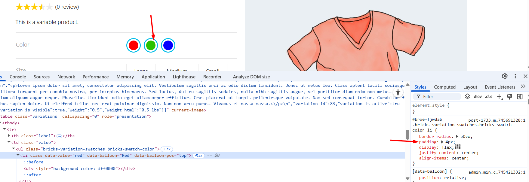
3- Currently, when we select a variable (of type color), it is a bit difficult to visually identify it. If you agree, displaying a check mark icon for the selected color would be much, much more user-friendly.
![]()
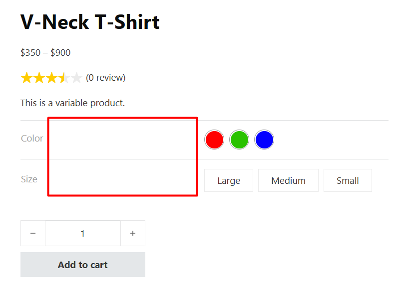
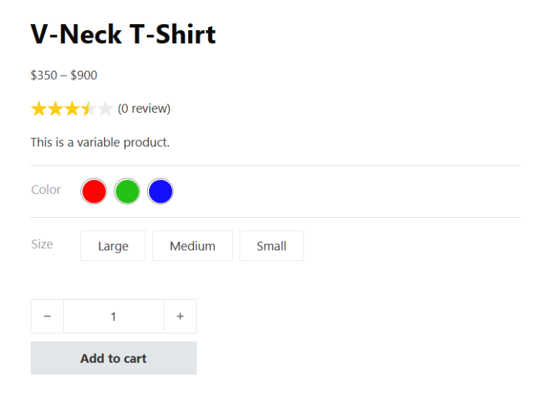
4- There is a lot of empty space in front of the variable titles, which is detrimental to the user interface. For example, if the number of variables is large, they are displayed in two rows. While there is a lot of empty space.
Before
After
5- This is easily possible with CSS, but it would be very useful if you add the padding control to the variation swatches > Type: Color. The border is now attached to the color. This helps control the distance between the color and the border so that the active color is more noticeable. Result:
Thank you