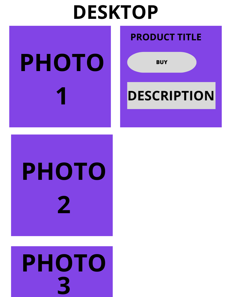
I want the gallery images to be stacked vertically beside the featured image and preferable in a slider to limit it to show max 3 images even when there are more images…
Anyway to achieve this look?
I want the gallery images to be stacked vertically beside the featured image and preferable in a slider to limit it to show max 3 images even when there are more images…
Anyway to achieve this look?
Were you able to customize this? I’m wanting to do the same
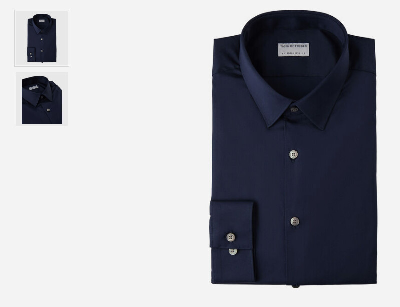
For anyone who may be looking to create this type of layout, this is what worked for me. Please keep in mind that this is using Frames for Bricks so you may need to modify/adapt the code accordingly. I put the CSS in the Product Gallery element.
root .woocommerce-product-gallery {
  display: grid;
  grid-template-columns: 1fr 5fr;
  align-items: self-start;
}
root .woocommerce-product-gallery .flex-control-thumbs {
  grid-template-columns: 1fr;
  order: -1;
}
Result:
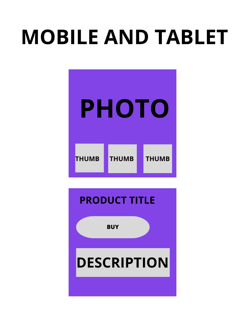
I want to create a gallery of images that has a conventional appearance on mobile and tablet devices, while on notebook and desktop screens, the WooCommerce image gallery should be displayed one below the other in a vertical layout.
did you ever manage to do this? im hoping to do it too