Everything works fine when the External Files option is not enabled.
#brxe-qkqhis .bricks-nav-menu,
#brxe-yxxcxg .bricks-nav-menu,
#brxe-lhqcjd .bricks-nav-menu,
#brxe-qqxazu .bricks-nav-menu,
#brxe-goooyc .bricks-nav-menu,
#brxe-uwljhz .bricks-nav-menu,
#brxe-feugqp .bricks-nav-menu,
#brxe-smwuop .bricks-nav-menu,
#brxe-zbvwvk .bricks-nav-menu{
flex-direction: column !important;
gap: 0px !important;
} Currently, these menus can only be styled by forcing it with CSS
Hi Mike,
Thanks so much for your report!
However, I am missing specific steps, your templates, and a live link to the website to reproduce the problem specifically.
Best regards,
timmse
Hi Timmse
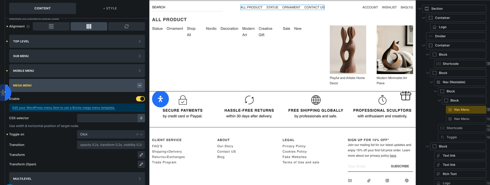
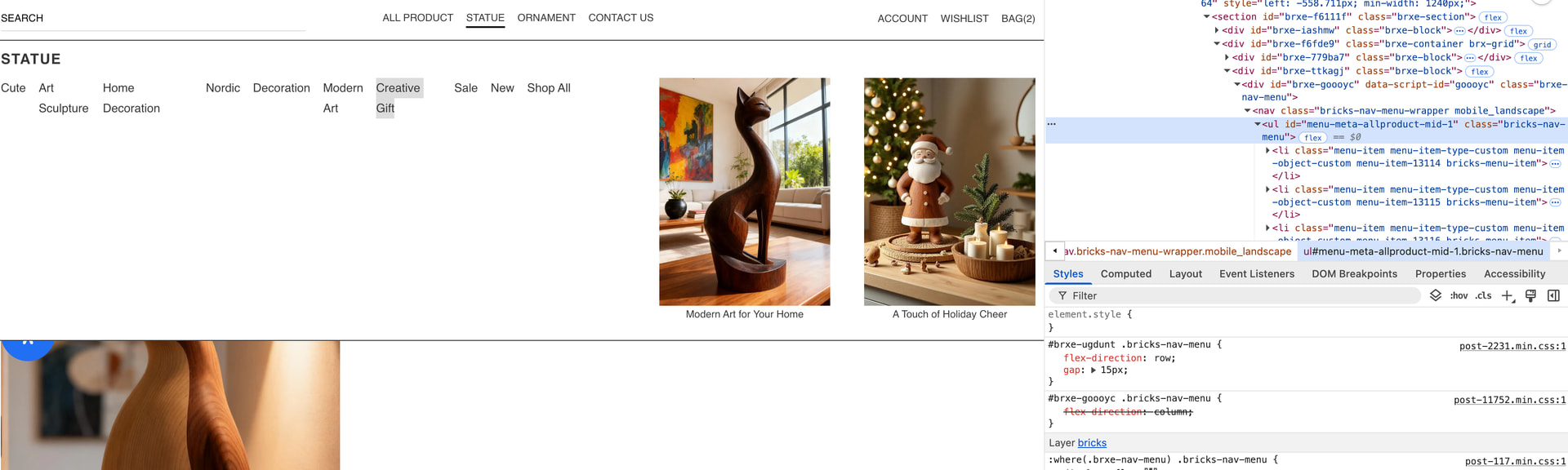
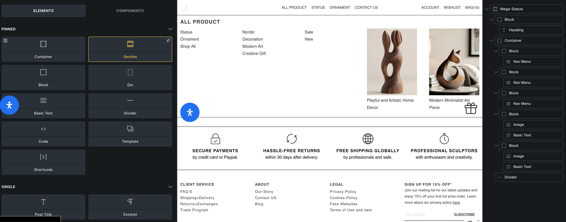
The first image shows my header structure, and the third image shows my mega menu structure
That’s right. Nevertheless, I asked for a link because it provides much more information than any screenshot could.
Hi Mike,
Thanks so much for the link! Now I can see what’s going on and can replicate the issue. However, there’s an easy “fix”: don’t set the main menu direction to row, as it is row by default, so there’s actually no need to set it.
If you set it, it will override the direction of the nested menus, since both selectors have the same specificity, so the loading order decides. In your case, as I said, it’s easy to solve – but if you do it the other way around (main menu = column, nested menus = row), the problem also occurs, and in that case it can really only be solved with custom CSS.
We’ll try to find a solution for this 