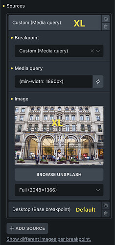
Hi, I added one custom breakpoint (I set it to 1890px at the moment). The purpose is to deliver sharper page hero images on large, high-density screens (4K and up). For that I use the maximum available standard resolution in WP (2560px).
My base resolution is Desktop. I don’t do mobile-first. The extra breakpoint is Desktop XL.
So far, so good. I don’t mean background images but < img > with customized sources. It works fine with all sources below the base breakpoint. In the source I get: <source media="(max-width: 991px)"> or other breakpoints. Great.
But for Desktop XL, I would expect <source media="(min-width: 1890px)">. But instead, in the page source I also get max-width: 1890px, which means the rule will never work as intended. The XL resolution will not be loaded on XL screens.
I set the sources starting from the lowest resolution and going up. As recommended in the UI.
Am I missing something?
Greetings,
Tom
