RicoGL
March 19, 2026, 1:55pm
1
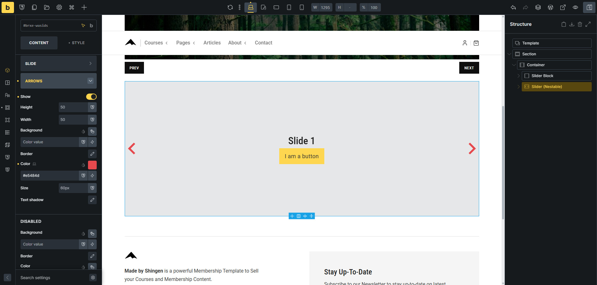
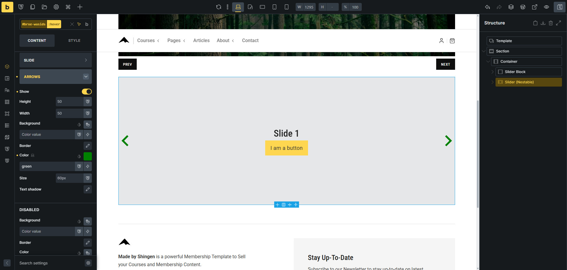
When styling slider arrows, the hover color for the icon doesn’t apply.
Generated CSS
#brxe-xxxxxx .splide__arrow {
  background-color: white;
  color: black;
}

#brxe-xxxxxx .splide__arrow svg {
  fill: black;
}

#brxe-xxxxxx .splide__arrow:hover {
  background-color: white;
  color: red;
}
Problem fill: black, so it overrides the color on hover.
Expected
Fix suggestion
.splide__arrow svg {
  fill: currentColor;
}
or:
#brxe-xxxxxx .splide__arrow:hover svg {
  fill: red;
}
Works fine at this end. Do you have any additional plugins or custom CSS that might be conflicting?
Video: Watch Styles-–-Made-by-Shingen | Streamable
timmse
March 20, 2026, 9:08am
3
Hi Rico,
Unfortunately, I cannot reproduce the issue with the default or custom arrows.
Could you please share the SVG file and a link to the website where the problem can be seen?
Best regards,
RicoGL
March 24, 2026, 8:12am
4
Could you try using these settings? Make sure the box is larger than the icon itself.
timmse
March 24, 2026, 8:51am
5
But the size has nothing to do with the fill color… Please provide me with the SVG file and a link to the site where the problem is visible.
RicoGL
March 26, 2026, 10:49am
6
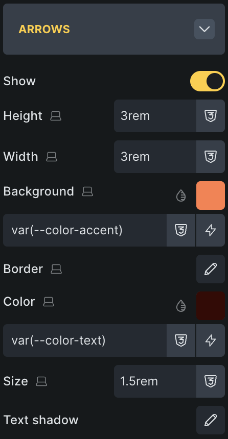
The issue is that the fill is applied to the SVG. But the hover color to the parent .splide__arrow.
So If you make the parent larger (in my example 3rem) than the SVG (in my example 1.5rem) you will see the issue.
timmse
March 26, 2026, 2:36pm
7
Aaaaaah, now I understand
To put it simply: the SVG color should change when hovering over .splide__arrow, not when hovering over the SVG itself, even if the SVG does not have a fill or stroke=“currentColor” attribute.
We’ll update this thread once it’s fixed
RicoGL
March 26, 2026, 3:29pm
8
Thank you very much for the investigation!
I have temporarily solved it with:
%root% .splide__arrow svg {
  fill: currentColor !important;
}
1 Like
 Thanks so much!