Browser: Chrome 110 OS: macOS / Windows / Linux / etc. URL: Link to a page that illustrates this issue Video: Short screen recording that illustrates this issue (free tool: jam.dev)
Hello,
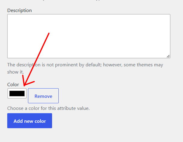
In WordPress 7.0, the heights of the “Remove” button and the color picker appear disproportionate.
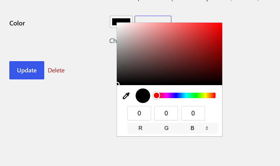
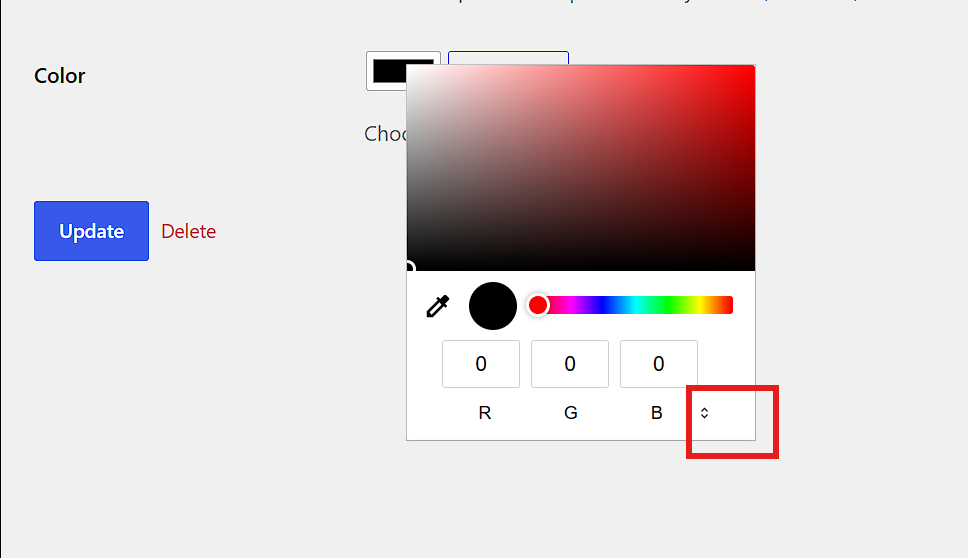
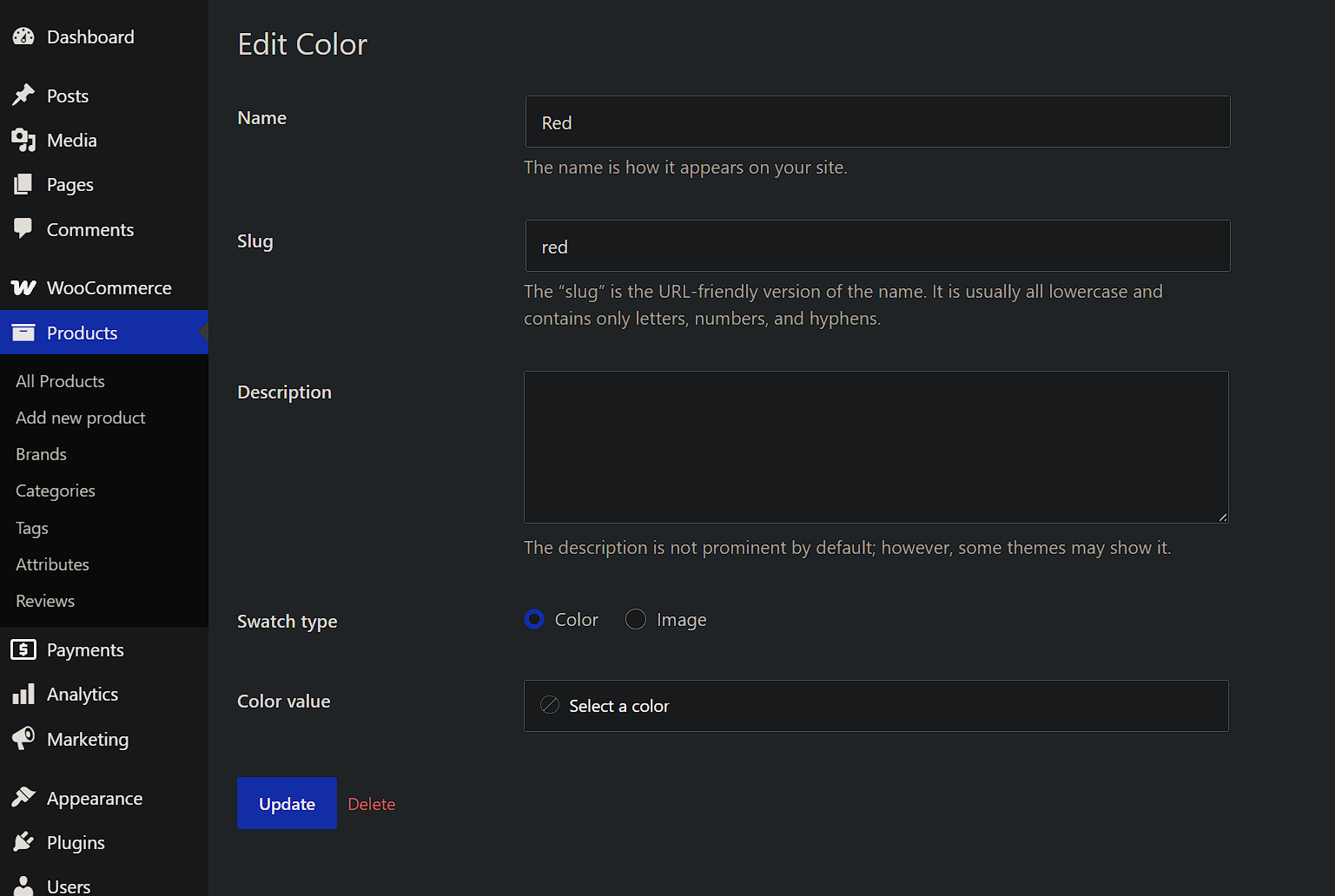
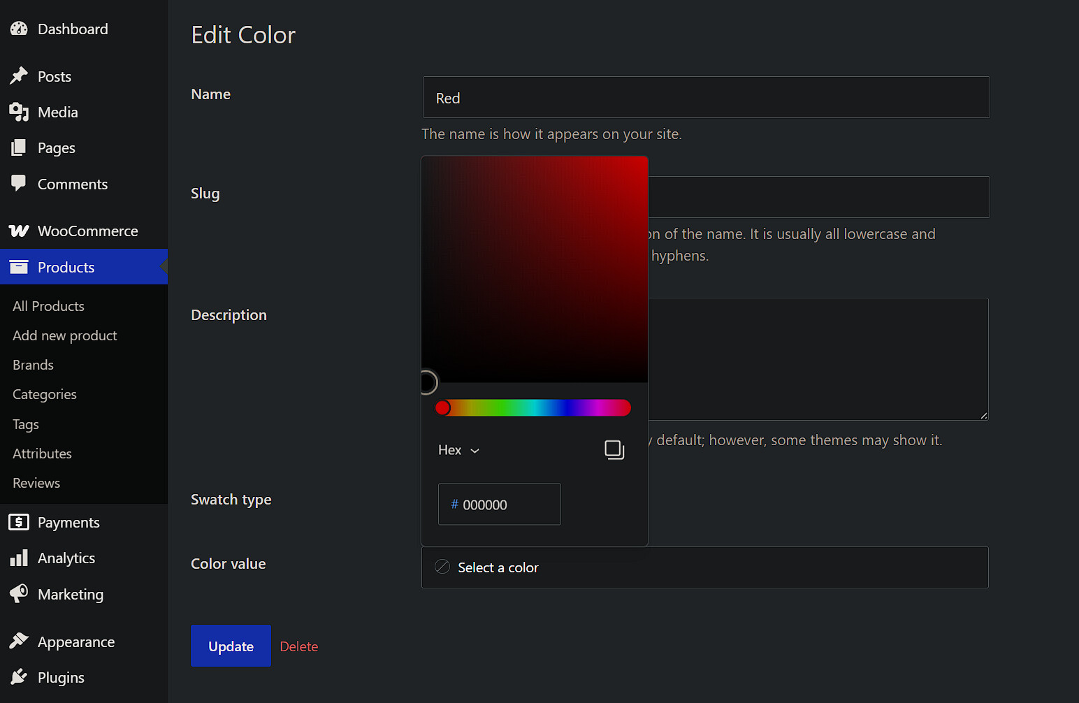
3/ Regarding the color picker in the “edit terms/product-attribute” section: I’ve noticed a few minor UI issues, such as with the button for switching color modes.
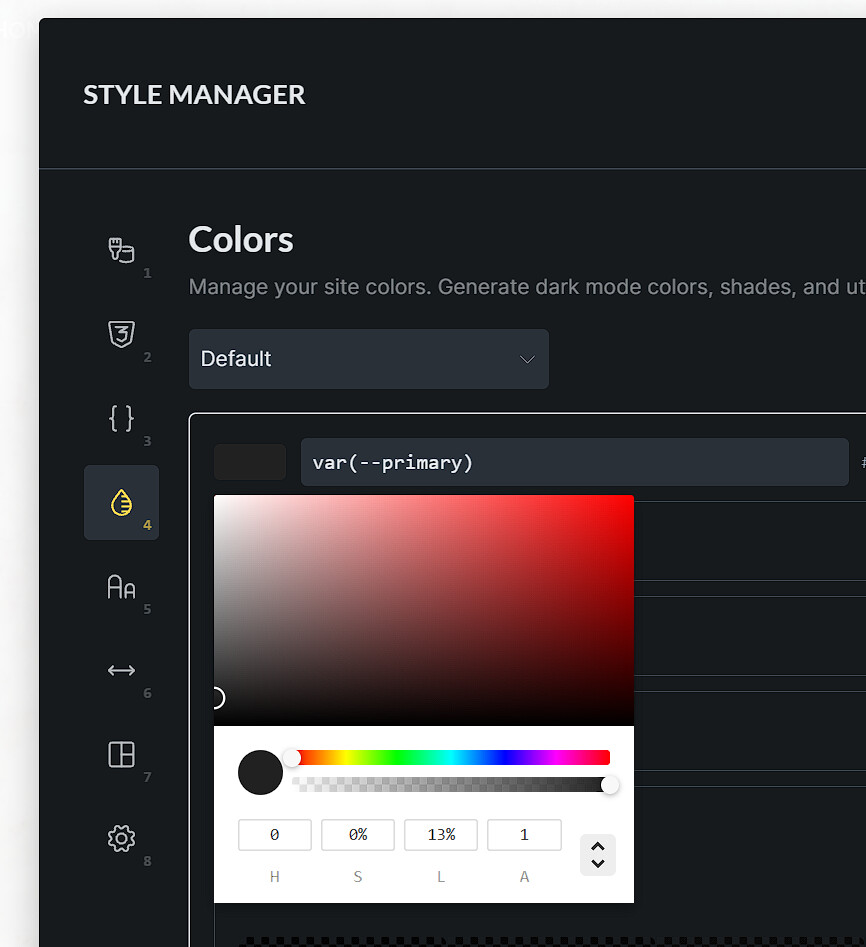
in the Wordpress settings, we use the native <input type="color"> which is different from the one that we use in the builder, so I’m not sure we can take this as a bug. If you try it from the Firefox, you will see that the picker is even more different - at least on macOS
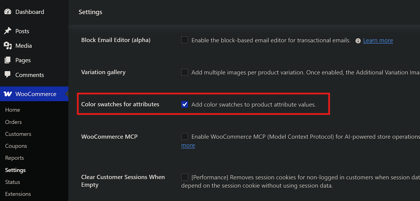
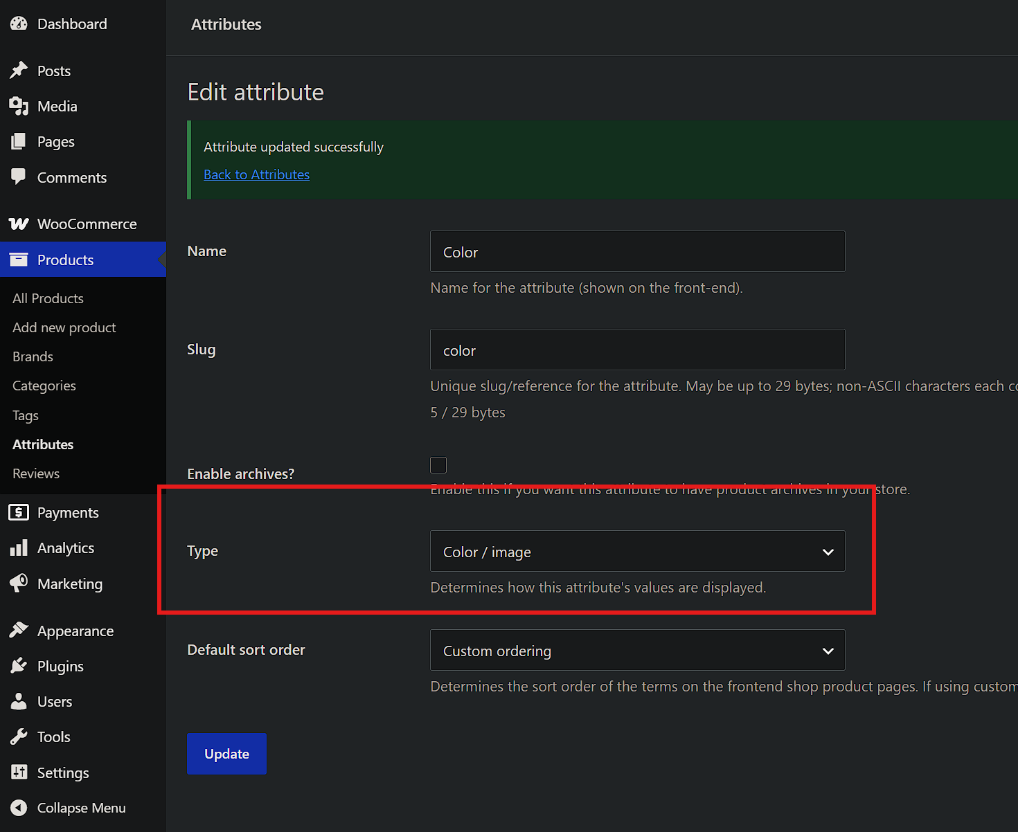
Integration with the Color Swatches for Attributes WooCommerce plugin would be excellent. The advantage of that plugin is that it allows you to use either a color code or an image for attributes like Color whereas Bricks restricts you to using only one of the two.