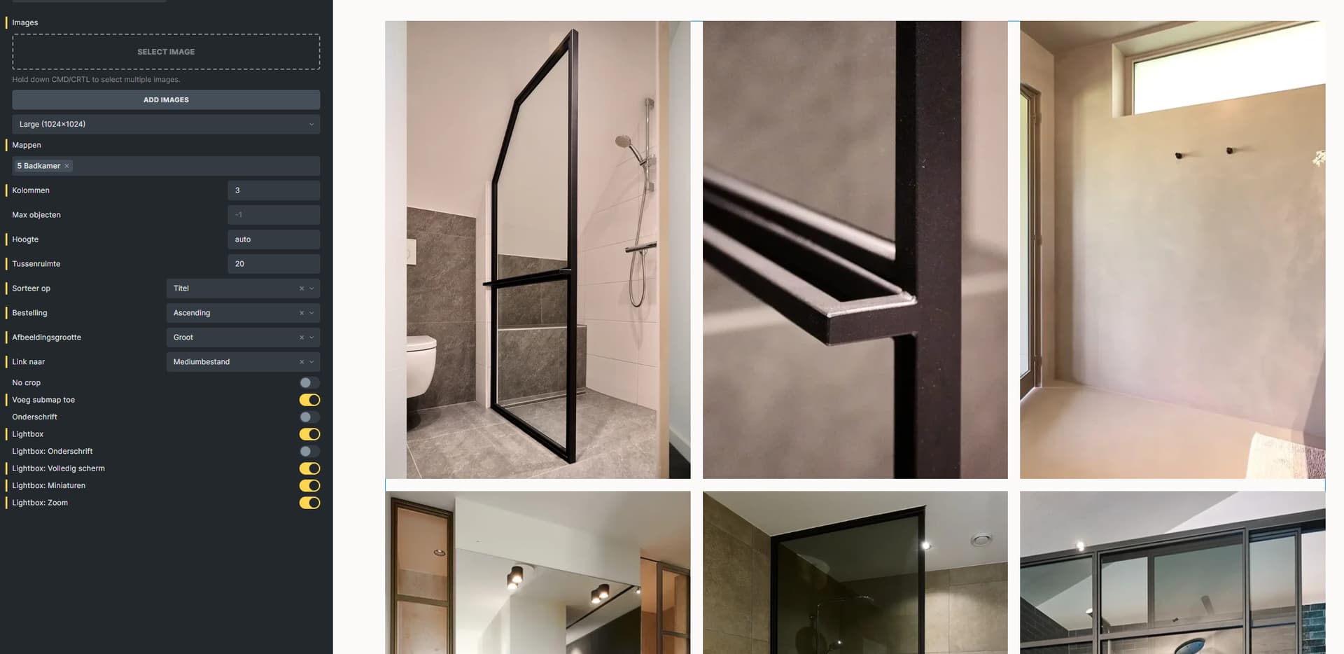
when using the happyfiles gallery and you set no crop, the number of columns is no longer responsive. So if you choose 4 columns on desktop, and 2 on mobile, it will be 4 columns.
If you disable no crop, all works well.
The issue is, if no crop is turned off, images are getting cropped really strange, since it doesn’t take into account whether an image is landscape or portrait.
Generally, both variants are technically completely different: the crop variant uses css grid and for the row height the set height for the images (you can use fit-content instead of a fixed value - then the aspect ratio is respected, but then, cropping is obsolete). The no-crop variant uses css columns, which keeps the image ratio.
No-Crop » Number of css columns/spacing is not responsive: I’ve added this to the bug tracker. You can solve this problem easily by manually setting the number of columns on the corresponding breakpoint:
/* No crop columns */
%root% ul {
  column-count: 2;
}

/* No crop horizontal spacing */
%root% ul {
  gap: 30px;
}

/* No crop vertical spacing */
%root% ul li {
  margin-bottom: 30px;
}
Very late reply haha, busiest time of the year.
Thanks for the solution.
Though I did try it, it sadly was still not looking very good.
For future reference / searches (and hopefully Thomas sees this as well)
I managed a trade-off solution.
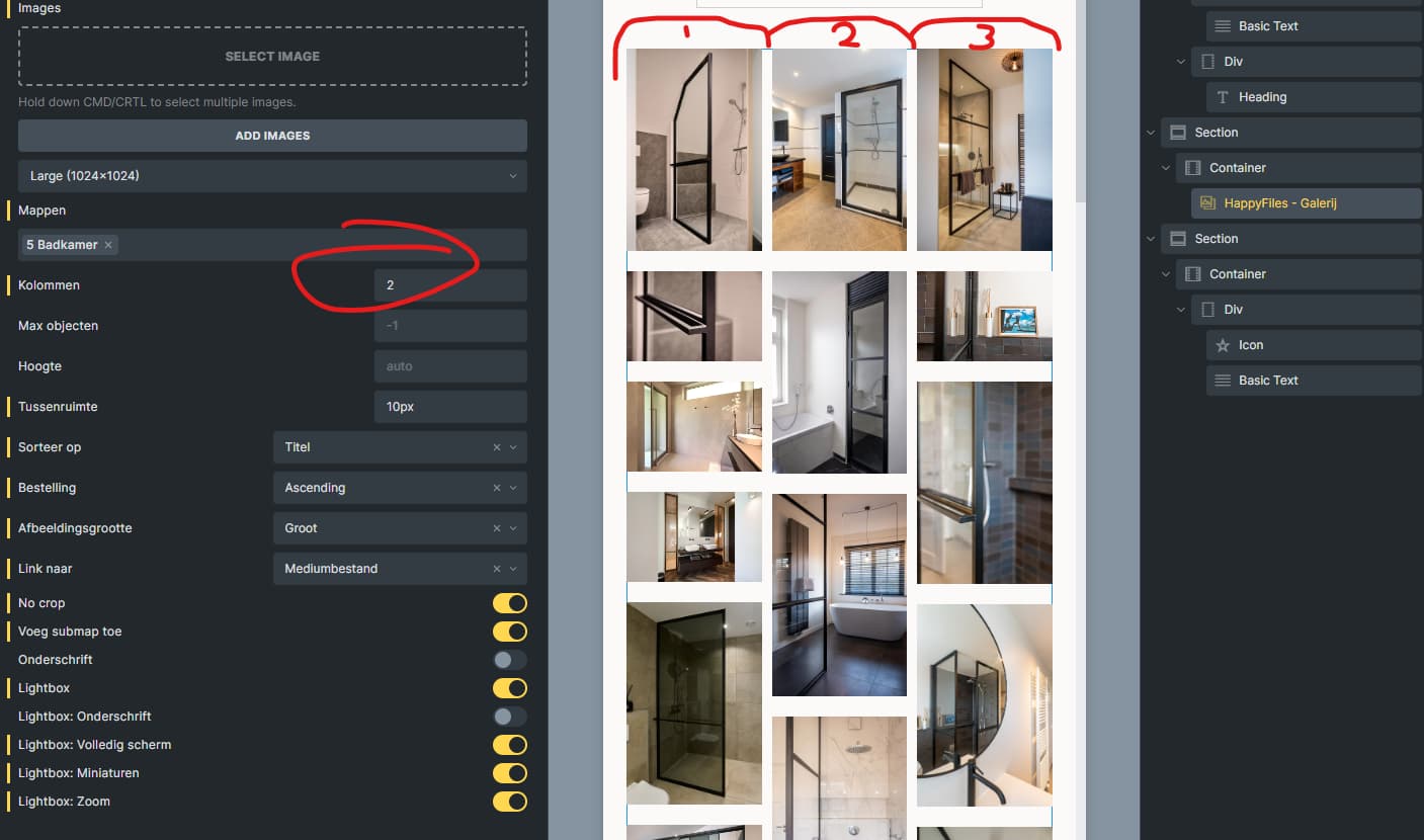
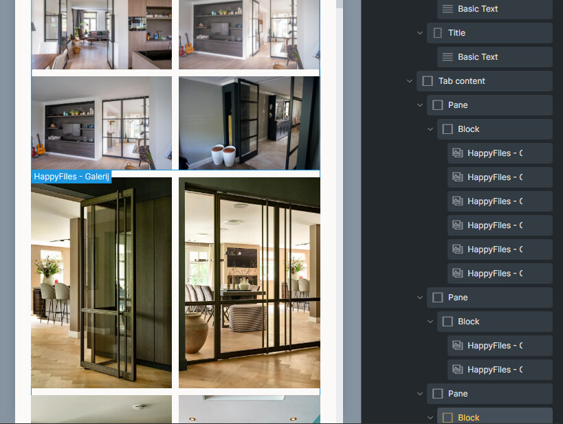
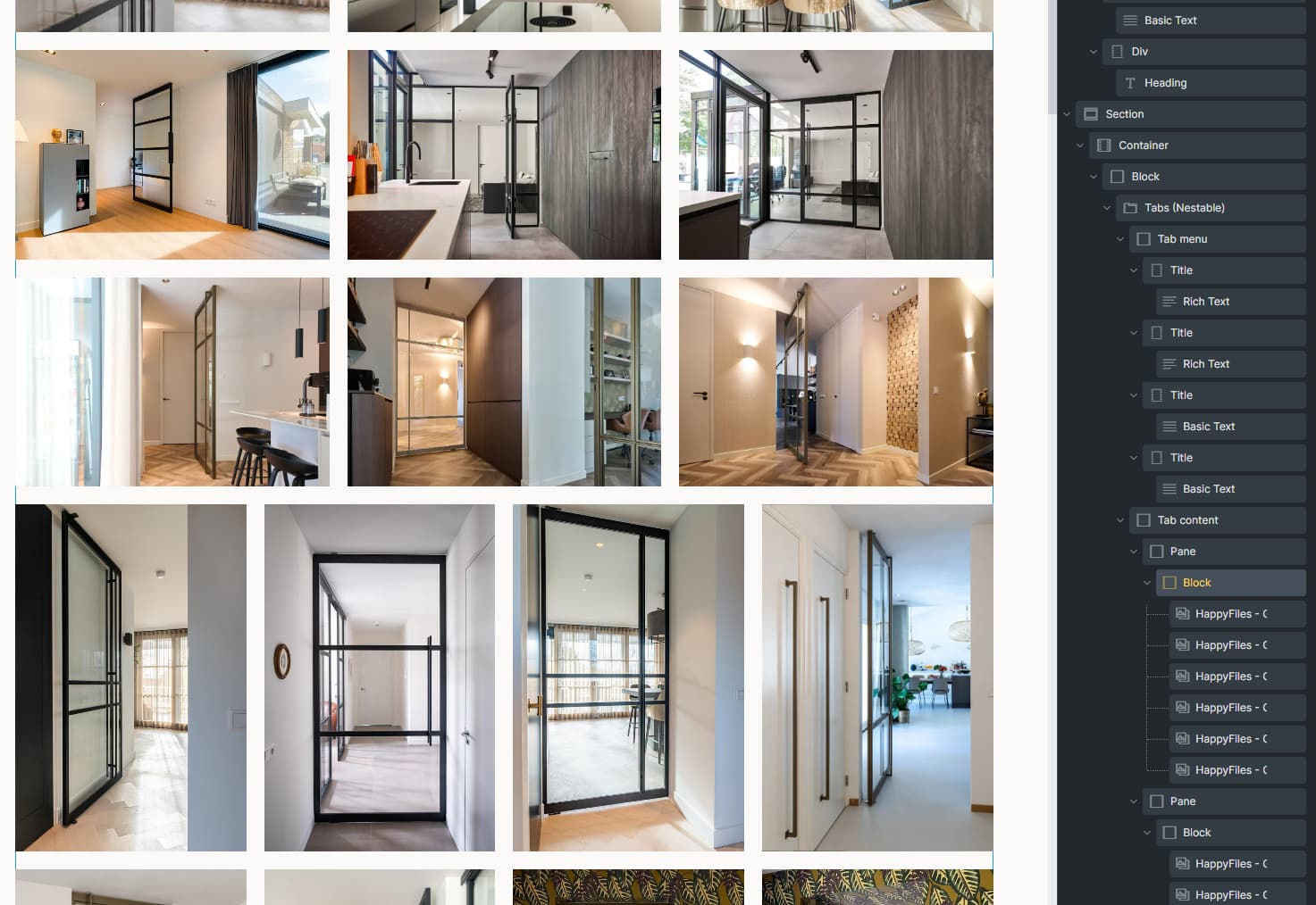
In the happyfiles folders, I split folders in 2.
Portrait, 2. landscape.
By adding a block (for the row gap) and two galleries in a pane, I now called each folder in a separate gallery.
(So should Thomas read it)
In a happyfiles gallery, having the option to sort by dimensions would solve it.
If that is too hard, when 2 folders are added to a gallery, it would be a solution to show one after the other. Right now it calls in all the images and sorts all the images. So therefore there is a need to add a gallery for each folder to solve it.
It would also be cool to see inside the happyfiles folder themselves if an image is portrait or landscape. Right now they all show square, so I had to open them one by one.
Quite a bit of extra work - BUT - it shows correctly in frontend now.
So, just to add to that (I found out today) there is one caveat to this method - and that is there is no Lightbox ID link possible with happyfiles galleries. Meaning the lightbox will only open the files you added in the first place. So… That’s a bit of a catch sadly.
This was a helpful solution to be able to control the number of columns for different breakpoints, but now I am finding that I want to be able to adjust the max item count at different breakpoints.