Browser: Chrome 110
OS: Windows
URL: Link to a page that illustrates this issue
Video: Jam
In the video, I show that the greyed out values for a component variant at a lower breakpoint (in this case Mobile Landscape) are incorrect.
As you can see, the greyed out values for padding on the “media-feature–reversed” variant on the Mobile Landscape breakpoint are incorrect. It is displaying the padding settings from the base variant from the desktop breakpoint, as shown at the 0:24 mark:
padding-top: var(–space-xl);
padding-right: var(–space-xl);
padding-bottom: var(–space-l);
padding-left: var(–space-xl);
However, it should be displaying:
padding-top: 0;
padding-right: 0;
padding-bottom: var(–space-2xl);
padding-left: var(–space-2xl);
It should be displaying the above because those are the actual styles applied on the “media-featured–reversed” variant at the Mobile Landscape breakpoint, as can be seen in the image below:
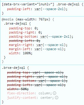
padding-top: 0, padding-right: 0, and padding-bottom: var(–space-2xl); are coming from the base variant at the Mobile Landscape breakpoint, which can be seen at the 0:29 mark in the video.
padding-left: var(-space-2xl); is coming from the “media-featured–reversed” variant at the Desktop breakpoint, which can be seen at the 0:14 mark in the video.
I’ll also add that it was confusing to me that setting a property (padding-left: var(-space-2xl); in this case) on a component variant on the Desktop breakpoint would have a higher specificity on a lower breakpoint than a property (padding-left: 0; in this case) set on the base variant at that lower breakpoint, as it results in these weird issues where different sides of padding are inherited from different places. It makes it more difficult to make a component and its variants responsive.
Hope this all made sense!