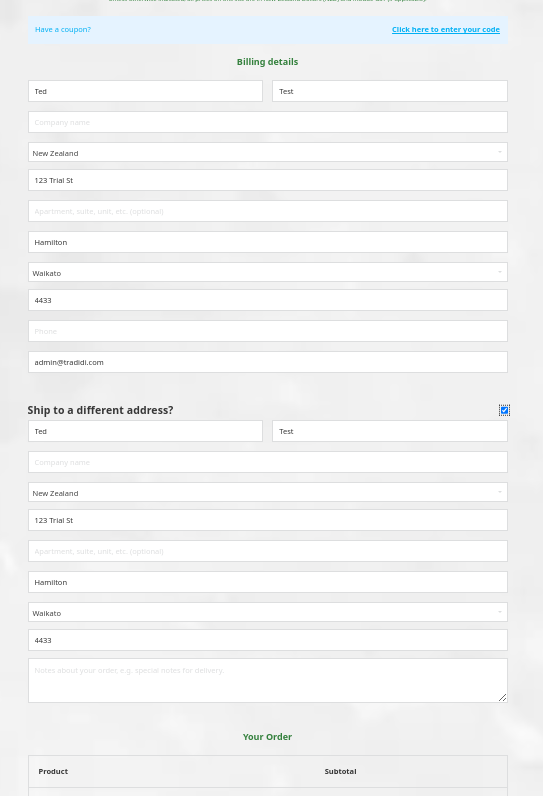
In the “Checkout customer details” block, the “Billing Details” and the “Ship to a different address?” section are showing in one wide column, underneath each other. They should show in two columns, like in the default WooCommerce template, and like the generated HTML and CSS seems to indicate (col2-set) was intended. The current layout is horrible on a large screen.
To fix the layout issue in the “Checkout customer details” block, ensure your theme’s CSS supports the WooCommerce col2-set class. Check for CSS conflicts or missing styles. Alternatively, customize the CSS to enforce the two-column layout.
The default layout certainly depends on on the layout of your checkout page. Assuming you want to display the order details next to it (as with the Storefront or TwentyTwentyThree theme), the two-column layout will no longer work. So using the defaults might work for you, but not for others. So adding these would create the same issue, but the other way around.
In principle, however, I agree with you that we should introduce settings with which it is possible to change the layout. I’ve created an improvement task for this.
In the meantime, you can of course use custom CSS (flexbox, CSS grid, or use the Woo way ) to achieve the same goal.
/* CSS GRID
  Change the template-columns to minmax(0, 1fr) on a breakpoint of your choice
*/
.brxe-woocommerce-checkout-customer-details .col2-set {
  display: grid;
  grid-template-columns: repeat(2, minmax(0, 1fr));
  gap: 24px;
}

/* Flexbox */
.brxe-woocommerce-checkout-customer-details .col2-set {
  display: flex;
  gap: 24px;
  /* add flex-wrap: wrap on the breakpoint you want it to wrap */
}

.brxe-woocommerce-checkout-customer-details .col2-set [class^="col-"] {
  width: 100%;
}

/* The Woo way
  Change the widths on a breakpoint of your choice to make them full-width again
 */
.woocommerce .col2-set, .woocommerce-page .col2-set {
  width: 100%;
}

.woocommerce .col2-set .col-1, .woocommerce-page .col2-set .col-1 {
  float: left;
  width: 48%;
}

.woocommerce .col2-set .col-2, .woocommerce-page .col2-set .col-2 {
  float: right;
  width: 48%;
}
 ) to achieve the same goal.