I’ve been thinking—and maybe this is a dumb question, so sorry if it is—but why don’t the Bricks settings in WordPress look and feel more like Bricks itself? Some plugins, like BricksForge, seem to do a better job at matching Bricks’ style than Bricks does in WordPress. I’m not an expert on child themes or anything, but it’s kinda weird how the WordPress interface feels so disconnected from Bricks. Bricks is super smooth and user-friendly, but then you go into WordPress settings and it’s like, “Wait, is this even the same thing?”
I get that this might already be on the roadmap or something you’re planning to work on, but honestly, at this point, it feels like it’s time to make it happen. Especially for beginners, it’s pretty confusing to switch between the two. Wouldn’t it be awesome if everything felt more cohesive? Or is that just not doable?
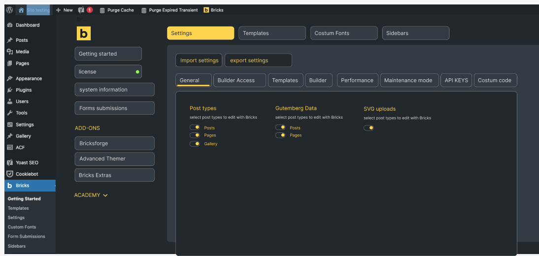
I just threw together a quick idea in Figma (real quick) of how I imagined it just to explain myself better. It made me realize how much I’d love to contribute to Bricks’ design if it was a remote possibility, ![]() you’re pretty great designers. Thanks to Bricks I learned how to make websites, I’m really thankful for what you’ve done.
you’re pretty great designers. Thanks to Bricks I learned how to make websites, I’m really thankful for what you’ve done. ![]()