Been working with Elementor since 2018, finally decided to switch over to Bricks and recently relaunched my own site. Pretty minimalistic for now but it will grow in the future. Built with ACSS, Frames, ACF Pro, Bricksforge & Brickscore.
Hi Philipp,
Is it wanted that the first card under Der Process shorter is as the others?
Accessibility wise, when we try to navigate via tabs, we don’t get access to the button “Kontakt aufnehmen” what is IMO the most important button
in the mobile view, as the testimonial cards are not the same height, it’s jumpy all around, and the slide is too fast to read.
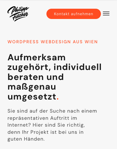
In your hero section, the main heading could be better, I had to take a second look to understand what the company is about.
Looking at the DOM we see that the H1 is “WORDPRESS WEBDESIGN AUS WIEN” but it’s placed visually much in behind
This site is super nicely designed and executed and I would hire you! I really like the whole dot grid notebook resemblance thing. Not all clients will be familiar with it but I think even to them it will successfully transport a vibe of webdesign process. The red cursor dot bothers me but I’m just not a fan of cursor effects like that in general, YMMV. Design-wise I would suggest equalizing the size of the red dot used as a punctiuation mark in your hero page copy and the cursor dot.
One functionality issue I noticed is that since you used anchors without the whole URL in your menu you can’t navigate the site anymore after checking the Impressum page. Also the “uns wissen” link at the end of the Homepage doesn’t work for me. And this isn’t really a design issue but on the copywriting end: since you always use uns/wir and seem to be an agency but go by an individual’s name I was a getting a bit mixed signals about whether you are one man show webdesigner or not. I think putting “agency” somewhere on the first screen or some other prominent place might help with that.