WAIT: WCAG 2.0 Accessibility Review

Hi team.
I meet often the following problems in the Accessibility Checker.

  • Replace your i elements with em or strong. (mainly in the sub-menu, list element, text element)
  • Add a fieldset and legend element to the form for each group of radio buttons. (form element)

Is there any possibility to solve these problems?

2 Likes

Hi Anos,
Welcome to the forum, and thanks for reaching out!
Which tool are you using for the tests?

  1. The i elements are probably the submenu indicator icons, right? In that case, neither em nor strong make more semantic sense.
  2. We can certainly adjust the markup when we get a chance (same goes for checkbox and select). I will consult with the team.

Best regards,
timmse

1 Like

Hi timmse,
Thank you for the contact.

The main tool that i use is AChecker Web Accessibility Checker
and secondary the wave[dot]webaim[dot]org
Both, but primarily the first tool is also used for certification by government agencies.

The Rationale for i element is that the i element is not handled as well by screen readers as the em and strong elements.
Details about the element are here: https://achecker.achecks.ca/checker/suggestion.php?id=117

Details about the form markup you can find here:
achecker[dot]achecks[dot]ca/checker/suggestion.php?id=168
Best regards,
Anos.

2 Likes

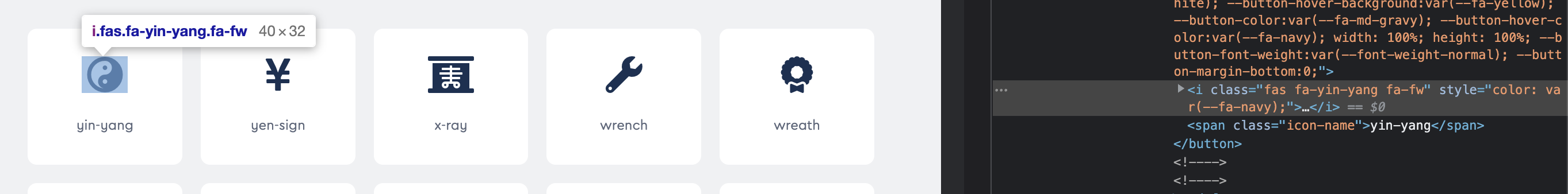
Icons really shouldn’t be wrapped in i tags - even fontawesome explains in their documentation that despite it being the default, it’s the wrong way to do it.

Well, however, they do not stick to it. Every single icon on the fontawesome site is using the <i> tag @Pete :smiley:

Again, replacing the <i> with <em> or <strong>, as the accessibility check suggests, doesn’t make any sense in terms of semantics because the icon isn’t either emphasized or strong text. The only element that even comes close is <span>.

Nonetheless, this is a massive change that should be well thought out and not rushed. One thing at a time…

1 Like

Correct, but they say in their own documentation that this is incorrect implementation and you should not do it this way

2 Likes

then i would call this a concerning response from bricks. we really need accessibility solved in a professional way.

3 Likes

Correct. Accessibility is getting more and more important these days. Fully agree!

3 Likes

Any progress with this?

No, not so far. I’ve been looking for official rules for quite a long time, but can’t find any. If any of you have a trustworthy, official, up-to-date source on the subject and would share it with us, it would be greatly appreciated.

The only really comprehensive source is font-awesome itself - and even there they use the i-tag: Accessibility | Font Awesome Docs

hello @timmse

maybe this one helps? : Startseite - Barrierefreie Gestaltung von User Interface-Elementen

and this: Patterns | APG | WAI | W3C

https://www.bitvtest.de/bitv_test/das_testverfahren_im_detail/pruefschritte.html

1 Like

Unfortunately not, or I’m missing something :thinking: The thread is not about the aria attribute (you can add yourself), it’s about the HTML tag for icons.

Here is the information about ACCESSIBILITY from a few websites that the rules the standards of the web

Hi Luis,
I know the pages, but please show me exactly where the topic HTML Tag for icons is treated :slight_smile: If there was anything in there about it, I probably would have found it in my research - but maybe I missed it.

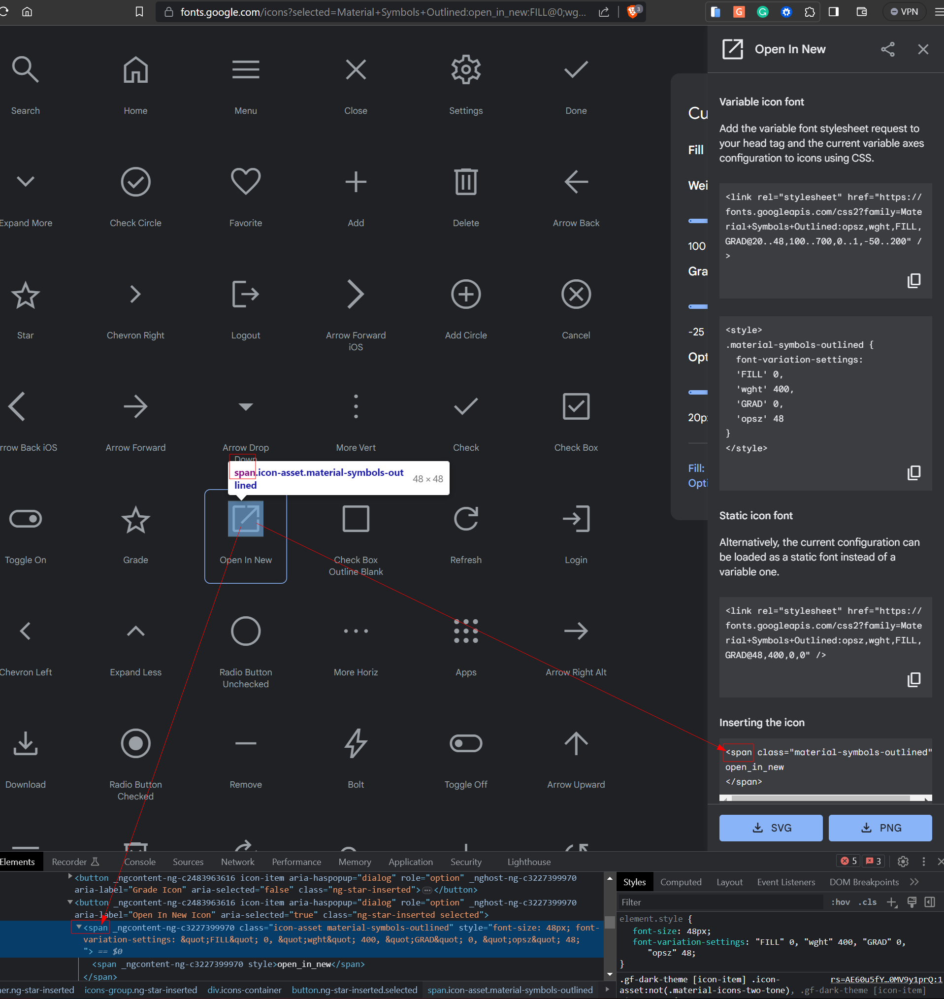
you are right, The only thing i found is that Google uses SPAN for their icons, and that’s it, I’m assuming that they should be following the same standards. but i don’t know i was just sharing does pages, i understood i thought you were asking for the website but i did not realize that in specific for the icons the only thing i see is this on Google icons,

Yes, but that’s the thing: there are thousands and thousands of sites that do it differently. That’s why I’m looking for an “official” source/information/guideline - but it doesn’t seem to exist :cry:

Related… (by FontAwesome)

2 Likes