Bricks Version: 1.4
Browser: Chrome Android / Samsung Browser Android
OS: Android 11
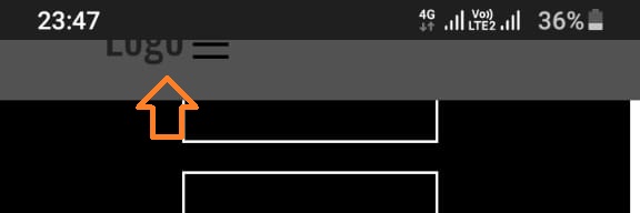
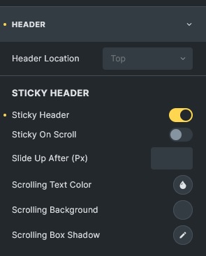
With the Sticky Header activated, when I scroll the page down on mobile, the header is getting half ‘cut’. It shows the complete header on scrolling up though.
Bricks Version: 1.4
Browser: Chrome Android / Samsung Browser Android
OS: Android 11
With the Sticky Header activated, when I scroll the page down on mobile, the header is getting half ‘cut’. It shows the complete header on scrolling up though.
Hi Khan,
can you please provide a link?
I don’t have an Android smartphone, but looking at the styles will certainly help.
Best regards,
timmse
@khan360 If you get this after upgrading from 1.3.X, maby you can check content, is it some image are larger than the container size.
I have a similar problem, and it seems to be some issue left over from the upgrade.
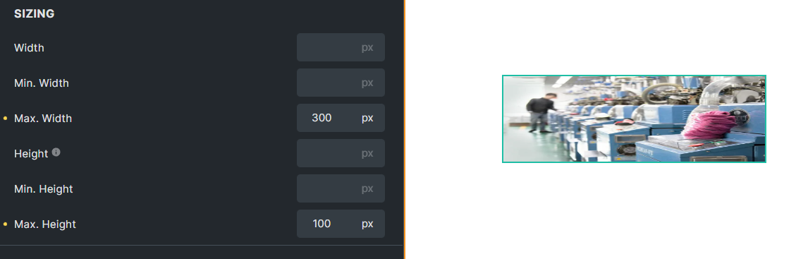
@timmse It should be noted that, after I upgraded to 1.4, the image “Max. Width” and “Max. Height” all set, some images are flattened, some are fine, I did not set the specific " Width" and “Height”, and it work fine in 1.3.x. Deleted “Max. Height” and just set “Max. Width”, the image displayed fine, maximum size should not affect the length/width ratio, please check it.
I can easily reproduce it:
@khan360 Without seeing the code… you may have defined fixed heights that push the navbar out of the viewport. Swap height for min-height and see if that solves the problem.
@Lee Hi Lee, that’s because the images had a wrapper before 1.4, and they don’t after 1.4 unless you set one or they are linked (the a-tag is the wrapper). So the widths and heights are applied to the wrapper if there is one. That’s why this works for images with a wrapper (because of the max-width: 100% on the img), but not for “naked” img tags, because you affect the aspect ratio of the image with your max-width and max-height specifications.
In responsive design, it is common practice to give images a max-width: 100%. This way, they automatically adapt to the parent element’s width, preserve the aspect ratio and never create an overflow.
Limiting both the (max)width and the (max)height of the image will override the aspect ratio, and the image will be stretched or compressed.
However, there is a solution: object-fit. Set object-fit to cover, then your max-widths and max-heights will also work on images without a wrapper.
Best regards,
timmse
@timmse Thank you very much for your reply. I redesigned it. And it seems to be fixed for some reason. I will keep a lookout if it happens again and will post the link here.
But I’ve noticed a second issue. If someone for whatever reason wants to put the Nav Menu Element inside an absolute / fixed positioned container and radically redesign the ‘ul’ element inside it, like giving it 100% width and some arbitrary height or other effects, and if a menu item in it has a sub-menu, on hover it doesn’t pop up at all. And even the cursor is not turned into a pointer
I do not have a link for it came across it yesterday. See if you can confirm it with an existing bug or I will post a link with the issue to debug.
@timmse thanks for your reply, the “object-fit” option works well.
Hey @khan360 , please share a link so I’m able to see what’s going on. There are countless possibilities to style the menu “radically” 