I never used the container width settings in theme styles because they never seemed to work and/or how they were intended to be used was not intuitive. So I always used to set my own CSS overrides.
But now as this was supposedly improved in v.1.4 I’ve trying to use it and figure it out again. Unfortunately is still doesn’t work and/or I don’t know how to use it.
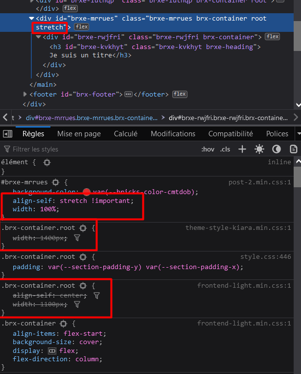
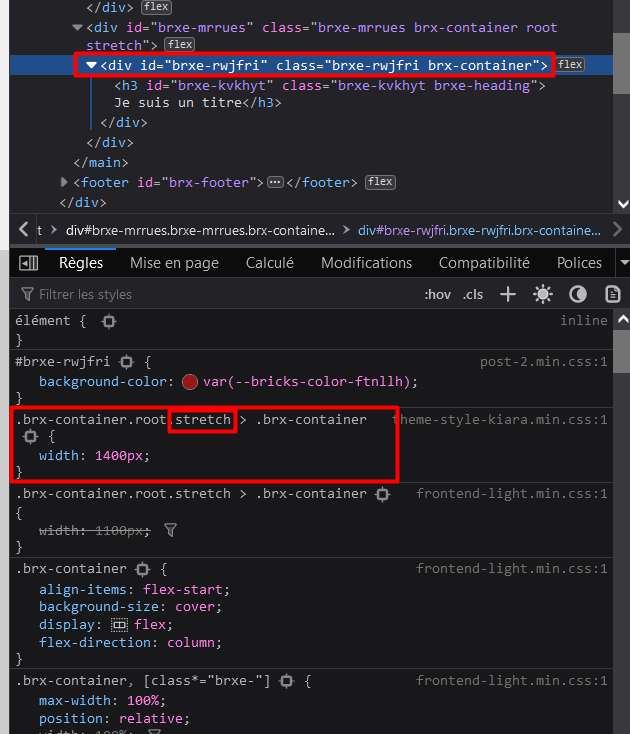
I always create at least two containers for each section on a page: an outer container (which I use a tag for, and always set to 100% page width) and an inner div, into which I place other elements or child divs. I do this so that I can set the background colour of the outer (root) container and have it span the will page width.
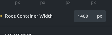
So I’ve create a new theme style in my site with Bricks 1.4. The root container width is set to 100%. The content width is set to 1360px.
On the front end, the outer (root) container is set to a width of 1360px, and the inner container (where my content is located) is set to 100%.
Yes, totally messed up design here…I really don’t know what they were thinking. It also seems to be just as bad as it was before…not sure what got improved in v.1.4. I guess I’ll just return to my own utility classes, which automatically set the root container to 100% and the max-width of the inner container to 1360px (or whatever I set it to).
Hi Eric & Yan,
The way Yan described it is correct.
The container width inside #brx-content will be overwritten if you use content width. For my part, I generally leave the content width untouched and only work with the container width. But as far as I can see, it isn’t backward.
The container looks quite simple at first sight, but if you look at it a bit more closely and take all eventualities into account, it is highly complex (as far as one can say about CSS).