There’s a problem with responsive website design. Page elements are displaying incorrectly or not at all, as shown in the attached photos. This is truly frustrating, especially since responsive websites are essential in today’s world, and full control over elements on the mobile version of the site should work flawlessly, yet the v1 bugs persist. Other than “clear cache” or switching browsers, the same thing happens. The builder’s mobile view remains the same. www.testry.omalywlos.pl
I have to check on phones whether the websites look good because I can’t trust browsers ;/
That’s because you’re logged in and can be fixed by adding this as a top value: calc(200px + var(--wp-admin--admin-bar--height))
The default top value is the height of the admin bar, but since you’re overriding it with 200px, it’s just 200px.
Screenshot 5
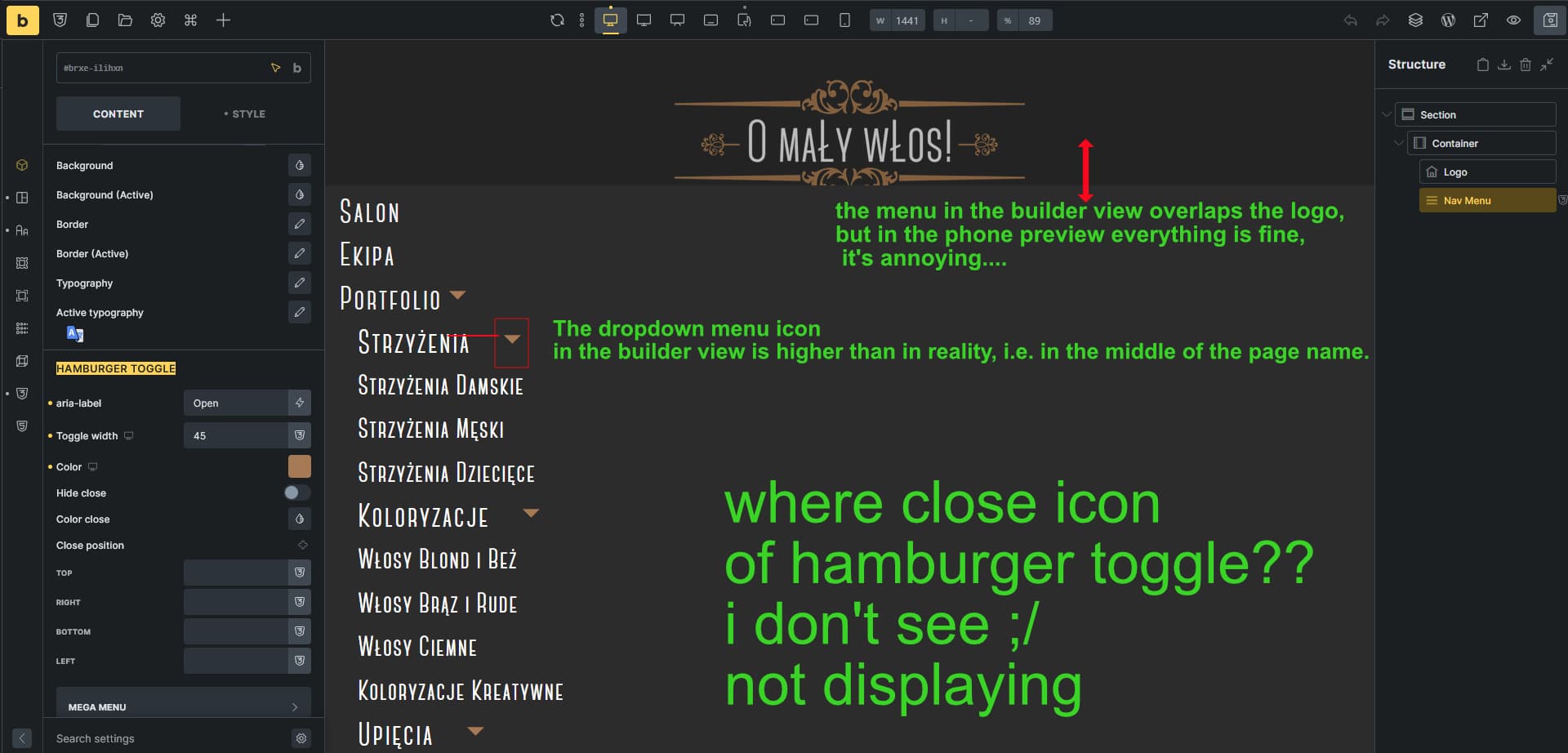
a) I don’t know how to replicate the menu overlaying the header. But it doesn’t really matter, because you don’t use a mobile menu there anyway, do you?
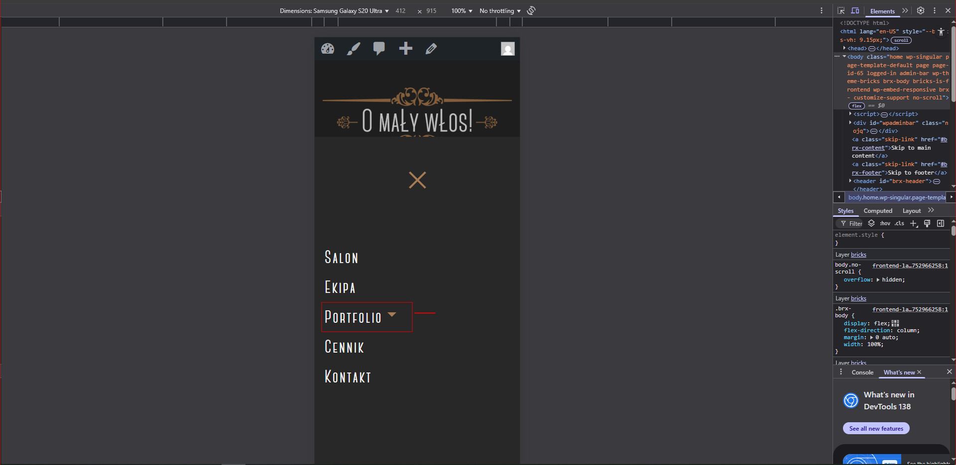
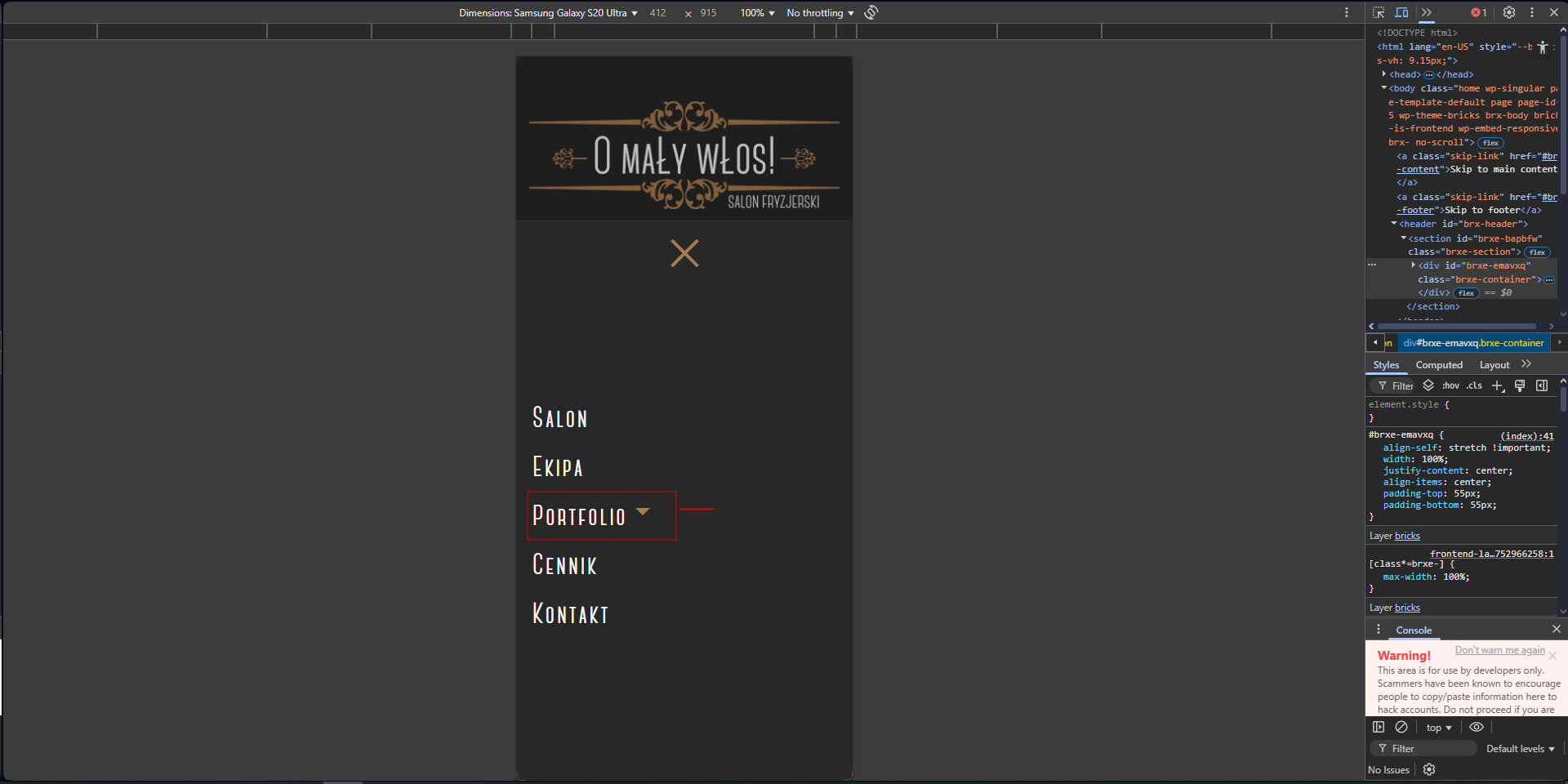
b) Dropdown icon: how can I replicate this?
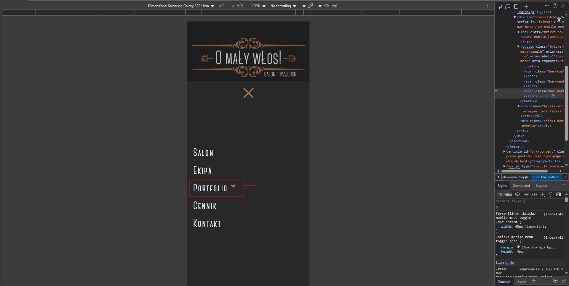
c) Close toggle: it shows only on the breakpoint where the mobile menu is enabled for. Since you’re on the desktop breakpoint, it doesn’t show (similar to a).
a) solved, all I had to do was uncheck the display of the admin bar in wp, shame I didn’t think of it
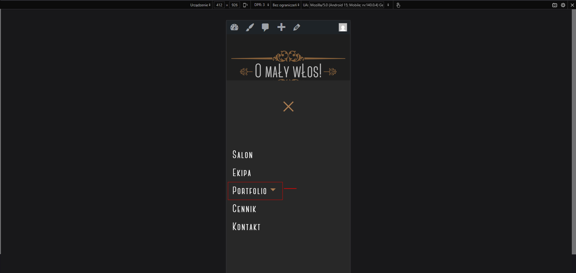
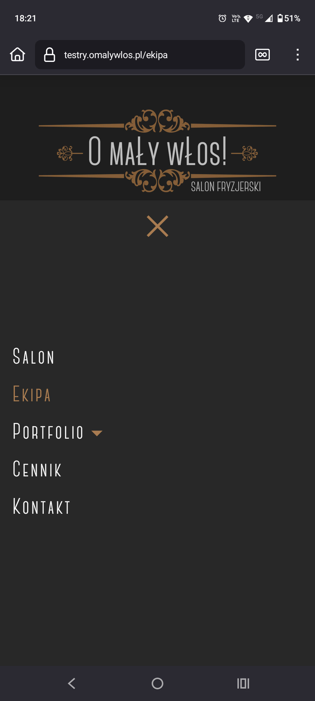
b) The drop-down menu icon in the builder and page tester, as seen in screenshots 1-5, is higher than it actually is, i.e. screenshot 6 on the phone. This is very problematic and frustrating. Is there a solution for this, or is it just the way it is?
c) solved