OS: Windows 11
Browsers: Latest Chrome and Firefox
The alignment settings for PREV/NEXT elements do not work on the front end.
OS: Windows 11
Browsers: Latest Chrome and Firefox
The alignment settings for PREV/NEXT elements do not work on the front end.
FIY:
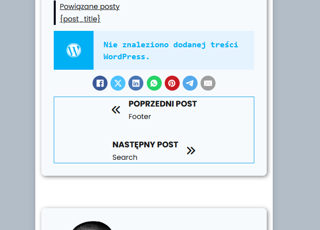
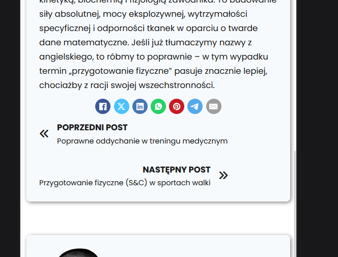
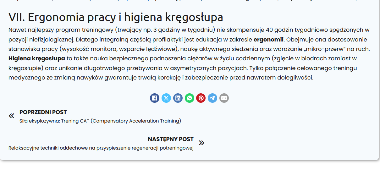
The conflict seems to arise only with very long post titles.
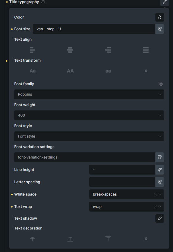
white-space: break-spaces;
text-wrap: wrap;
Hi Daniel,
Thanks so much for your report!
Which breakpoint are you specifically on, and what are your settings?
In addition, a live link would be great so I can see the problem.
Best regards,
timmse
Had a similar appearance. When a long title appears it eats up the space of the other and does not keep the 50% 50% split.
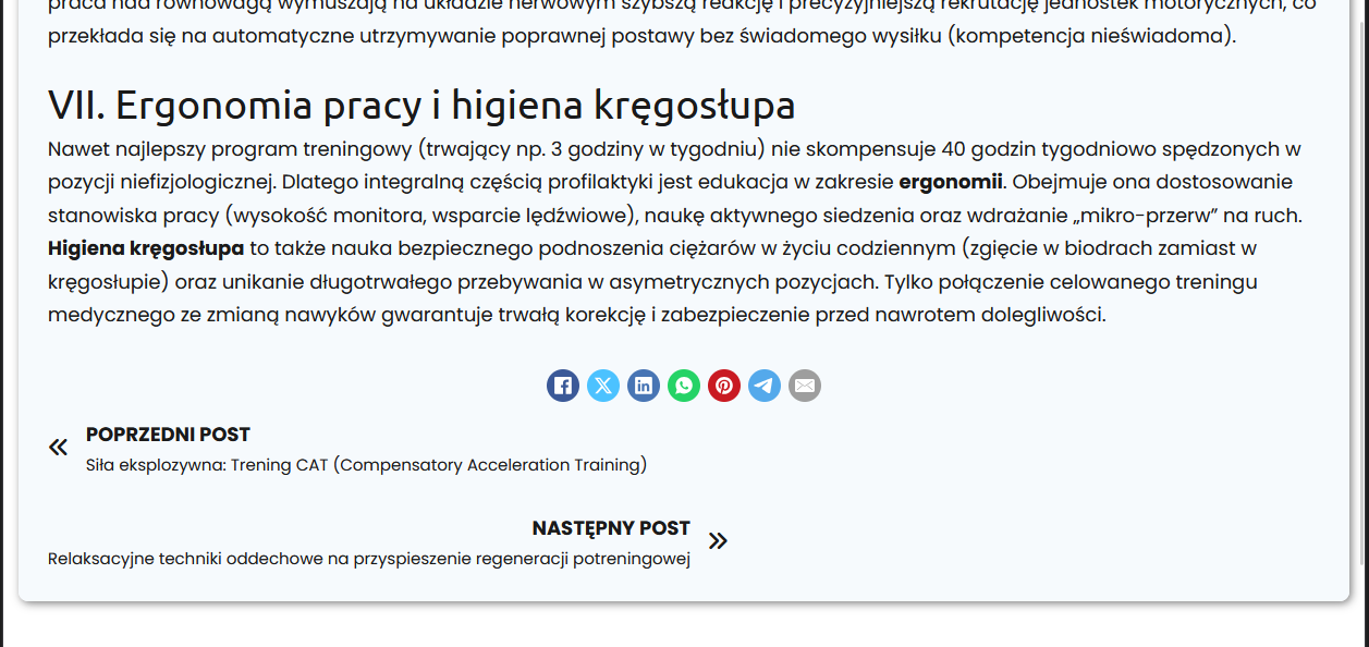
Jak wygląda współpraca z trenerem medycznym? / Marcel Gielezy: Terapia Ruchowa 1050-660 ish; the issue is present when the prev and next post titles are very long
@timmse hello, any news? I provided the link in the reply above.
Hi @primexaos,
I’m sorry, @timmse is currently away, and it looks like we missed this one. I beleive they should work of you set the “direction” to “row”? Would that solve it?
Matej
@Matej it is set to row. This is what it looks like when flex-direction is row
Hi @primexaos,
I’m sorry. I meant to say column, on smaller screens. Can you try:
{"content":[{"id":"snemvu","name":"post-navigation","parent":"gwfovm","children":[],"settings":{"label":true,"title":true,"prevArrow":{"library":"ionicons","icon":"ion-ios-arrow-back"},"nextArrow":{"library":"ionicons","icon":"ion-ios-arrow-forward"},"image":true,"_direction":"row","prevJustifyContent:mobile_landscape":"center","nextJustifyContent:mobile_landscape":"center","_direction:mobile_landscape":"column"},"themeStyles":[]}],"source":"bricksCopiedElements","sourceUrl":"https://1bricks.local","version":"2.2-beta"}
Matej
desktop, 1250px inline size on the screenshot - it looks as if it was switching automatically to column when the prev and next blog titles are too long to fit, and the inline size of the element is set to fit-content rather than 100% of the container?
EDIT: Analyzed the code and it looks like it’s because of flex-wrap rule.
Title too long > wrap > only 1 element, so it’s moved to flex-start, which is why it appear on the left when LTR direction is used.
Under Style >> Layout >> Gap they added a 30px Gap at some point in a version that causes this for me. Set it to 0. It was always 0 before.
Hi Daniel,
Sorry for the late reply 
Matej and I looked at the post navigation independently of each other and don’t see any bugs. To center the links, you have to set the direction to column and limit the width, otherwise flexbox will do its thing—and that can lead to confusing situations here and there. Bottom line, though, this is the expected behavior.
Please try this, maybe it will give you the result you want?
{"content":[{"id":"nuhenp","name":"post-navigation","parent":0,"children":[],"settings":{"label":true,"title":true,"prevArrow":{"library":"ionicons","icon":"ion-ios-arrow-back"},"nextArrow":{"library":"ionicons","icon":"ion-ios-arrow-forward"},"_direction:tablet_portrait":"column","postWidth":"45%","postWidth:tablet_portrait":"65%","prevJustifyContent:tablet_portrait":"center","nextJustifyContent:tablet_portrait":"center","_alignItems:tablet_portrait":"center"},"themeStyles":{}}],"source":"bricksCopiedElements","sourceUrl":"https://brxdev.local","version":"2.1.4"}