After recent Bricks updates, we’ve found that many of our Bricks sites have mobile menu styling issues with regards to text alignment being incorrect and padding issues.
For example, in the site https://drerinlush.com/, the mobile menu items are all aligned right. If I try to edit the menu and align menu items left, nothing updates in the builder or on the frontend. I’ve tried regenerating CSS and that doesn’t help.
Apart from that, mobile menu items that have submenu items have extra left-padding which makes those items look indented. This wasn’t like that before.
As a temporary fix for the client, I’ve added the following line of code in the .header__nav class:
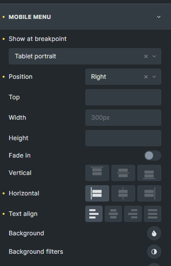
Hi @timmse , I’ve updated to v1.8.3 and this problem still persists. On the mobile menu, the top level menu items can be aligned to the left, using horizontal alignment option:
Hi Chris,
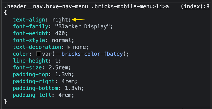
Unfortunately, I can currently only say what I see. Of course, I can’t know where the settings come from.
Dr. Erin
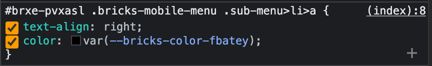
The nav menu aligns the text to the left by default (add a new nav menu for testing and see how it behaves). But in your case, the text-align is set to the right (same for the submenu items). As I said, I don’t know where, and how you set it.