I’m working on a layout with nestable tabs, where each tab contains different sets of posts retrieved through different queries. Each set of posts is wrapped in a flexbox wrapper (red container in attached URL). My goal is to have the flexbox wrapper (red container in attached URL) adjust its size based on the number of posts displayed within it.
However, I’m encountering an issue where when I set the flex-basis and width of the flexbox wrapper (red container in attached URL) to ‘auto’ containing the query loop, the wrapper stretches to fill the entire width, regardless of the number of posts inside.
On the other hand, when I use the same flexbox configuration without containing the query loop, the wrapper adjusts its size correctly according to the number of posts.
Thanks for your suggestion. I tried to implement it. It worked to some extent but with additional issues.
Now, when there are two posts inside the query loop container, they are flowing vertically even though the wrapper flex-direction is set to row. However, as I add more posts, the layout starts adjusting and becomes more appropriate.
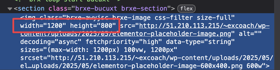
Also, I would like the dimensions and resolution of my attached images to be full instead of partial sizes.
Surprisingly, none of these issues occurs when I do not use query loop.
as I can’t reproduce the issue locally, can you send temporary login credentials to your website and a link to this topic to help@bricksbuilder.io using the email address you used during the purchase, so we can take a look? (If you have staging, please send a staging one).