Here is the Bricks website that looks good on laptop, desktop, mobile.
Navigation bar which is, semantically speaking, an HTML unorderd list is displayed as it should (horizontally, with all the styles etc.)
This is screenshot of it:

However, when the website is loaded on Smart Interactive Touch Whiteboard of 65 inch (viewport size 1280x624) it suddenly looks wrong, like an unstyled unorderd list (vertical, bullets visible, etc) here is a screenshot of it:
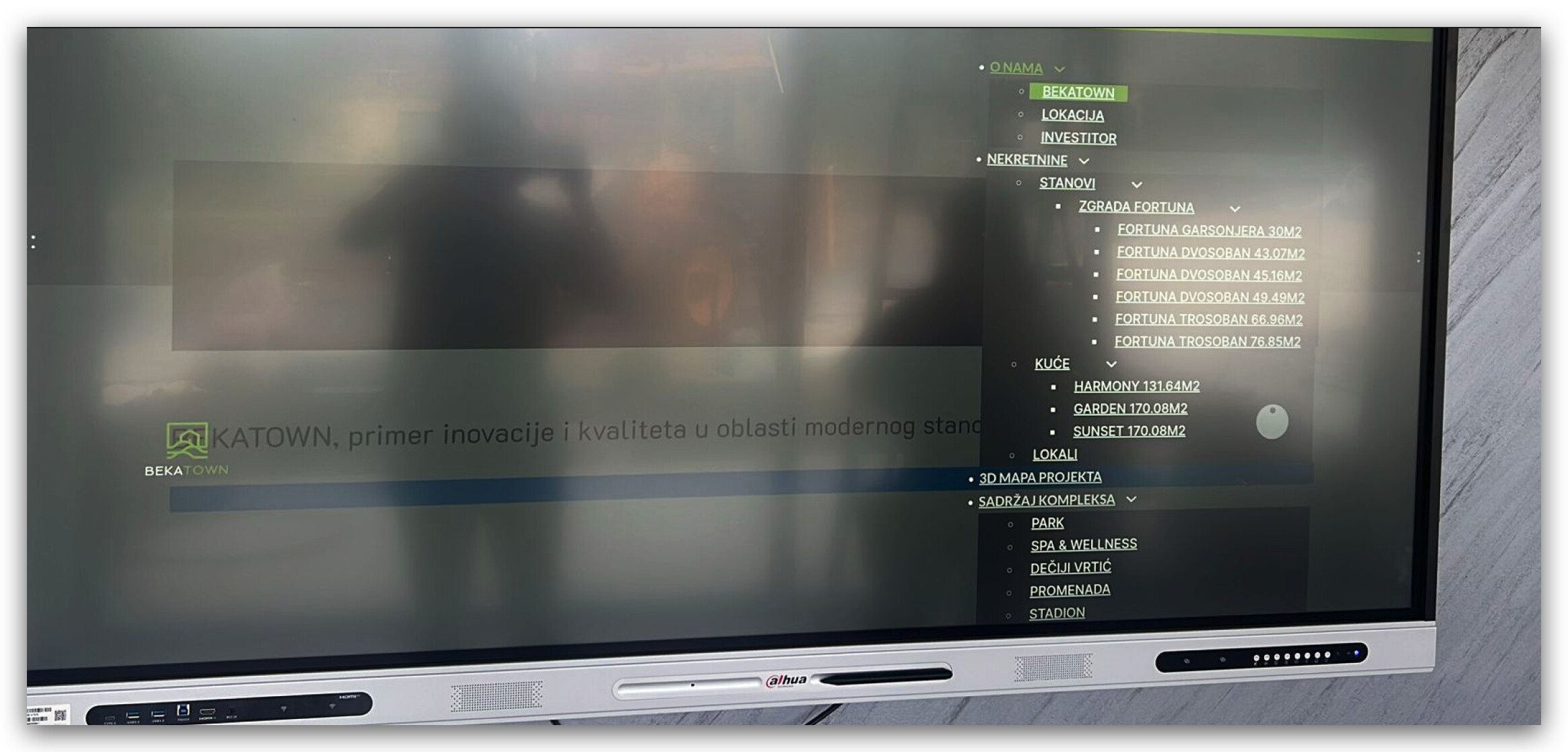
Since the client wants to showcase this new website of theirs on that smartboard which they already bought and installed in their office, I need to fix this. They also tried it on other Smart Whiteboard devices by different manufacturers and result is the same.
I don’t have an idea how to approach this since it’s native Bricks nav bar widget, and it is set all good on my side, and is showing-up correctly on desktops/laptops/mobile.
Please help.