Hi bricks team,
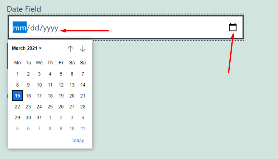
Currently, the appearance of the Datepicker field in the form element is quite similar to a simple text field. If we ignore the title, it is not at all obvious that it is a Datepicker field until we click on it. It would be great if the Datepicker field was visually different from the other fields. For example, having a custom icon (calendar icon) and – / – / – would be great. Like in the screenshot below