Using WooCommerce and Bricks, I am not able to adjust how the layouts on the following pages lay out on different breakpoints, and it affects the UI/UX negatively:
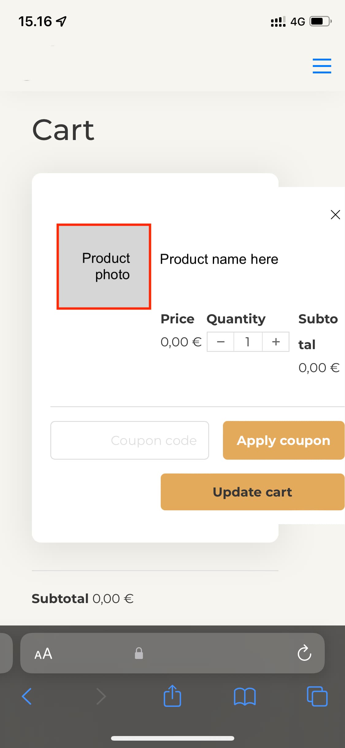
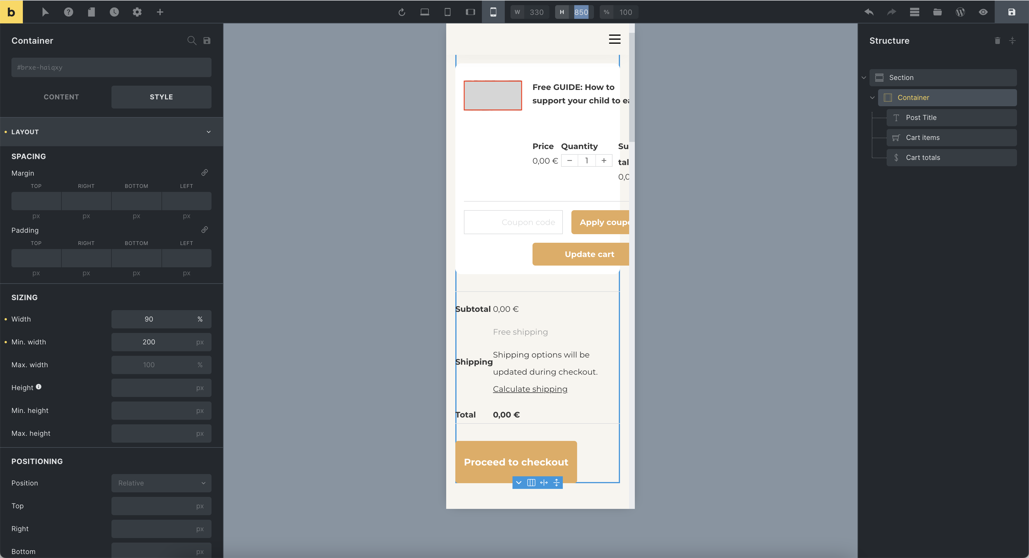
Cart page: Desktop OK, when scaling down to tablet/mobile browsers, things start to clutter; Cart overflows from the browser window, makes the page side-scroll, the Shipping + Subtotal section is a HTML table which’s columns are unbalanced and no options to adjust them is offered (this seems impossible via CSS, but can I just not find the selectors?)
Checkout page: On mobile, has the same issue as the table of the Cart page. The details are laid out in a table and it’s column width is not responsive nor adjustable.
It’d be good and sustainable to have the same adjustment options on the “Add to cart” module (single product page) as well. On the add to cart, variations & quantity section, as it is always stacked up in just one, very unpleasing and disordered way. The only way to make it look fine is to make all elements within it have a width of 100%. This is workable, doesn’t really affect UX as far as I have experienced, but the two points above do cause harm to UX.
Setting minimum width does not affect overflow. I’ve attached a screenshot. I can change the overflow setting under Bricks Editor → Layout → Misc, to “hidden” or “scroll”, or “auto” (better of course than “visible”), but that does not exactly solve the clutterness. Min-width or overflow will not affect how other CSS or HTML is set. Simply the HTML table, within which the details of the cart are laid in, is spaced too tightly, and doesn’t offer a mobile layout.
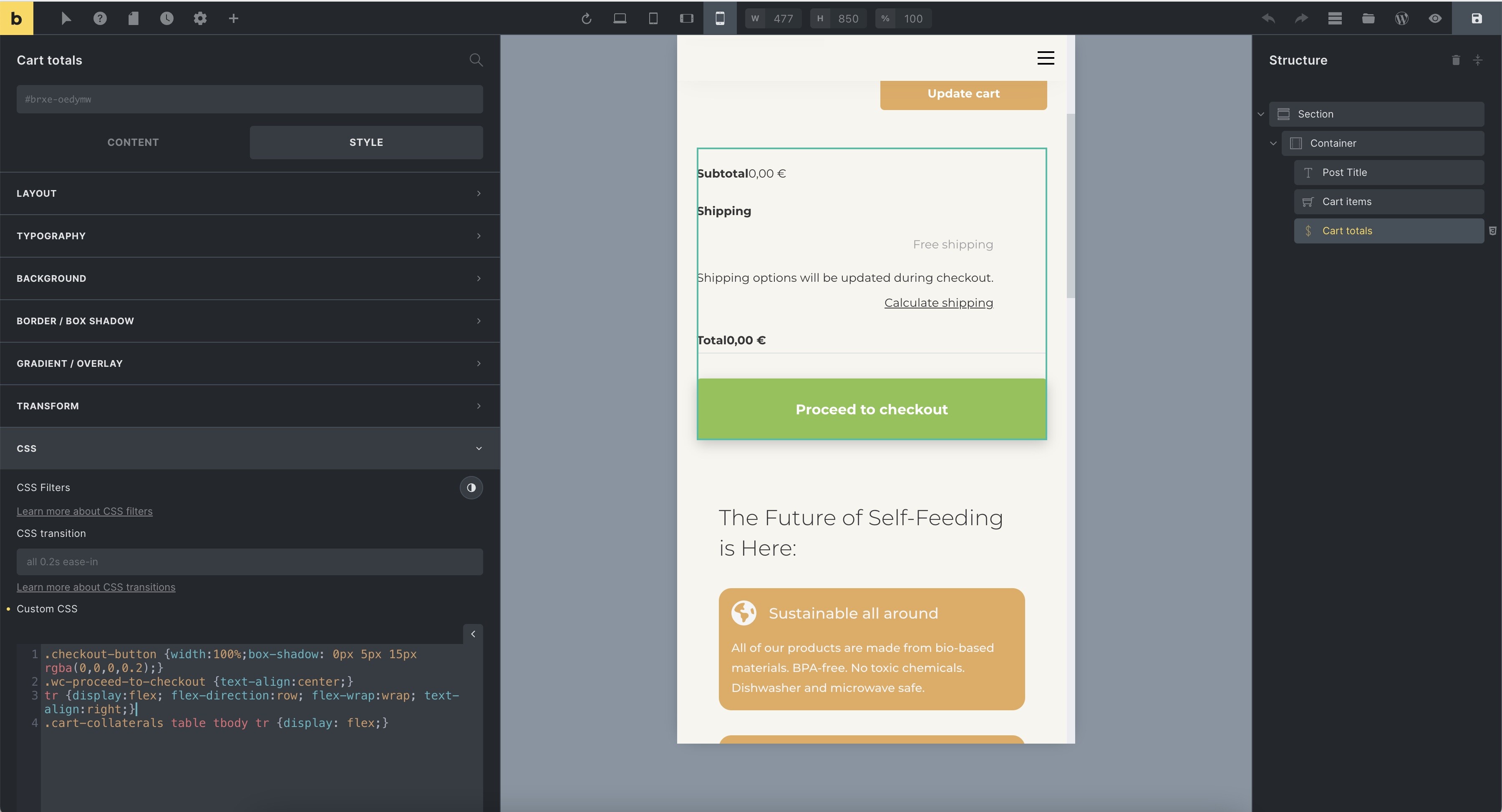
An workable fix in my case is to remove all paddings, borders and margins. That solution removes the overflow and makes the cart usable on most mobiles. However, the readability and usability of the cart on mobile will suffer from this.
The most suitable and sustainable solution would be to offer an option where the column direction is set from top-to-down, not left-to-right as it is at the moment, in an effort to offer better usability and UI.
I will demonstrate what I mean for the bottom part, as it is simpler to understand:
Rather than:
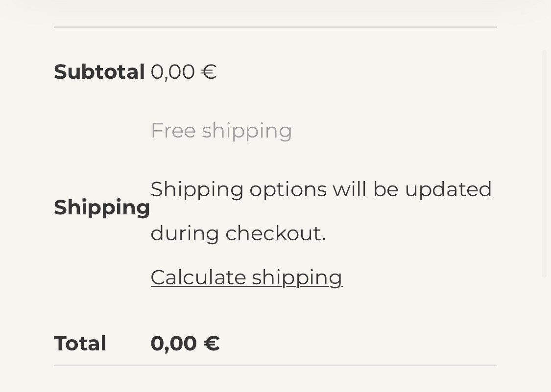
Subtotal: 0,00 €
<'br> Shipping: Free Shipping / Shipping options will be updated during…
<'br>
…
A better option would be:
Subtotal: <'br>
0,00€
Shipping:<'br>
Free Shipping
Shipping options will be updated during…
…
I know I could possibly reach this layout through modifying the WooC files or making my own WooC Hooks, but given that this option would have to be done seperately for every site by every WooC site anyone ever makes on Bricks, I’ll call it a feature that needs to be updated.
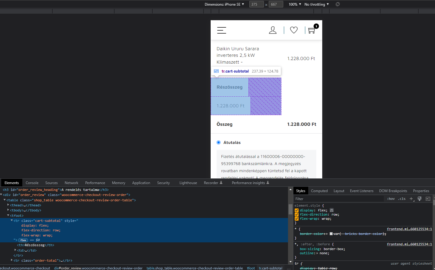
If you want break lines (example shipping, cost ect) i think you can do this with custom css.
Chrome, right click… Find the elements class, and modify it.
I’m just curious about your solution, what kind of logic you followed and how you solved the unique design. Based on the printscreen, I started playing with it myself, but I would also like to know your solution.
I haven’t found anything new since, as stated in my earlier messages, I removed all the paddings and aligned all text to the right.
I appreciate you playing it out with inspect element, but did you try it within Bricks Builder? I may have to give it another go using WP Customizer CSS or such.
Make the changes in the inspector as you wish. Copy the selector with all settings. Download the style.css from the theme folder and copy the changes from the inspector into it. Then upload the style.css again. If the changes are not applied, try !Important.
Business Bloomer has published a free video about customizations in Woocommerce. However, you have to register. This should actually work.
 Based on the printscreen, I started playing with it myself, but I would also like to know your solution.
 I may have to give it another go using WP Customizer CSS or such.