Browser: Chrome (update)
OS: macOS / Windows / Linux / etc.
Hi,
We can say with certainty that bricks is the biggest site builder in the WordPress world. Personally, I have no doubt about this. But it is surprisingly weak in some areas of WooCommerce. In terms of customization and ui ux issues. In this thread, I want to address the product page. Because it is very important for customers in the first stage.
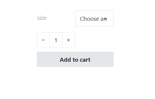
Please see the screenshot below.

There is a large distance from the title (size) to the variable box that cannot be controlled. The size of the variable box is too small, so that the text “Choose an option” is incomplete.
The dropdown icon is integrated into the text and everything looks cluttered.
Even if we make the width of the element 100%, we will still have the screenshot above.
There is no option to customize the variable dropdown.
It was a bug report so far. But something like the screenshot below would be really cool in Bricks. site link

thank you!
