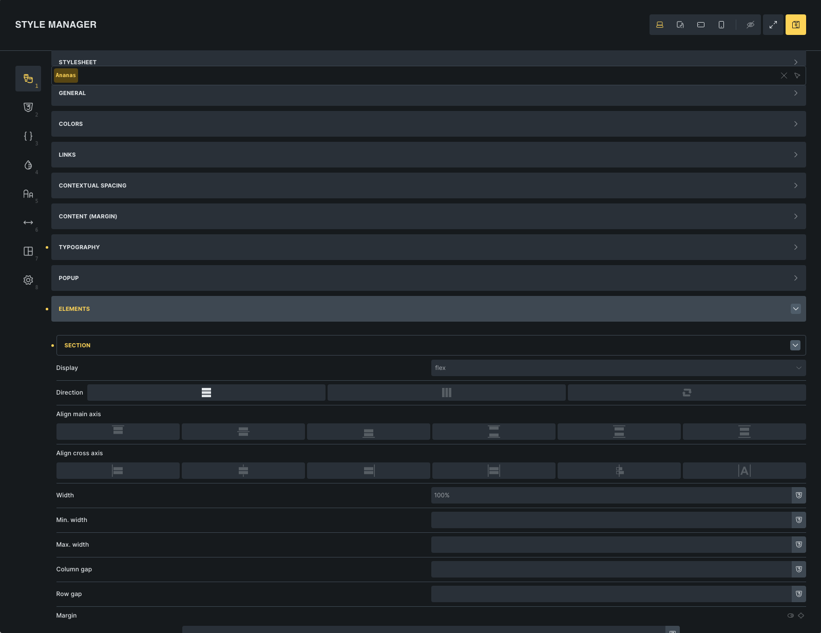
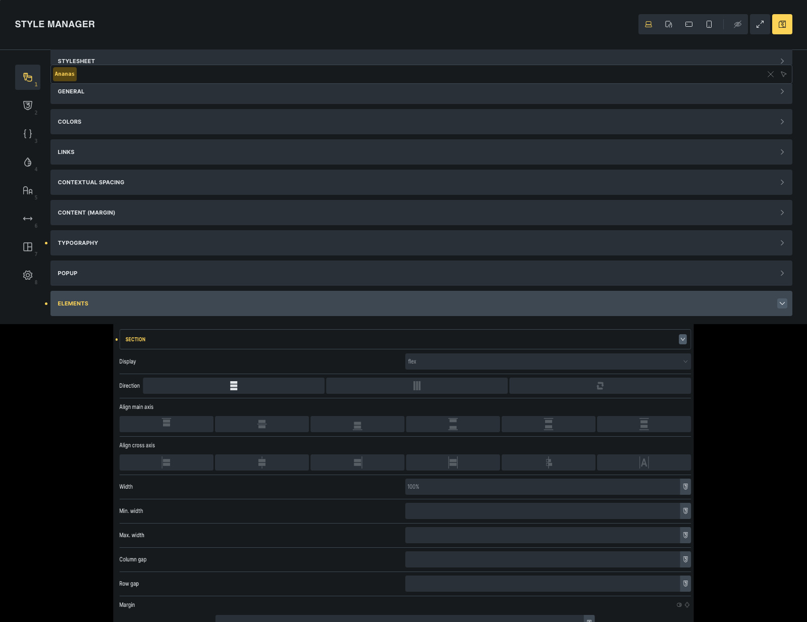
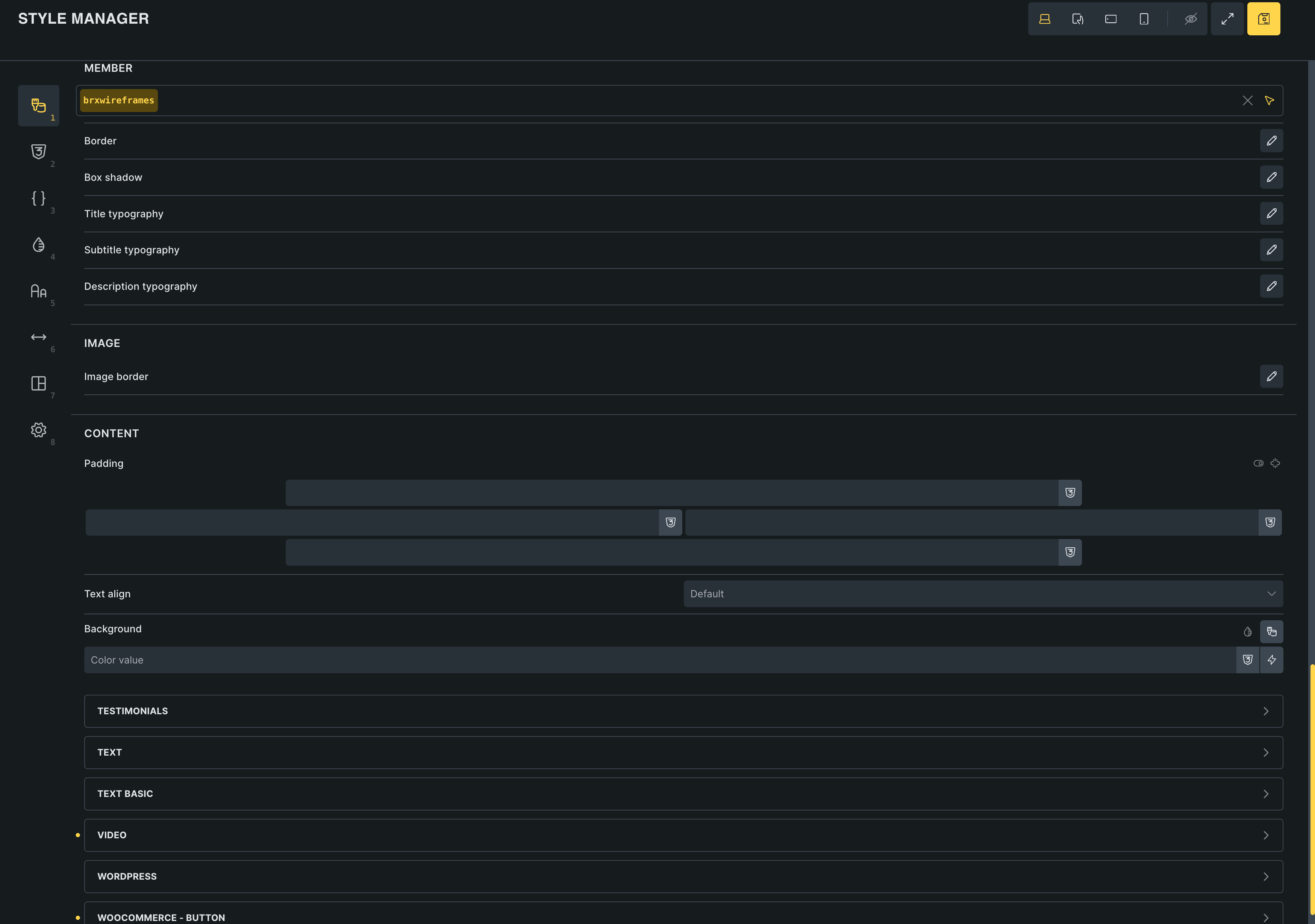
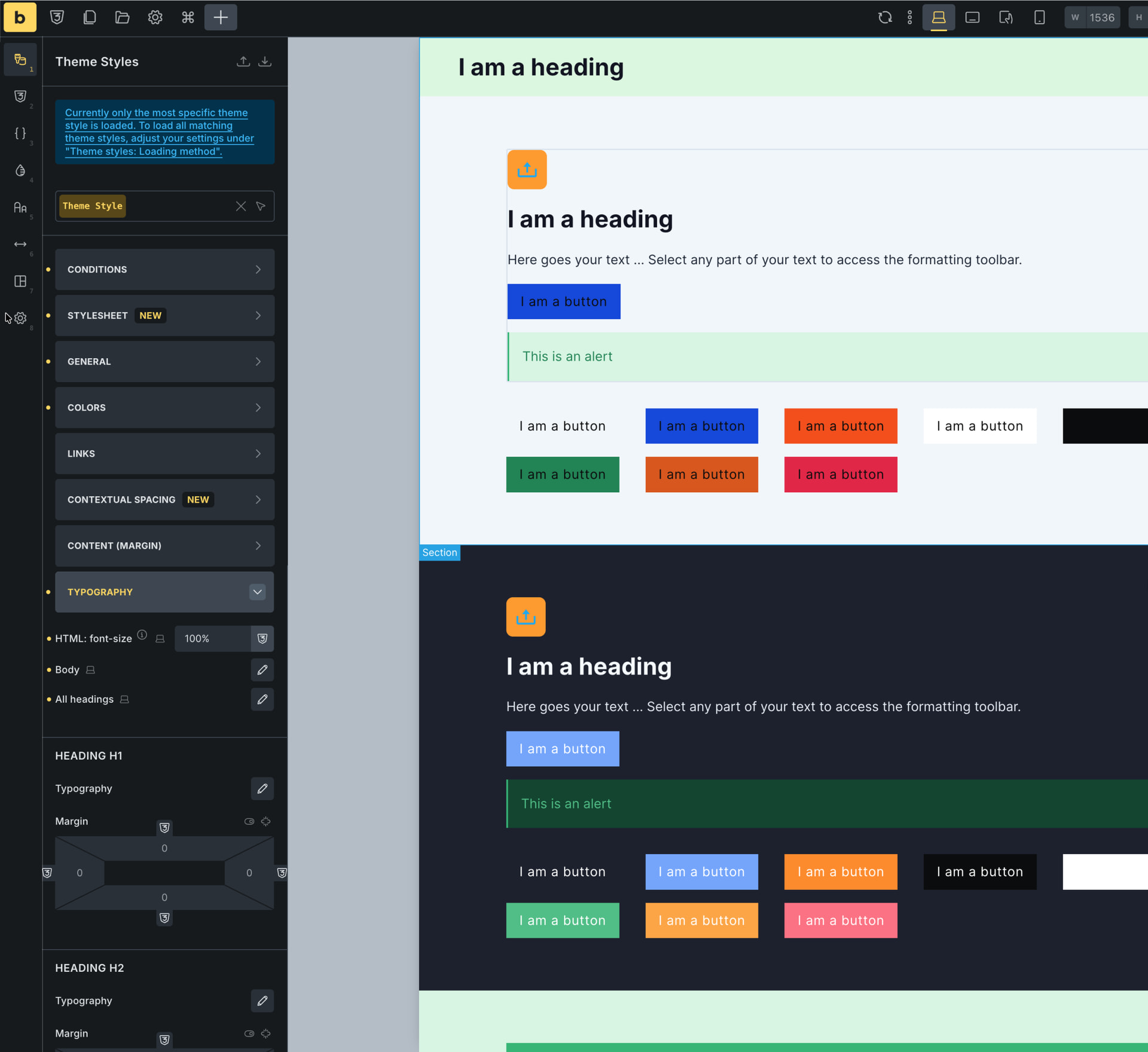
The element settings in the style manager panel seems a bit too wide.
Most of us work on big screen for web development, I assume, this causes a readability issue. Our eyes and mouse are going left to right in order to know what field is what and what is actually filled. A narrower element settings would also improve the hierarchy hence the readability and ease of use.
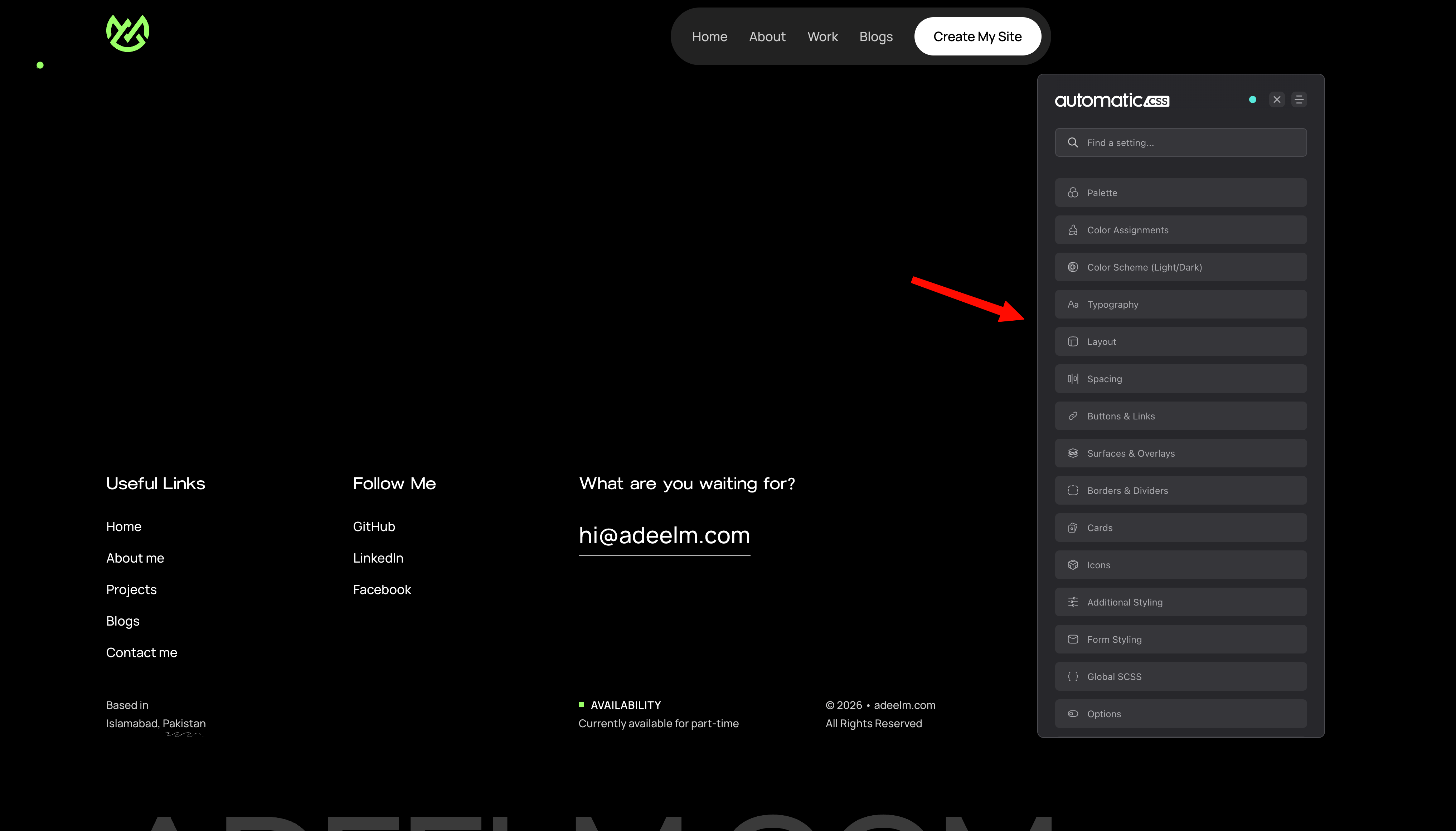
In my opinion, the whole style manager and preview options can be more clean and simpler just like Automatic CSS.
This will make the UX/UI better, and less bloatware in theme itself because then they don’t need to build a separate Preview window.
I’m noticing with every new new release there are more icons and buttons. It’s not only confusing for us using Bricks for years but for new developers who are switching to Bricks builder.
We can just give our opinions, at the end it’s @timmse call.
It looks weird. Like an image being stretched. And its not that nice to use, when your eye needs to go this much from left to right. I may even click the wrong button for that reason.
The old version width were much easier to use and looked more professional.
I agree that the dropdown symbol is too far from the label. There should either be a max-width concept implemented, or a nonstandard approach to move the symbol next to the label.
Btw, unless you have done a survey, you have no data to back your “most of us” statement. (I see no reference to a data source.) Let’s keep the discussion truthful. You could say “I work on a big screen …”
The old approach is problematic for those of us who use 14” screens. Given the option of a too scrunched toolbar or a too wide panel, I vote for the too wide panel every day. At least I can read the complete value.
My wishlist would be to be able to edit styles and see the changes in real time. Going full screen to edit styles and not be able to preview it is not modern practice. Most themeing tools give you some way to see the effects as you style.
In general though, a reasonable max-width makes sense, or make the width adjustable somehow like a panel.
My whole team is incredibly frustrated by the new UI of the theme editor! It was design for a narrow sidebar, not a fullwidth window. I’m really struggling to understand how the Bricks team thought this was an improvement. I hope the release a 2.2.1 update SOON that addresses this. A simple width restriction to the styler window would be a good temporary patch.
I’ll pile on here - the full-width theme styles panel is a clear UX regression. It’s a UI that was originally conceived for a sidebar context, and just stretching it across the screen doesn’t make it “new” or “improved.”
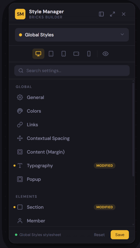
The real fix? Make it a detachable, dockable sidebar panel. This is how Automatic CSS already handles its settings, and honestly, it’s how every serious design tool and IDE has worked for two decades - VS Code, Figma, Photoshop, even OS-level system preferences (anyone remember Windows 8).
Dockable/floating panels aren’t a novel concept. They’re standard practice.
This would also address what Vigilante raised - editing styles while previewing changes in real time on the canvas. That’s the expected workflow in 2025. This way (dockable hovering sidebar), one will be able to preview changes on ANY page.
Short-term: a max-width cap on the panel would be a reasonable patch.
Long-term: a proper resizable, dockable sidebar is the way to go. The pattern already exists everywhere. Just implement it.
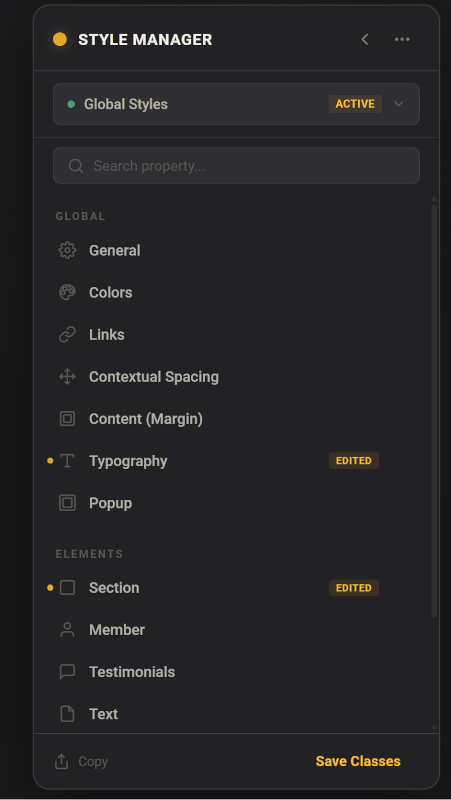
With today’s tools, you can build and iterate on ideas within minutes to at least start with an inspiration. Note, beloe exmaple imo doesn’t make sense in some ways, it’s just pretty rought sketch for a detached sidebar. I perfectly understand this is not an easy task to actually pull off in reality in one week or something silly like that. So again, just a sketch of what I mean when I say detachable sidebar instead of ultra wide Style Manager above canvas…
I agree, the new Style Manager is too wide, I’ve big screen but that is not the main issue. The main issue is that I cannot see the page. I think it is so important to be able to simultaniously seeing the actual page and the theme style manager at the same time. The previous version with the theme style manager on the side was better. Thank you.
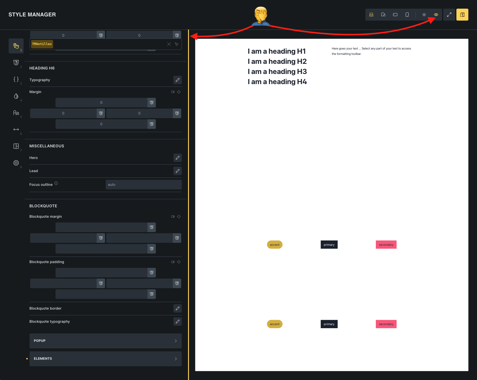
To all of us complaining about this issue, I don’t know why someone from BB does not simply communicate about it here, but the UI offers a way to improve the situation:
Toggle the “eye” icon (it will display the current page).
As vigilante and SuperTiti have discovered, the Canvas Preview (the little eye icon) should help (also with real-time previewing of changes). We’re in a bit of a quandary here because we have different types of panels: some that require very little space (such as theme styles) and others that require considerably more space (all the others).
Assuming we reduced the width of the theme styles to the old “dimensions”, I’m pretty sure the feedback would be that jumping back and forth between different widths is annoying (I even think we had that in one of the beta or rc versions, and the canvas preview is a result of the feedback).
Thematically speaking, it makes perfect sense for the theme styles to be located in the style manager. Moving them to a separate, possibly “floating” panel creates yet another level that you have to access somehow (another button, somewhere).
Remember that nothing is set in stone and can be improved over time, provided it makes sense and is feasible. But sometimes it’s simply time that makes you get used to certain things… Let’s see what the future holds for this case
While I agree with you that these settings belong with the style manager, I think that the style manager window should be part of the left sidebar.
Perhaps, instead of opening as popup, it replaces the left sidebar so you can toggle between style manger, font manager, etc and normal content/style edits.
IMO, it makes more sense to keep the concept of “left sidebar for style settings,” whether those are per element/widget or global. Just like we had before. And for those who still want full-width, the pop-up can also be an option. This would even remove the need to have a preview in the first place, which is hard to use anyway when working on responsive changes.
Hope that makes sense.
Either way, I’m never leaving Bricks. You guys are way better than the competition!