Would it be possible to change or at least provide an option to allow the choice of how the Dynamic Data values are presented when we click on the lightning bolt?
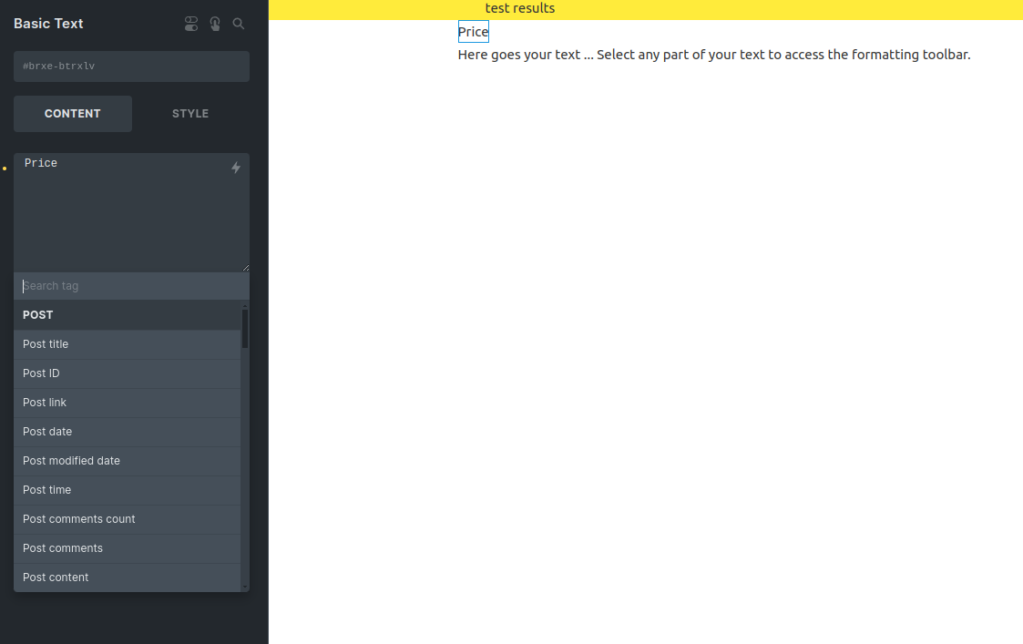
IF I have a Basic Text element and click on the lightning bolt then I get a fully expanded list of all available entries. This is a pain as invariably the one I want is near the end of the list so much scrolling is needed to find it.
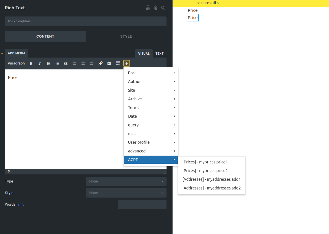
But if I use the lightning bolt in the Rich Text Element then I get a nicely categorized drop down that is much nicer to view and far easier and faster to select from.
Could we have the Rich Text display as the default for all instances of the Dynamic Data Lightning bolt?
Already submitted to the Idea Log, but awaiting ( hopefully ) acceptance.