Bricks Version: 1.2
Browser: Brave
OS: macOS
URL: https://try.bricksbuilder.io/tade6e4d/test/
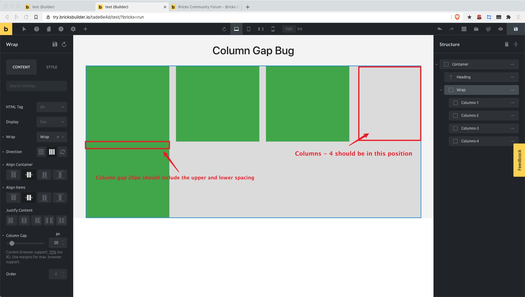
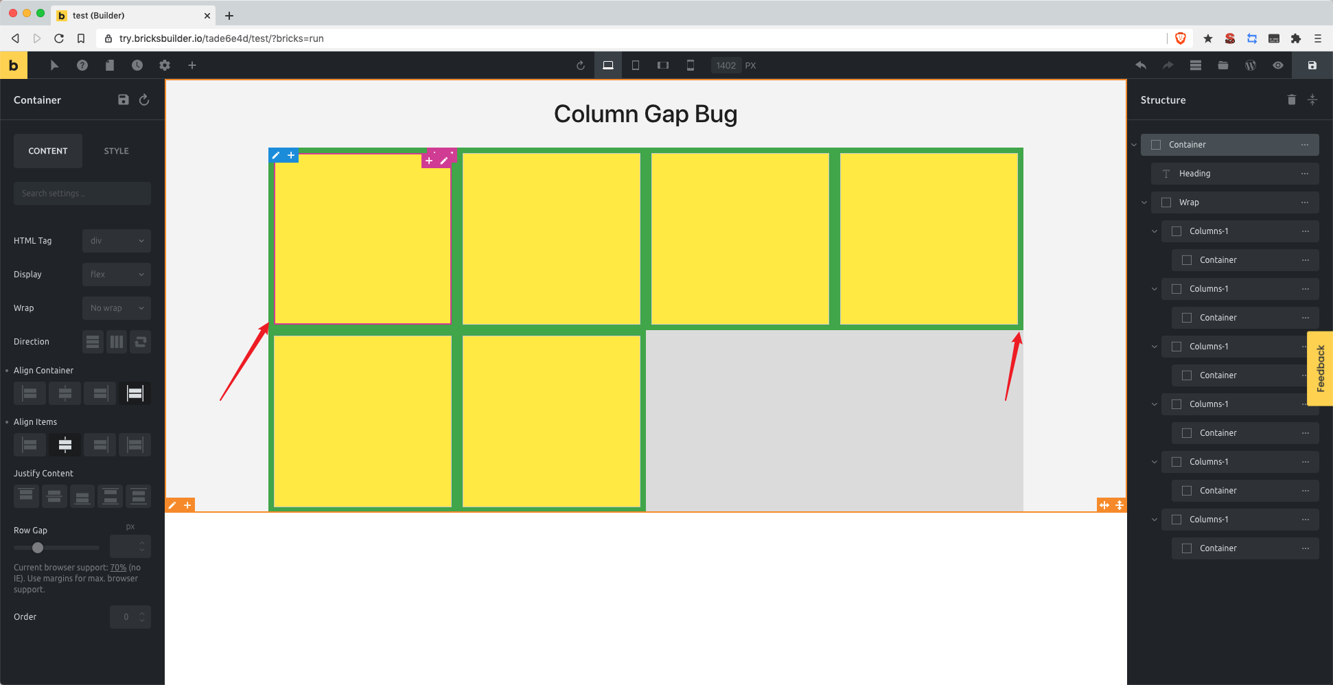
There is a problem with the way column gap is calculated.
Bricks Version: 1.2
Browser: Brave
OS: macOS
URL: https://try.bricksbuilder.io/tade6e4d/test/
There is a problem with the way column gap is calculated.
Works fine for me. Might be a width problem. Check to make sure your columns don’t have their widths set. Out of the box, Bricks automatically calculates and sets the width of all inner containers to be equal, after taking into consideration any padding/gaps.
EDIT: I verified that once you set the width for your inner containers, it’d behave like in your screenshot. It’s fine to not set the width for your inner containers if you only intend to have one single row.
However, if you want multiple rows (eg. 2 rows of 4 containers per row), then we have a small problem. Not sure how to implement that without writing some custom CSS in the code section at the moment.
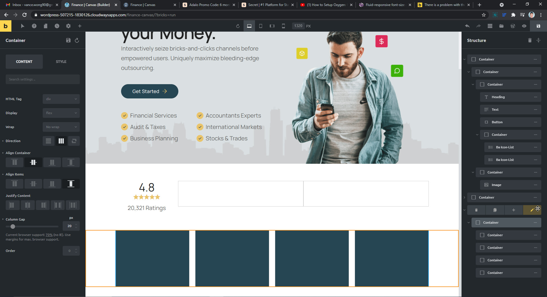
2nd EDIT: I figured out a way to do it. Refer to the screenshots below:
The main container (not the section container) has to have wrap set as “wrap” instead of the default “nowrap”. This will allow the main container’s children to wrap around the container (eg. the fifth 25% width container will go to the second row, and so on).
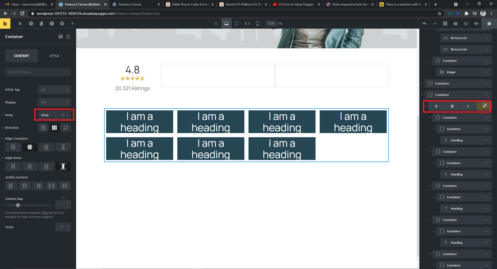
Under the main container’s “Style” settings, go to “inner container” and set the padding (eg. 8px all around). This will create a padding around the inner container children, so it looks like in the screenshot.
Finally, set the inner containers’ width to 25%. Because we set the inner containers’s padding in the main container to be 8px all around, it’d calculate accordingly and you’ll have it in a nice row of equal columns. In my structure, I created an additional container inside just for visual demonstration purposes by setting the background to be blue, so there’s no need to create an additional container. UNLESS you’re thinking of creating a card of sorts, then you might need an additional container.
Section container
Main container
Inner container #1 (25% width) > column content
Inner container #1 (25% width) > column content
Inner container #1 (25% width) > column content
Inner container #1 (25% width) > column content
Hope this helps.
Thank you for your reply. I know how to set padding, but it’s not perfect. Pading takes up space on both sides. What I hope is that columns-4 set by oxygen nninja represents that this row allows four columns, so that the multi row list will be beautiful. Core Framework Documentation & Tutorials by OxyNinja.com
@dicrm A fellow Brave user, nice  Okay, so you need to set the column width as you want to have a four column layout (and your container has more than four inner container/columns), correct?
Untested, but: You could try setting the column width to 24% and the “Column Gap” to 1%. Would that work for you?
@thomas I use another site builder, the column gap is calculated automatically for top, bottom, left, right when we insert the value there.
But they have 1 option to choose. There allow us to choose the number of items to be show for a row for different breakpoints. If I remember correctly, it happens to Elementor and Divi. So, I think Bricks should do it too. It’s really useful and it helps a lot.
Elementors’ “gap” is just setting the padding, not a real gap, if I remember correctly.
If that’s the case, I think something like nth-last-child() selector would be required for this to work seamlessly. And there should probably be something like “how many columns is in this container” field, so it works as you’d like.
For eg. if there are 4 columns in this container, then nth-last-child(3) won’t have the column gap applied.
Not sure how the implementation would be for the Bricks team, but this sounds like how you’re intending it to work? In that case, CSS grid function might be more appropriate to implement?
Just finished updating 1.2.1 This problem still exists, and very much affects the personalized layout