Hi,
In some sections of the builder, the titles are a bit long, when they could be more concise and useful. For example:
in Hide element in builder/frontend
Builder: Hide element > Hide in builder
Frontend: Hide element > Hide in Frontend

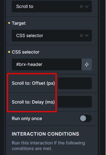
In the “scroll to” action (interactions)
Scroll to: Offset (px) > Offset (px)
Scroll to: Delay (ms) > Delay (ms)
Especially in interactions, this long title means that if the responsive indicator is added to the Offset (px) and Delay (ms) options in the future, there will be no empty space for the responsive indicator.