Hi bricks team,
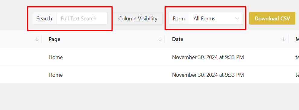
1- I think the Form Submissions section in Bricks is a bit weak and could be much better. One of the most important of them is that the options sent in the form are all displayed in the table. Therefore, if there are many of them, we have to scroll horizontally to view the information sent by the user. This is not interesting at all. On the other hand, if you have a field of type text area and a relatively long text is written in it, everything will be crowded. Please see the screenshot below.
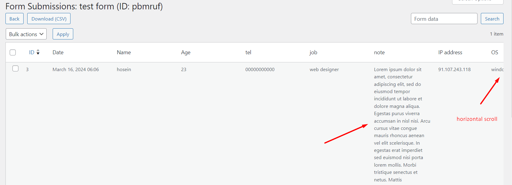
Elementor has a suitable solution in this section. Even if the number of form fields is very large (like a multi-step recruitment form) there will be no problem and everything will be displayed properly. Please see the screenshot below.
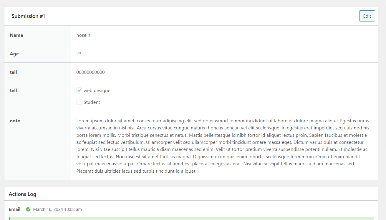
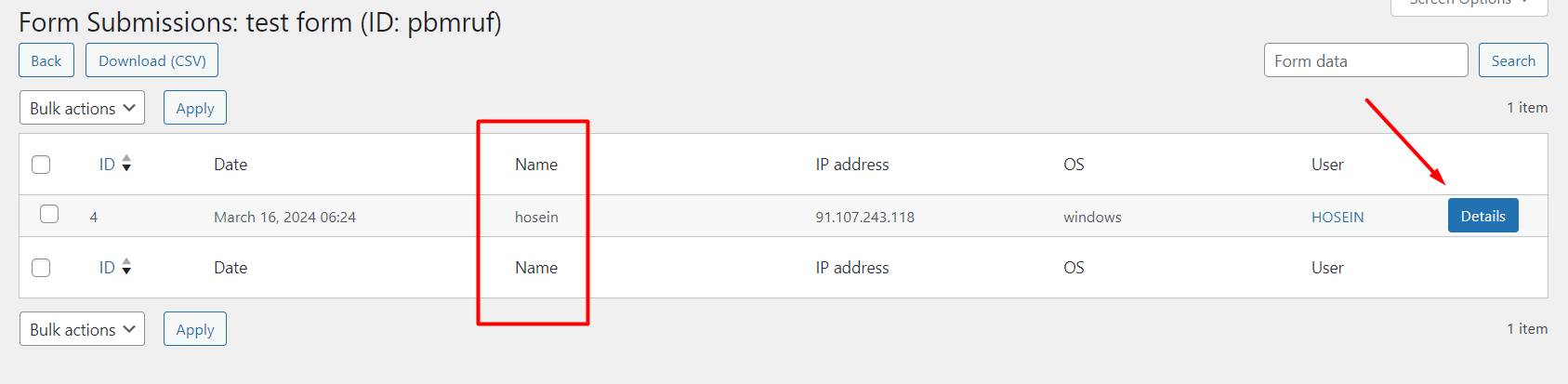
2- It would be great if you could add this option so we can choose which form fields are displayed in this section. For example, I have a recruitment form that takes over 30 different fields from the user. But I want the user’s name or any desired field to be displayed in the Form Submissions table. In fact, an option like this is needed for all fields. Therefore, if we enable this option, a column for it will be displayed in Form Submissions.
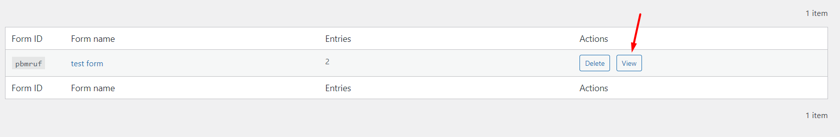
3- View button in actions section to view forms
In fact, the result of the above 3 items will be the following screenshot. We chose to display the name field in the table. By clicking the details button, we will see the complete information of the form, like in Elementor. Of course, if it is a pop-up, it will be even better than Elementor.
cheers