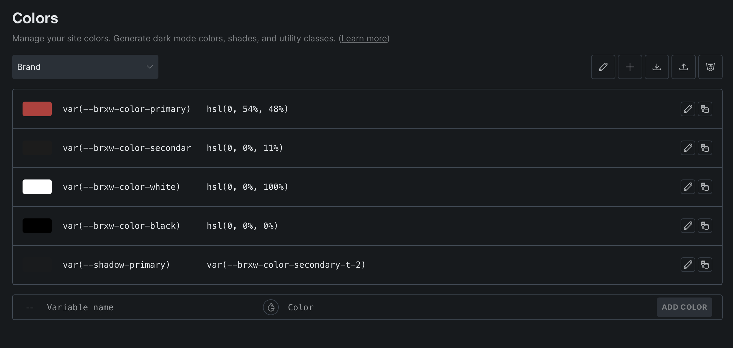
The Colours (“Colors”) page in Bricks Style Manager has a really strange use of space, and I think there’s easy low-hanging fruit ready here for improvement. The variable name column should be expanded so that longer names can be seen without being cut off, especially when there is so much room for the colour value which normally doesn’t need as much space. Maybe even just a 50/50 column split here between colour name and colour value would be ideal.
Example in screenshot below: The secondary colour variable name expands past the column width. Anything of a similar length or longer will be cut-off. This is on a 16” Apple MacBook Pro, by the way (I assume on larger screens this may not be an issue).