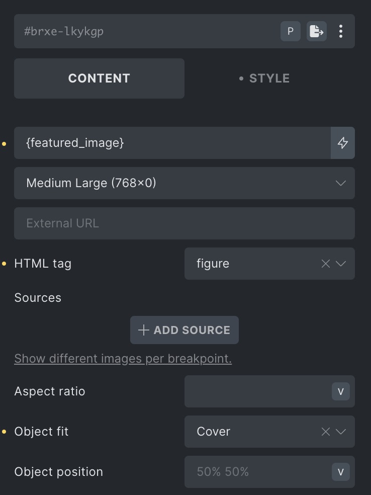
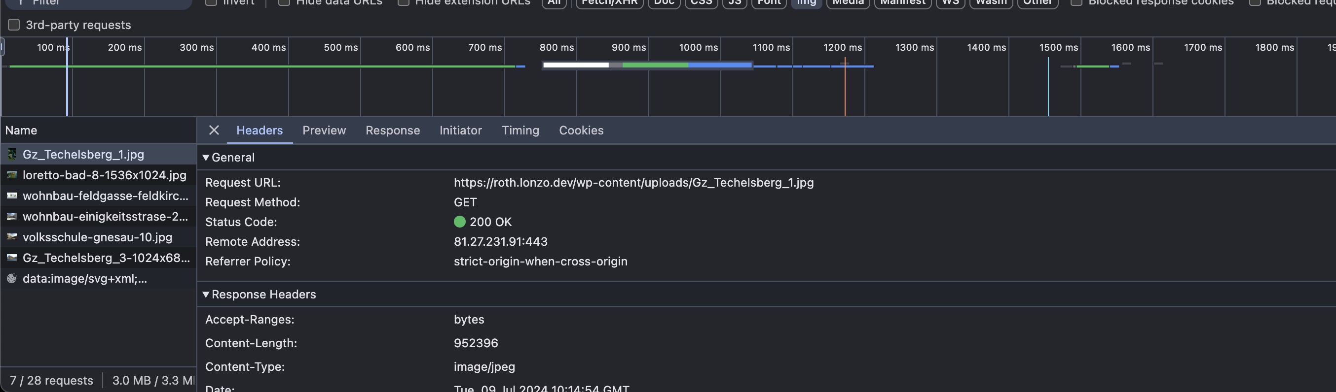
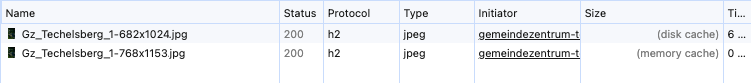
I have set up an image to display at Medium Large size. For some reason the browser is loading its full sized version.
Here is the output HTML:
<img width="768" height="1153" src="https://roth.lonzo.dev/wp-content/uploads/Gz_Techelsberg_1-768x1153.jpg" class="css-filter size-medium_large" alt="" decoding="async" fetchpriority="high" srcset="https://roth.lonzo.dev/wp-content/uploads/Gz_Techelsberg_1-768x1153.jpg 768w, https://roth.lonzo.dev/wp-content/uploads/Gz_Techelsberg_1-200x300.jpg 200w, https://roth.lonzo.dev/wp-content/uploads/Gz_Techelsberg_1-682x1024.jpg 682w, https://roth.lonzo.dev/wp-content/uploads/Gz_Techelsberg_1.jpg 799w" sizes="(max-width: 768px) 100vw, 768px">
Here are some screenshots of the image setup on the editor and the Network tab.