Putting the logo in a container with 100% height with a centered main axis reveals a small top-margin that isn’t reflected anywhere else in the builder or with the chrome inspection tool
A-tag is looking all funky — seems like like it might be what’s being centered around — although on higher breakpoints all the way to desktop the a-tag is just as funky looking with no effect on centering
It would seem that the logo element is somehow tied to the image on the left rather than the parent element.
The font looks the same above the 768px width, yet the centering works. It specifically breaks at the <768px breakpoint. The ONLY style being applied by an outside force is the basic official Bricks breakpoint media queries, as far as I can tell (flex-wrap).
Just re-tested and the Font Size also causes the layout to shift,- the ghost margin I believe,- even on higher resolutions. So it’s centered on higher resolution just because of the Font size
Once you reduce the height of the image on the left it seems to also resize the container on the right.
So perhaps there are 2 problems? 1 with the Font size and 1 with how you arranged the containers there?
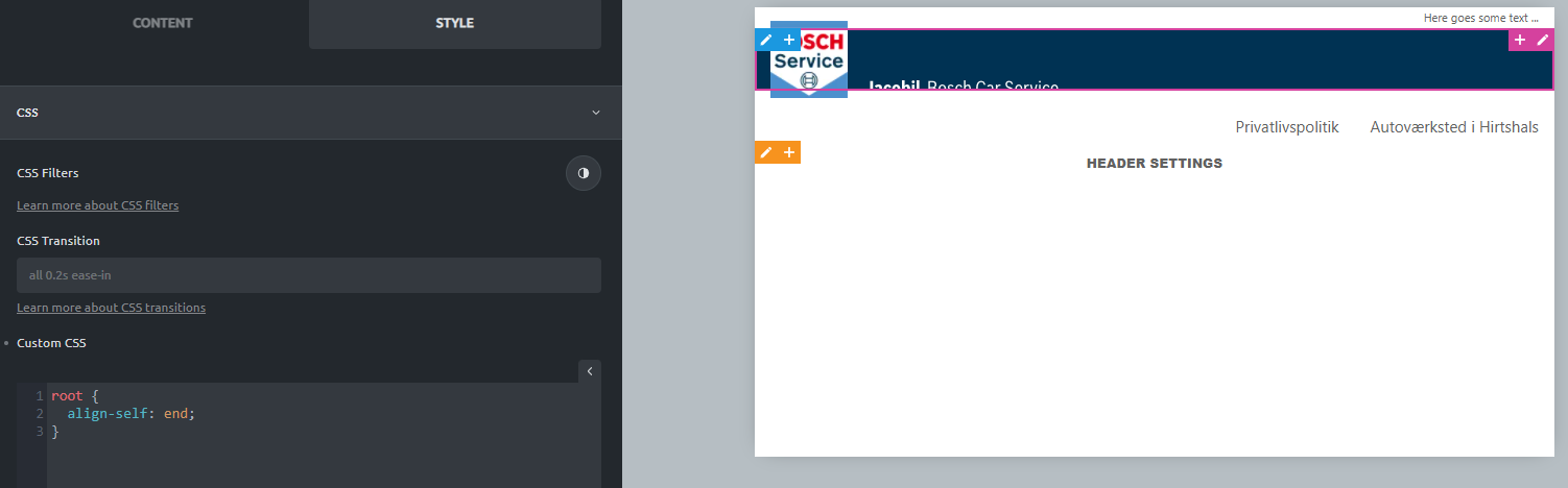
I never tried to do such a layout before, with an image larger then the background. Can you share how the structure panel looks like in this case?
There is a tiny “gap” below the logo caused by the font settings, but that does not cause the jumping, as you can see here: https://vimeo.com/660863535/1b6439625b
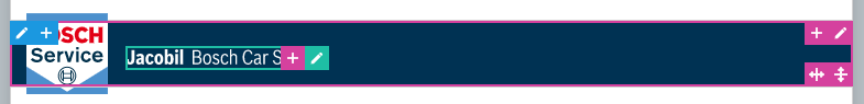
The logo image and the logo element are wrapped in containers. So the align-items: center on the outer container centers the containers, and the container that contains the logo element (Jacobil Bosch car Service) orients itself on the image element container, which changes. And this causes the jump, I guess. It’s hard to explain, so I hope you get what I mean
I would also change the general structure. For example, empty containers to create spacing are not quite as lovely. So instead, I would work with margins. Would you please look at this template to understand what I mean?
@timmse
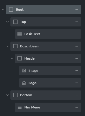
The three main containers — top, beam and bottom — are all meant to contain elements of their own.
Top container will have quick access contact information, while the bottom container will contain the actual menu (on desktop). They’re not there to create space (otherwise margins of course are the way to go). I simply stopped in my tracks as I hit the snatch.
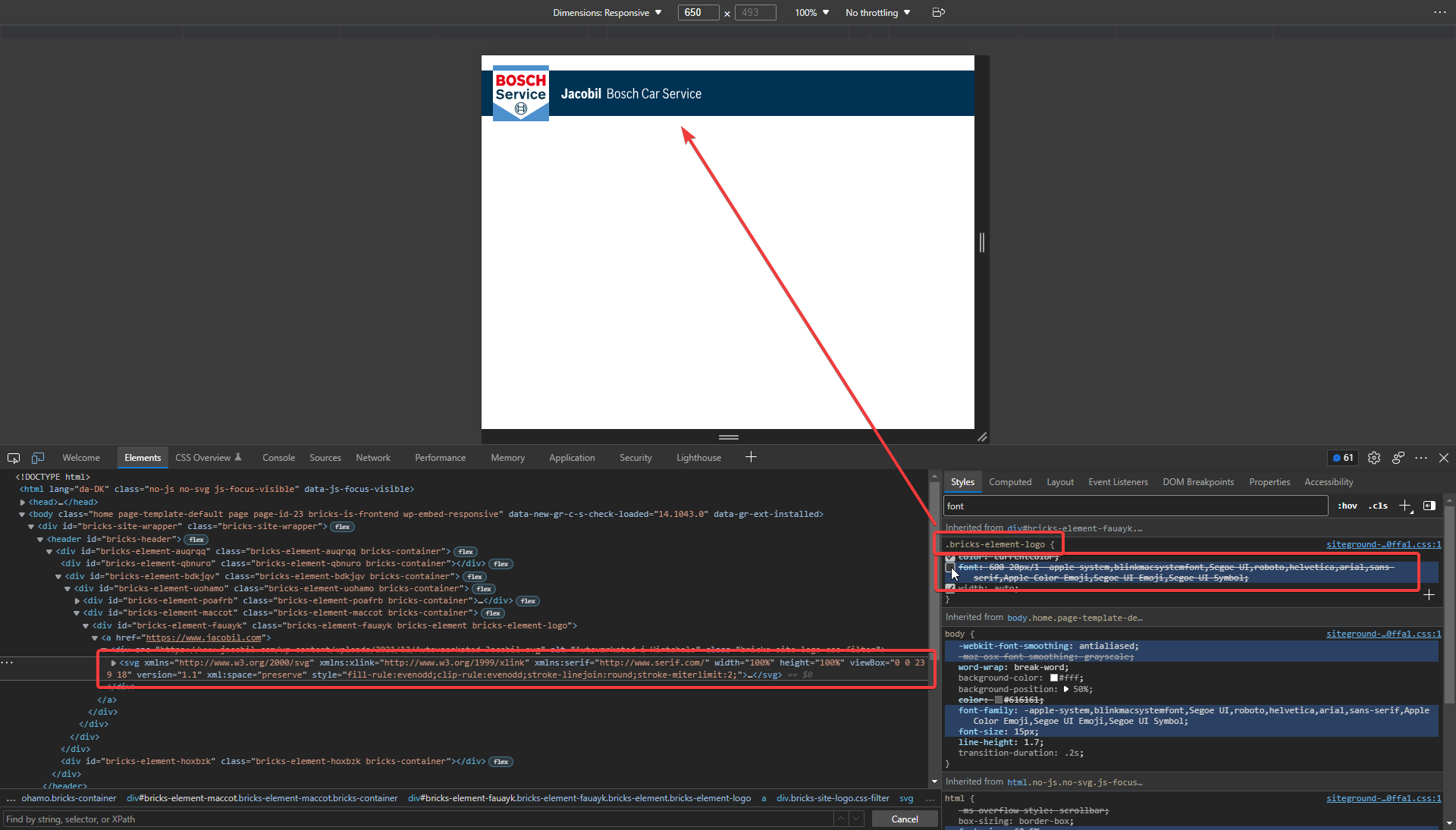
I only later wrapped the SVGs in containers, just to see if the issue persisted, which it does. To avoid confusion, I’ve now removed the wrapping containers and filled in the blanks @ https://www.jacobil.com/ — as you can see, the SVG is still aligning itself according to the image rather than adhering to align-items: center.
I’ve built this exact structure for many Bosch Car Service repair shops, in everything from Oxygen to even Divi (yikes) — this only happens with Bricks; surely it’s unintended?
See here how the logo element (and image element — i checked) is somehow bound to the neighbouring element even if the parent element has been set to align-items: center (or “Align Cross Axis” in the builder): https://photos.app.goo.gl/KCG362i7gdXHYvcU6
I tried with PNGs as well, just to make sure SVGs weren’t the issue. Issue persist regardless of image type.
the logo element, it clearly shows that the overflowing image is increasing the height of the parent container — this happens even with the container’s max-height set to 60px (matching the height set in the builder).


 Not sure about this.