SOLVED: WooCommerce: Checkout thank you/order received template no button margin

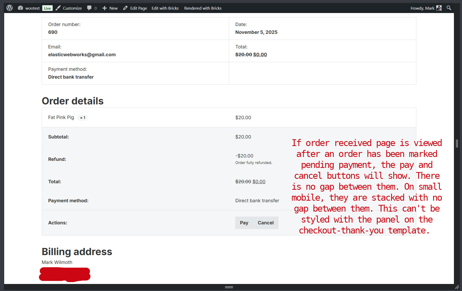
If the order received (checkout thank you) page is viewed after an order has been marked pending payment, the pay and cancel buttons will show. There is no gap between them. On small mobile, they are stacked with no gap between them. This can’t be styled with the panel on the checkout-thank-you template.

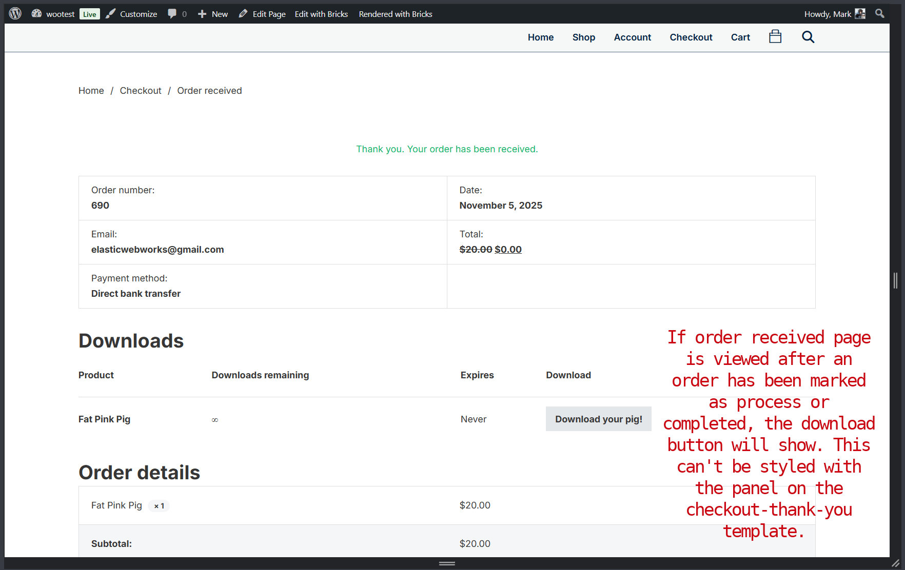
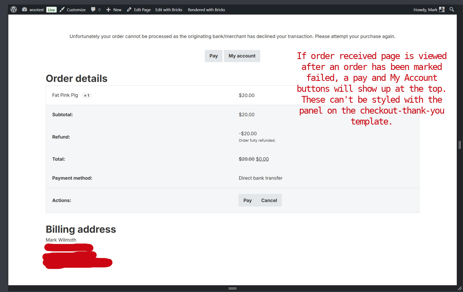
The rest is not technically a bug, but there are other buttons that may show and there is no syle for them in the builder panel. They are not hard to style for me, just pointing it out.

The Account View Order template is the same. It has no way to style those buttons in the panel. The Pay & Cancel buttons have no margin.

Hi @macksix,

thank you for letting us know. I was able to replicate the issue locally, and I’ve created an internal report.

Thank you,
Matej

1 Like

There is no panel style for the submit button on the Product Tabs element used on the Single Product Template either.

It’s not big deal though.

Yeah, we will have to go over those controls and implement what we feel it’s needed and try to do it in non-repetitive way.

Thanks,
Matej

We fixed this issue in Bricks 2.3, now available as a one-click update in your WordPress Dashboard.

Please read the changelog entry before updating, and let us know if you continue to experience issues.

1 Like