Bricks Version: 1.5 beta
Browser: Brave
OS: macOS
URL: https://23.discofever.co.uk
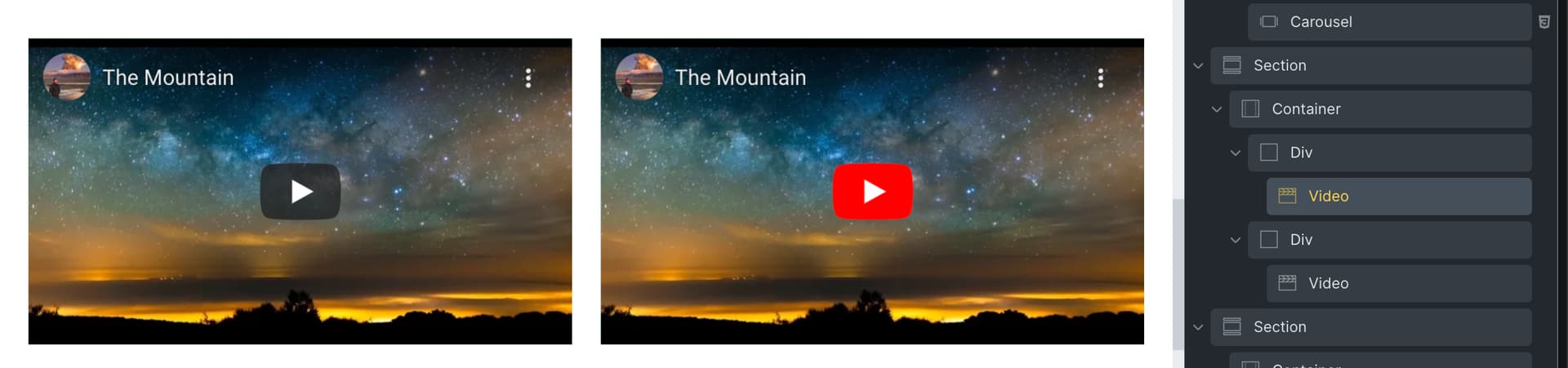
When you place two video elements side by side in a DIV with horizontal rows enabled, for some reason they render at some ridiculous height and out of ratio.
Short screencast to explain…
https://drive.google.com/open?id=1HpMDRXDT0MfJOBSbxWDYDVVTMZ0T9Gx_&authuser=info%40discofever.co.uk&usp=drive_fs
Hi Ian,
Thanks so much for your report!
The problem arises through the mix of flexbox and the video wrapper settings. If you wrap both videos with one div each, they keep their aspect ratio and everything is fine.
The video wrapper, .brxe-video, has a default width of 100% and a padding-top of 56.25% to keep the aspect ratio at 16/9. If you put it directly into a flexbox container alongside another element, the width isn’t 100% anymore (50% - gap), as it is relative to its parent. If you wrap the video with a div, the video’s width will stay at 100% inside the 50% width parent.
Best regards,
timmse
Ok so wrap each video inside its own DIV?
I’ll give that a whirl, thank you!
Yep, it’ll definitely work!
1 Like
It did work :). It was the one thing I didn’t try!
Thank you again for your help, really appreciate it.
1 Like
Hi, it didn’t work for on me.
I dont want see light gray right and left side on my video and it must be fixed width with div.
Hey Mehmet,
Do you have a live link? Then I can see what you have set and maybe understand what you want to achieve.
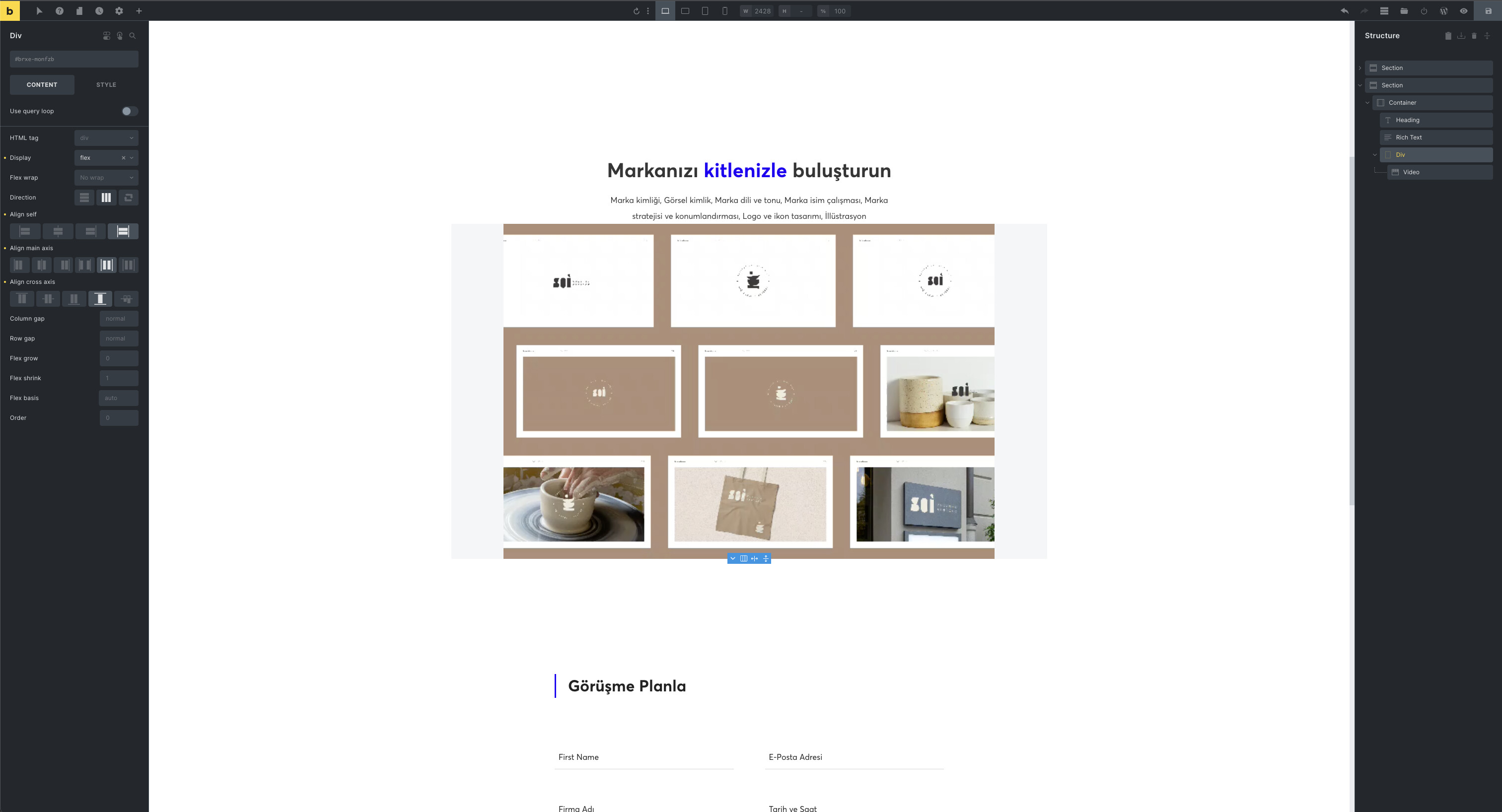
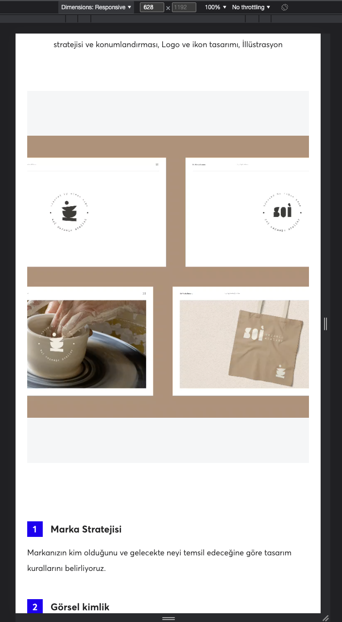
Hi I changed video width as 1920x1080 the problem is solved. But when I use video width 1200x800, I need to set height for disapperieng light gray background. Also when I checked 1920x1080 width video on responsive mode in chrome the problem is still going on.
I’m sharing screenshot and my link.
Here is a link: Servisler – Salt Tasarım
Hi Mehmet,
Your problem is different from the one in this thread (two videos side by side).
In your case, you don’t have to wrap the video element with a div and you don’t have to give it a width or a height, but in the case of the mobile video only an aspect ratio of 1 or a background color - then the grey background disappears by itself 
root {
  aspect-ratio: 1;
  background-color: white;
}
Best regards,
timmse
Hi Timmse, thanks for your help, your custom code is solved my problem.
Cheers.