Browser: Chrome 110 OS: macOS / Windows / Linux / etc. URL: Link to a page that illustrates this issue Video: Short screen recording that illustrates this issue (free tool: jam.dev)
Hello,
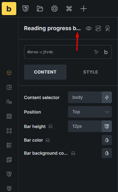
In the Elements panel, element names are abbreviated based on the width of the panel, which is fine.
We’ve fixed this issue in Bricks 2.0.1, now available as a one-click update in your WordPress Dashboard.
Please take your time to read the changelog entry before updating: Bricks 2.0.1 Changelog – Bricks, and let us know if you continue to experience issues.